☎ Call ☏ WhatsApp

Noida

What color furniture hides dust?

What Color Furniture Hides Dust? Best Dust-Resistant Colours
Interior A to Z · Furniture & Interior Design Delhi · Gurgaon · Noida · Delhi NCR
Furniture Colour & Maintenance Guide

What Color Furniture Hides Dust?

Discover practical furniture colours and finishes that make everyday dust less noticeable while keeping your home stylish, comfortable and easier to maintain.

Quick answer: Medium warm neutrals such as taupe, greige, beige, muted brown and natural wood tones can make everyday dust less visually obvious than very dark or very light high-contrast surfaces. The finish matters too: matte or low-sheen furniture often looks more forgiving than glossy black or highly reflective surfaces. There is no universal “dust-proof” colour because dust visibility depends on particle colour, lighting, surface texture and the furniture finish.
Best furniture colours

Which furniture colours make dust less noticeable?

If easy maintenance is important, think about contrast rather than simply choosing the darkest or lightest furniture. Mid-tone, warm and naturally varied surfaces can visually soften everyday dust between cleaning sessions.

Taupe

Balanced warm-grey/brown tone with relatively low visual contrast.

Greige

A practical neutral that works across contemporary interiors.

Natural Wood

Grain and tonal variation can make small particles less obvious.

Warm Beige

Soft and versatile for bedrooms, living rooms and wardrobes.

Medium Grey

A balanced alternative to very light or very dark furniture.
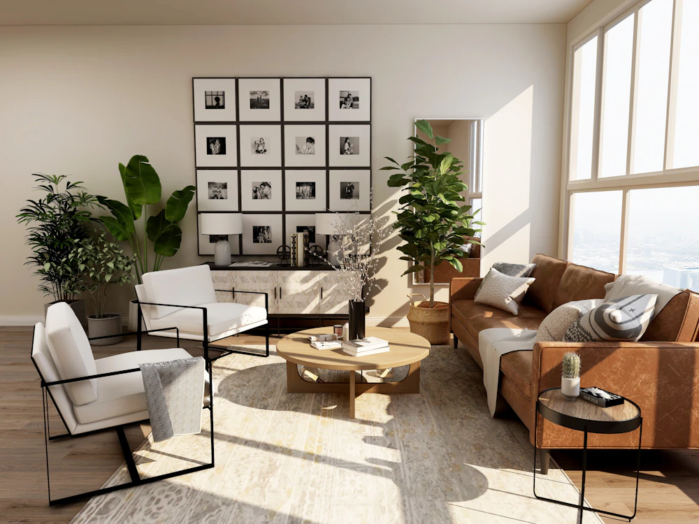
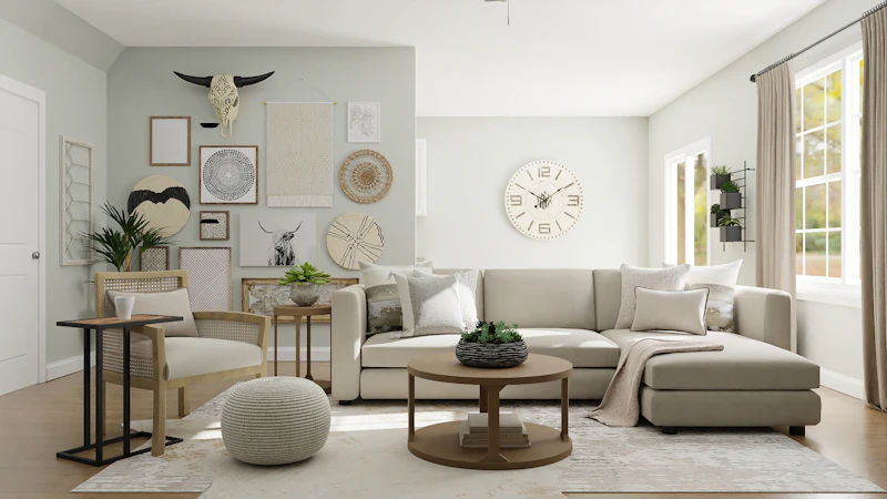
Warm neutral furniture and contemporary interior design
The key principle

Dust visibility is about contrast, not just colour.

There is an important difference between furniture that does not collect dust and furniture that makes dust less noticeable.

Dust can appear light, grey, brown or dark depending on where it comes from. Strong contrast makes particles easier to see, while mid-tone and visually varied surfaces can reduce the apparent contrast.

  • Medium tones can be visually forgiving.
  • Natural wood grain creates tonal variation.
  • Matte finishes reduce strong reflections.
  • Glossy black can reveal light dust quickly.
  • Very white surfaces can reveal darker particles.
  • Strong direct sunlight can reveal dust on almost any surface.
Colour guide

Best furniture colours for a low-maintenance-looking home.

These colours are not dust-proof. They are simply useful choices when you want furniture that does not visually highlight every small particle between regular cleaning.

01

Taupe Furniture

Taupe sits between grey and brown and works particularly well with warm white walls, beige fabrics, natural wood and soft lighting.

It is a strong option when you want a sophisticated neutral without choosing very dark furniture.

02

Greige Furniture

Greige combines the calm character of grey with the warmth of beige. It works well for wardrobes, TV units, cabinets and contemporary living room furniture.

03

Natural Wood

Oak, walnut-inspired, teak-inspired and other natural-looking wood surfaces provide grain and tonal variation that can visually soften small amounts of dust.

04

Warm Beige

Beige furniture works especially well in bedrooms and living rooms where the goal is a calm, warm and timeless interior.

05

Medium Grey

A mid-grey can provide a practical compromise between very dark charcoal furniture and very light white furniture.

06

Muted Brown

Warm brown furniture can work particularly well with wood, cream, off-white, olive, terracotta and other earthy interior palettes.

At-a-glance comparison

Which furniture colours show dust most easily?

The table below describes general visual behaviour. Actual results depend on lighting, dust colour, surface texture and finish.

Furniture colourDust visibilityVisual characterUseful pairing
TaupeGenerally lower contrastWarm & sophisticatedIvory, beige, wood
GreigeGenerally lower to medium contrastModern & neutralWhite, stone, oak
Natural woodOften visually forgivingWarm & organicCream, beige, green
Medium greyModerateContemporaryWhite, black, wood
WhiteCan show darker particlesBright & airyOak, beige, pastel
BlackCan show light dust stronglyDramatic & luxuriousWood, brass, warm neutrals
Colour + finish

The furniture finish can matter as much as the colour.

Choosing the right colour is only half the decision. A glossy surface reflects light and can make fingerprints, smudges and fine particles more obvious.

Matte and low-sheen finishes generally create a softer visual surface. Textured or wood-grain finishes can also introduce variation that makes small amounts of dust less visually prominent.

Matte laminate A practical choice for many wardrobes and cabinets.
Low-sheen finish Reduces strong reflections compared with high gloss.
Wood grain Adds natural visual variation.
Textured surface Can visually break up small marks and particles.
Natural wood furniture with matte interior finishes
Matte vs glossy

Should you choose matte or glossy furniture?

If easy visual maintenance is a priority, compare the finish before deciding on the colour.

A

Matte

Matte surfaces have less reflection and can create a softer, contemporary appearance.

They are particularly useful for modern wardrobes, TV units, cabinets and minimalist interiors.

B

High Gloss

Gloss creates reflection and can make a room feel polished, but fingerprints, smudges and contrasting dust can become easier to notice.

C

Wood Texture

A natural-looking grain introduces variation and warmth while reducing the completely uniform appearance of a plain surface.

Room-by-room recommendations

Dust-conscious furniture colours for different rooms.

01

Living Room

Consider taupe, greige, medium grey, warm beige or natural wood for TV units, consoles, coffee tables and storage.

02

Bedroom

Warm beige, taupe, muted brown and natural wood work well with calm bedroom palettes and soft textiles.

03

Wardrobes

Greige, beige, wood grain and medium neutral laminates can provide a practical and cohesive wardrobe finish.

04

Study Room

Medium wood tones, greige and muted grey can provide a professional appearance without relying on very dark surfaces.

05

Dining Room

Natural wood, medium brown and warm neutral furniture can work well with practical flooring and easy-clean finishes.

06

Entryway

Because entryways receive frequent contact, a mid-tone console with a durable low-sheen finish can be easier to maintain visually.

Modern neutral living room furniture design
Delhi NCR homes

Choosing furniture for a dusty urban environment.

In cities such as Delhi, Gurgaon and Noida, furniture selection should consider more than colour. Surface durability, ease of cleaning, upholstery, hardware and ventilation all influence everyday maintenance.

  • Choose practical, easy-to-clean furniture finishes.
  • Consider matte or low-sheen surfaces for frequently touched furniture.
  • Use washable or easy-clean upholstery where appropriate.
  • Plan closed storage for items that should stay dust-free.
  • Avoid unnecessarily complex decorative grooves where cleaning is difficult.
  • Use a colour palette that fits the room instead of selecting colour only for dust visibility.

Interior A to Z’s furniture guidance similarly recommends dust-resistant laminates and easy-to-clean fabrics for NCR homes. :contentReference[oaicite:1]{index=1}

Interior inspiration

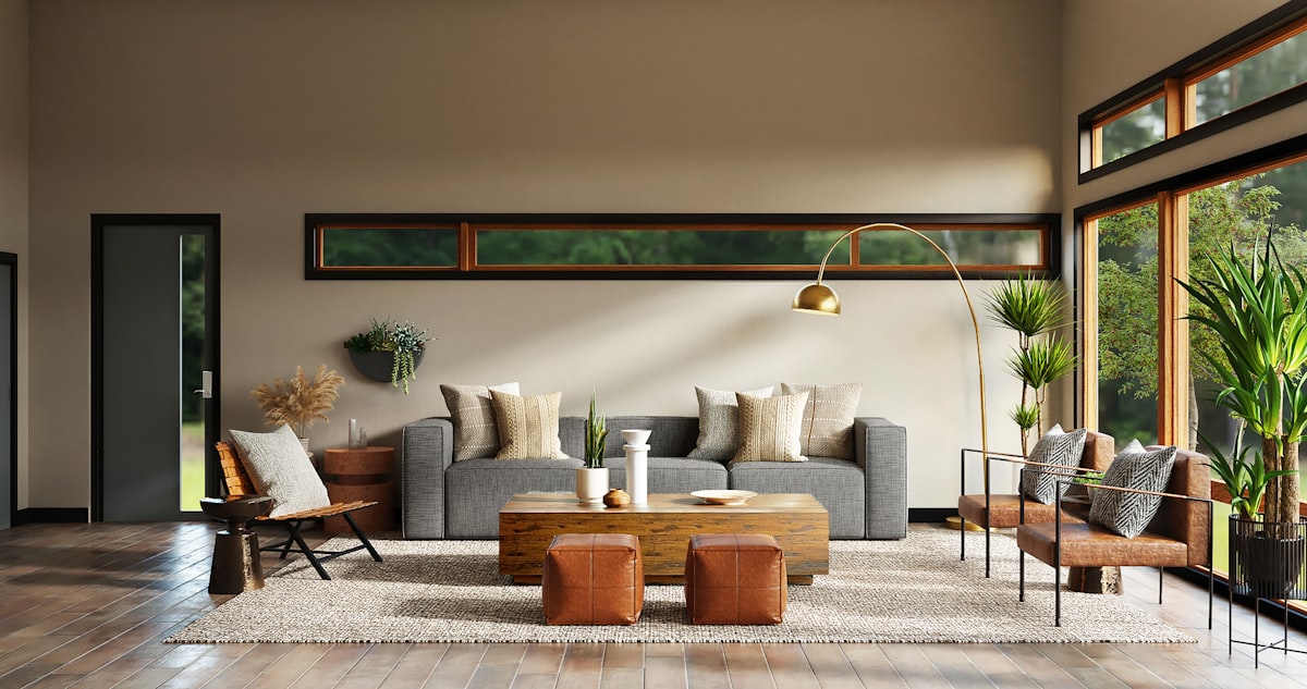
Warm neutrals, wood and matte finishes work naturally together.
Maintenance checklist

Colour helps, but good furniture planning helps more.

The best low-maintenance interior is not simply one with a dust-hiding colour. It combines practical materials, accessible storage and surfaces that are easy to clean.

01 · Use accessible surfaces Avoid furniture details that create difficult-to-reach dust traps.
02 · Prefer practical laminates Select finishes appropriate for the furniture’s everyday use.
03 · Consider closed storage Doors and drawers protect stored belongings from open-room dust.
04 · Keep furniture off the floor where practical Floating furniture can make floor cleaning easier.
05 · Choose upholstery carefully Easy-clean and washable fabrics can simplify regular maintenance.
06 · Control clutter Fewer exposed objects mean fewer surfaces requiring frequent dusting.
07 · Consider sunlight Strong direct light can make particles more visible on almost any surface.
08 · Clean regularly No furniture colour replaces routine cleaning.
Common mistakes

Furniture colour choices that can make dust more noticeable.

Very glossy black everywhere Light dust particles and fingerprints can create strong contrast on dark reflective surfaces.
Pure white in high-contact areas Darker particles, marks and everyday stains may stand out clearly.
Choosing colour without checking lighting Direct sunlight can reveal particles that are less visible under softer ambient light.
Ignoring the finish Two furniture pieces with the same colour can look completely different depending on gloss, texture and grain.
Too many open shelves Open storage creates more exposed surfaces that require regular dusting.
Designing only for appearance Furniture should balance colour, durability, cleaning, storage, comfort and the overall interior concept.
Related interior guides

Continue planning a practical, beautiful interior.

How to Choose Furniture

Explore furniture selection, materials, finishes, comfort and practical considerations for Indian homes.

Read furniture guide →

Living Room Interior Design

Coordinate furniture, TV units, storage, wall treatments, lighting and colour into one cohesive living room.

Explore living room design →

Bedroom Interior Design

Explore bedroom furniture, wardrobes, storage, lighting, materials and calm colour palettes.

Explore bedroom design →

Materials Expertise

Understand how materials, colours, finishes and furniture construction work together.

Explore materials →

Interior Design Services

Explore residential interior design and complete interior solutions from Interior A to Z.

View services →
FAQ

Questions about dust-friendly furniture colours.

What color furniture hides dust best?

Medium warm colours such as taupe, greige, beige, muted brown and many natural wood tones can make everyday dust less visually noticeable because they generally create less stark contrast than very dark or very light surfaces.

Does dark furniture show dust more?

Very dark furniture, especially black or charcoal, can make light-coloured dust easier to see. High-gloss dark furniture can also reveal fingerprints and smudges more clearly.

Does white furniture hide dust?

White furniture creates a bright, clean appearance but may show darker particles and marks through strong contrast. The result depends on the room’s lighting and the furniture finish.

Is natural wood good for hiding dust?

Natural-looking wood with visible grain can be visually forgiving because the surface already contains tonal variation. It can also create a warm, timeless appearance.

Is matte furniture better than glossy furniture for dust?

Matte and low-sheen finishes generally reduce reflections and can make fingerprints and fine particles less visually prominent than glossy surfaces. Cleaning performance still depends on the actual material.

What furniture colour is practical for Delhi NCR homes?

Taupe, greige, warm beige, medium grey and natural wood tones can be practical choices when combined with durable finishes and easy-to-clean materials. Interior A to Z also recommends considering dust-resistant laminates and easy-clean fabrics for NCR homes.

What is the best furniture finish for easy maintenance?

A matte or low-sheen laminate, veneer or other appropriate furniture finish can be a practical choice. The right finish depends on the furniture type, room, usage and cleaning requirements.

Can furniture colour reduce the need for cleaning?

No. Furniture colour can only change how noticeable dust appears. Regular cleaning is still necessary, particularly in high-dust urban environments.

Interior A to Z

Choose furniture for colour, maintenance and the whole interior.

A good furniture scheme balances appearance with everyday practicality. Consider the room’s lighting, wall colour, flooring, storage needs, material, finish and cleaning routine before finalising the design.

What color furniture hides dust? Read More »

What color furniture makes room look bigger?

What Color Furniture Makes a Room Look Bigger? | Interior A to Z
Interior A to Z · Small Space Interior Design Delhi · Gurgaon · Noida · Delhi NCR
Small Room Colour Guide

What Color Furniture Makes a Room Look Bigger?

Discover the furniture colours, finishes and design combinations that can make a compact room feel brighter, lighter, calmer and more spacious.

Quick answer: Light furniture colours such as off-white, cream, beige, pale grey, soft blue, soft green and light wood can help a room feel brighter and more open. The effect is stronger when furniture is appropriately scaled, visual clutter is reduced, natural light is preserved and walls and furniture have a visually connected palette. Colour changes perception; it does not physically increase the room’s dimensions.
Best furniture colours

Light furniture colours that can make a room feel more spacious.

Light furniture can help maintain visual brightness and reduce the heavy contrast that large dark pieces can create in compact interiors. The best choice still depends on daylight, walls, flooring and the overall design scheme.

Off-White

Bright and visually light without the starkness of pure white.

Cream

Warm and soft, especially effective with natural materials.

Light Beige

A calm neutral foundation with a warm character.

Light Grey

Contemporary and understated for modern compact interiors.

Light Wood

Adds warmth and texture without excessive visual weight.

Bright contemporary interior with light furniture and neutral colours
Why colour matters

Furniture colour changes visual weight.

A piece of furniture occupies the same physical area regardless of its colour, but its visual presence can change.

Light furniture can blend more easily with light walls and create greater visual continuity. Dark furniture creates stronger contrast and can become a more prominent focal point.

  • Light surfaces can reflect available light.
  • Similar wall and furniture tones can reduce visual boundaries.
  • Lower contrast can make furniture appear less dominant.
  • Natural wood adds warmth and visual texture.
  • Dark furniture can work well when used selectively.
Colour comparison

Which furniture colours create a lighter visual effect?

There is no universal best colour. The result depends on daylight, wall colour, flooring, furniture scale and the amount of contrast in the room.

Furniture colourVisual characterWorks well withUseful for
Off-whiteBright and visually lightWhite, cream, light woodCompact living rooms
CreamWarm and openBeige, wood, soft greenLiving rooms and bedrooms
Light beigeSoft and cohesiveWarm whites, wood, stoneWhole-home interiors
Light greyClean and contemporaryWhite, oak, muted coloursModern apartments
Soft blueFresh and airyWhite, pale greyBedrooms and lounge areas
Light woodWarm and naturalCream, beige, whiteContemporary homes
Dark brownGrounded and visually heavierWarm neutralsAccent furniture
BlackStrong contrast and visual weightWhite, wood, beigeSelected accents
Visual continuity

Match furniture with the room instead of treating it as a separate object.

One effective way to make furniture feel visually lighter is to reduce unnecessary contrast between the furniture, walls and surrounding surfaces.

For example, a cream sofa against a warm-white wall can feel visually quieter than a black sofa against the same wall.

Light sofa + light wall Creates stronger visual continuity.
Light wood + cream Adds warmth without heavy contrast.
Beige + warm white Creates a soft, cohesive palette.
Light grey + white Works well for contemporary interiors.
Light wood furniture with neutral walls
Furniture scale

Furniture size can matter more than furniture colour.

A light-coloured oversized sofa can still make a small room feel crowded. A properly scaled darker accent chair may have less impact. Spacious interiors depend on colour, scale and circulation working together.

01

Choose the right sofa

Measure width, depth and height against your actual room before purchasing.

02

Use slim furniture

Lighter profiles and visible legs can preserve more visual floor area.

03

Use multifunctional pieces

Storage ottomans, storage beds and nesting tables can reduce the need for multiple separate pieces.

04

Consider floating furniture

Wall-mounted TV units, desks and cabinets can expose more floor area.

05

Protect circulation

Clear pathways are essential in any compact room.

06

Reduce visual clutter

A restrained arrangement usually creates more perceived space than filling every available surface.

Modern room with neutral furniture and reflective surfaces
Add depth

Pair light furniture with strategic mirrors.

Mirrors can reflect daylight, windows and parts of the room, increasing the sense of depth. Their placement matters more than simply adding multiple mirrors.

  • Place a mirror where it reflects useful light.
  • Consider full-height wardrobe mirrors.
  • Use one strong mirror instead of many small ones.
  • Avoid reflecting clutter or unattractive areas.
  • Coordinate the mirror frame with the interior palette.

Explore small-space interior ideas →

Light + colour

Lighting changes how furniture colour is perceived.

The same furniture colour can appear different under daylight, warm artificial light and cool artificial light.

01

Maximise natural light

Keep windows visually open and use suitable window treatments that allow comfortable daylight.

02

Use layered lighting

Combine ambient, task and accent lighting rather than relying on a single central fixture.

03

Keep the palette balanced

Coordinate furniture colour with wall finishes, flooring, curtains and lighting temperature.

Room-by-room guide

Furniture colours for different compact spaces.

Small Living Room

Consider cream, off-white, light beige, light grey or light wood. Pair with compact seating and restrained décor.

Small Bedroom

Warm white, beige, soft grey and light wood can create a calm, visually continuous backdrop.

Small Dining Area

Light wood and warm neutral furniture can maintain visual openness while adding natural texture.

Compact Study

Light wood, white and pale grey can create a clean workspace. Wall-mounted desks can preserve floor space.

Small Entryway

A light console, mirror and vertical storage can make a narrow entrance feel more organised.

Small Apartment

A consistent neutral palette across connected rooms can create visual continuity and reduce fragmentation.

Small-space formula

The practical formula for making a compact room feel larger.

Colour works best when combined with furniture scale, storage, circulation and lighting.

01 · Light base Use light walls and furniture as the visual foundation.
02 · Lower contrast Connect furniture and walls where a seamless appearance is desired.
03 · One accent Add stronger colour through artwork, cushions, rugs or one furniture piece.
04 · Clear floor Avoid unnecessary furniture and preserve circulation.
05 · Vertical storage Use wall height rather than consuming additional floor space.
06 · Strategic mirror Reflect light and depth where it improves the room.
07 · Layered lighting Create depth instead of depending on one harsh light source.
08 · Consistent materials Repeat wood, metal or neutral finishes to create visual continuity.
Visual inspiration

Light furniture works best when the entire room feels connected.

Common mistakes

What can make a small room feel smaller?

Oversized furniture

Light colour cannot compensate for furniture that is too large for the room.

Too much dark furniture

Multiple dark pieces can create stronger visual boundaries and increase the feeling of density.

Too many colours

Competing furniture colours can fragment a compact interior. Use accents selectively.

Blocking natural light

Tall furniture placed directly in front of windows can reduce brightness and visual openness.

Excessive decoration

Too many objects create visual pressure and make furniture feel more dominant.

Ignoring circulation

Comfortable pathways are essential even in a visually spacious room.

Related Interior A to Z guides

More ideas for compact interiors.

How to Design Your Bedroom

A practical guide to bedroom layout, storage, furniture, lighting and colour.

Read bedroom guide →

Interior Design Services

Explore residential interior design, space planning and complete home interior services.

View services →

Interior A to Z Projects

Explore completed residential and interior design projects.

View projects →
FAQ

Furniture colour questions answered.

What color furniture makes a room look bigger?

Light furniture colours such as off-white, cream, beige, pale grey, soft blue, soft green and light wood can help a room feel brighter and more spacious when combined with suitable lighting, furniture scale and visual continuity.

Does white furniture make a room look bigger?

White furniture can contribute to a brighter and more open appearance, particularly when combined with light walls, natural daylight and uncluttered circulation.

Does dark furniture make a room look smaller?

Dark furniture creates stronger visual contrast and can have greater visual weight. Too many large dark pieces may make a compact room feel more enclosed, although dark furniture can work effectively as an accent.

What furniture colour is best for a small living room?

Cream, off-white, beige, light grey and light wood are useful options. The final choice should also consider wall colour, flooring, daylight, furniture scale and the interior style.

Can furniture colour really make a room look bigger?

Furniture colour does not change the physical dimensions of a room, but light-reflective colours and lower visual contrast can influence perceived spaciousness.

What furniture is best for a small apartment?

Appropriately scaled multifunctional furniture is useful in many small apartments. Storage beds, compact sofas, nesting tables, wall-mounted units and customized storage can help preserve usable floor space.

Should furniture match the wall colour?

Furniture does not need to exactly match the walls. However, similar or complementary tones can reduce visual fragmentation and create a more continuous appearance.

Can mirrors make a room look bigger?

Strategically positioned mirrors can reflect light and visual depth, helping a compact room feel more open. Placement matters more than simply adding many mirrors.

Interior A to Z

Make your room feel bigger through better planning.

Colour is only the beginning. A well-planned compact interior combines furniture scale, circulation, storage, lighting, mirrors, materials and a coordinated palette to create a more spacious visual experience.

What color furniture makes room look bigger? Read More »

What does every small bedroom need?

What Does Every Small Bedroom Need? | Small Bedroom Guide
Small Bedroom Design Guide

What Does Every Small Bedroom Need?

A small bedroom does not need more furniture. It needs better planning: smart storage, comfortable circulation, appropriately scaled pieces, useful lighting and a calm visual balance.

Quick answer: Every small bedroom needs five essentials: a properly positioned bed, efficient storage, clear walking space, proportionate furniture and layered lighting. Mirrors, lighter finishes and multifunctional furniture can then improve the feeling of space without overcrowding the room.
The essentials

Six things a small bedroom should get right

The most successful compact bedrooms are designed around function first. Decoration becomes more effective when the basic layout already works.

01

A comfortable bed

The bed is usually the largest item in the room, so its position and size determine much of the remaining circulation. Choose the largest practical size without compromising movement around it.

02

Smart storage

Use wall height intelligently. Full-height wardrobes, sliding shutters, loft storage, drawers and under-bed storage can reduce the amount of furniture occupying the floor.

03

Clear circulation

A bedroom feels smaller when doors, wardrobes and furniture compete for the same passage. Keep the main walking route simple and test every door and drawer before finalizing the layout.

04

Proportionate furniture

Avoid filling a compact room with oversized bedside tables, bulky dressers or deep furniture. Smaller, integrated pieces often create more usable space.

05

Layered lighting

Combine general illumination with bedside, dressing, wardrobe or accent lighting where useful. This creates flexibility without relying on one bright central fixture.

06

A calm visual scheme

Light and restrained finishes can reduce visual heaviness. Use colour, texture and decoration selectively so the room remains comfortable rather than visually crowded.

01 · Storage

Use the walls before using more floor space.

Vertical storage is one of the most effective strategies for a compact bedroom. Instead of spreading storage across the floor, use the available wall height.

  • Full-height wardrobes
  • Sliding wardrobe shutters where appropriate
  • Overhead loft storage for less-used items
  • Floating shelves and bedside storage
  • Storage beds and under-bed drawers
  • Integrated dressing or study storage
Small bedroom with practical furniture and organized storage
Compact modern bedroom with layered lighting
02 · Furniture

Choose furniture that earns its footprint.

In a small bedroom, every large object affects circulation. Instead of adding individual pieces, look for furniture that performs more than one function.

  • Storage bed instead of a standard bed where useful
  • Floating bedside tables instead of bulky cabinets
  • Sliding wardrobes where hinged shutters create conflicts
  • Compact dressing units
  • Foldable or integrated study desks where required
  • Wall-mounted furniture where appropriate
Space planning

Plan the room around movement

The objective is not simply to fit everything inside the bedroom. The objective is to make the room easy to use every day.

ElementSmall-bedroom approachWhy it matters
BedPosition first and keep access practical.The bed determines circulation and the location of other furniture.
WardrobeConsider full-height or sliding solutions.More storage can be created without spreading furniture across the room.
Bedside storageUse compact or floating units.Preserves floor space while keeping essentials accessible.
Study areaIntegrate it into storage when possible.Reduces the number of separate furniture pieces.
MirrorUse one strategically rather than many.Can reflect light and improve perceived openness.
LightingUse ambient plus task or accent lighting.Creates flexibility without visually filling the room.
03 · Light & reflection

Make the room feel lighter, not simply brighter.

Light-coloured finishes, thoughtful mirrors and controlled lighting can help a compact bedroom feel more open. The goal is visual continuity, not filling the room with reflective surfaces.

A mirror can be useful near a dressing area or positioned where it catches available light. Wall-mounted bedside lights can also free up valuable bedside surface area.

For a more premium effect, combine ambient ceiling lighting with warm bedside or concealed lighting around selected architectural details.

Explore complete bedroom interior design →
Elegant small bedroom using warm lighting and light finishes
Furniture selection

What furniture does a small bedroom actually need?

Start with the essentials and add pieces only when the room can support them comfortably.

Bed

The primary piece. Choose a practical size and consider integrated storage when additional storage is required.

Wardrobe

Prioritize usable internal storage. Full-height designs can make better use of vertical space.

Bedside unit

Keep it compact. Floating units can preserve floor space while providing a useful surface and drawer.

Dressing area

Add one when required. Integrate the mirror, drawers and lighting instead of creating a separate bulky zone.

Study desk

Include a desk only when the bedroom needs to support work or study. Integrated designs can reduce visual clutter.

Seating

A chair, bench or ottoman can be useful, but only if it does not interfere with the main circulation route.

Design formula

A simple small-bedroom formula

If you are starting from an empty room, use this sequence before selecting decorative details.

1

Measure

Record room dimensions, doors, windows, electrical points, AC units and existing architectural constraints.

2

Place the bed

Establish the main focal point and test the available walking space around it.

3

Plan storage

Decide what must be stored before selecting wardrobe size, configuration and internal accessories.

4

Add furniture

Introduce bedside, dressing, study or seating furniture only when the layout can accommodate it.

5

Layer lighting

Plan ceiling, bedside, dressing and wardrobe lighting before final furniture and ceiling work.

6

Style last

Finish with colours, artwork, textiles and accessories after the functional layout is working.

Visual inspiration

Small bedroom design should feel calm and intentional.

Use a limited palette, integrated storage and carefully selected materials to create a room that feels organized rather than crowded.

Avoid these mistakes

Small bedrooms become difficult when the essentials are ignored.

Too much furniture

Adding more pieces does not automatically make the room more useful. Prioritize the furniture that supports everyday routines.

Storage planned too late

Decide what needs to be stored before finalizing wardrobes and decorative features.

Ignoring wardrobe clearance

Check how doors, drawers and shutters open in relation to the bed and main walking route.

One central light

A single fixture may provide general illumination but does not always support reading, dressing and relaxing equally well.

Oversized furniture

Bulky pieces can consume circulation space and make the bedroom feel visually heavy.

Decorating every wall

Small rooms usually benefit from restraint. Create one or two focal areas rather than filling every available surface.

Delhi NCR homes

Small bedroom planning for apartments, builder floors and homes

Compact bedrooms are common in apartments and builder floors, where storage, furniture and circulation have to work within a limited footprint.

In Gurgaon, Noida and Delhi NCR homes, a practical small-bedroom layout can combine full-height storage, sliding wardrobes, compact furniture, lighter finishes and layered lighting. The exact solution should still follow the room’s measurements, window position, doors and the lifestyle of the person using it.

Interior A to Z approaches bedroom design by planning the bed, circulation, wardrobes and storage first, followed by lighting, wall treatments, furniture and decorative details.

Explore Home Interior Design in Delhi NCR →
FAQ

Small bedroom questions

What does every small bedroom need?

Every small bedroom needs a comfortable bed, practical storage, clear circulation, appropriately scaled furniture and useful lighting. A calm colour palette and selective mirrors can further improve the feeling of openness.

How can I make a small bedroom more functional?

Start with the bed and circulation, then plan storage around what you actually own. Full-height wardrobes, sliding shutters, storage beds, floating furniture and integrated study units can help when appropriate.

What furniture is best for a small bedroom?

Choose furniture according to the room’s scale. Storage beds, compact bedside units, sliding wardrobes and integrated furniture can be useful where they solve a real space problem.

Do mirrors make a small bedroom look bigger?

A strategically positioned mirror can reflect available light and increase the perception of visual openness. It should be used as part of the overall layout rather than simply covering an empty wall.

What lighting does a small bedroom need?

A combination of ambient lighting and task or accent lighting usually gives more flexibility than relying only on a single ceiling fixture.

Can a small bedroom include a study table?

Yes. If the room needs to support work or study, a compact or integrated desk can be planned around the storage and circulation requirements.

Interior A to Z

Make a small bedroom work harder.

Good small-bedroom design is less about adding decoration and more about making every element work together. Plan the bed, circulation, storage, lighting and furniture first, then build the visual character around them.

For a customized bedroom interior, share your room photographs, approximate dimensions, location and preferred style with Interior A to Z.

Explore Interior Design Services →
Interior A to Z · Bedroom Interior Design · Delhi NCR · Gurgaon · Noida

What does every small bedroom need? Read More »

What color curtains make a room look bigger?

What Color Curtains Make a Room Look Bigger? | Interior A to Z
Small Room Interior Design Guide

What Color Curtains Make a Room Look Bigger?

Discover how curtain colour, fabric, length and placement can make a compact room feel brighter, taller and more visually open without changing its actual dimensions.

Quick answer: Soft white, ivory, cream, light beige, pale grey and subtle pastel curtains can help a room feel larger because they keep the window area visually light and allow the room to maintain a brighter, more continuous appearance. The effect depends on natural light, wall colour, curtain fabric, furniture scale and installation—not colour alone.
Best curtain colours

Six curtain colours that can create a more spacious feel

The best choice is usually a light, visually quiet colour that works with the walls, flooring and furniture already in the room.

Soft White

A clean choice for compact rooms. White curtains can help maintain brightness and create continuity with white or light walls.

Ivory & Cream

Warmer than pure white, cream can create an inviting appearance while keeping the window treatment visually light.

Light Beige

A practical neutral that works particularly well with warm wood, natural textures and contemporary neutral interiors.

Pale Grey

Useful in modern interiors where you want a cooler neutral without introducing a strong visual block around the window.

Soft Pastels

Muted blue, green or blush tones can introduce personality while keeping the overall palette light and restrained.

Light Sand

Natural sandy tones pair easily with wood, beige walls and earthy interiors while keeping the room visually warm.

The visual principle

Light curtains can reduce visual weight around the window.

Windows are often one of the largest visual areas in a room. Heavy, dark or strongly patterned curtains can become a major visual block. Lighter curtains generally create a softer transition between the window, walls and rest of the room.

This does not mean every small room needs white curtains. The objective is to choose a curtain colour that supports the room’s natural light and maintains visual continuity.

  • Choose lighter tones for a brighter visual effect.
  • Coordinate curtains with wall and furniture colours.
  • Use sheer fabric where daylight is a priority.
  • Avoid unnecessary heavy patterns in compact rooms.
  • Use full-length curtains to emphasize vertical height.
  • Layer curtains when both daylight and privacy are required.
Bright modern room with light window treatments and neutral interior
Colour comparison

Which curtain colours work best in compact rooms?

Think about the amount of daylight and the existing colour palette before selecting the fabric.

Curtain colourVisual effectWorks well with
Soft whiteBright, clean and visually lightWhite, light grey, wood and minimalist interiors
Ivory / creamWarm and airyBeige, warm white, wood and earthy finishes
Light beigeSoft and cohesiveWarm neutrals, timber and natural textures
Pale greyModern and understatedWhite, charcoal accents and contemporary furniture
Muted pastelLight with a subtle colour accentSoft bedroom palettes and restrained contemporary schemes
Dark charcoal / navyDramatic and visually heavierLarger rooms or carefully controlled accent schemes
Elegant neutral room with floor length curtains
More than colour

Curtain length can be just as important as curtain colour.

A light curtain can still look heavy if it is poorly proportioned. In many interiors, installing curtains higher and using a full-length drop creates a stronger vertical line.

  • Position the rod thoughtfully in relation to the ceiling.
  • Use floor-length curtains where the room and window allow.
  • Avoid unnecessarily short curtains that visually cut the wall.
  • Keep the curtain stack away from the main window opening where possible.
  • Check radiator, AC, furniture and door clearances.

The final proportion should always follow the actual window, ceiling height and furniture arrangement.

Fabric choice

Choose the fabric according to the amount of light you need.

Curtain colour is only one part of the equation. Fabric density changes how much daylight enters the room and how visually substantial the curtains appear.

Sheer curtains are useful when preserving daylight is a priority. Lightweight woven fabrics can provide more privacy without becoming visually dominant. Blackout curtains are valuable where darkness and privacy are essential, particularly in bedrooms.

For many rooms, a layered treatment works well: a lighter inner layer for daytime and a more opaque outer layer for privacy and light control.

See bedroom lighting and brightness ideas →
Neutral interior with soft curtains and natural daylight
Small-room styling

How to make curtains work with the rest of the room

The most spacious-looking result usually comes from coordinating several small decisions rather than relying on one curtain colour.

Match the visual tone

Curtains do not need to exactly match the walls. Similar light tones can create a smooth, continuous appearance.

Keep patterns controlled

Large, high-contrast patterns can dominate a compact room. If you use patterned curtains, consider a restrained scale and palette.

Let daylight in

Keep the window area as unobstructed as practical and select fabric according to the amount of natural light available.

Coordinate with furniture

Light curtains pair naturally with light visual masses, warm woods and carefully scaled furniture.

Use mirrors selectively

A strategically positioned mirror can reflect available daylight and contribute to a stronger feeling of openness.

Reduce clutter

Even the best curtain colour cannot compensate for excessive furniture and crowded window areas.

Room-by-room guide

Best curtain approach for different rooms

The right curtain depends on how the room is used as well as how large it is.

Small Bedroom

Soft white, cream, beige or pale grey can create a calm backdrop. Consider sheer layers for daylight and blackout layers when needed for sleep.

Small Living Room

Choose a light neutral that coordinates with the sofa and walls. Floor-length curtains can help emphasize the vertical proportion.

Dining Area

Keep window treatments visually simple so they support rather than compete with the dining furniture and lighting.

Study Room

Prioritize glare control and comfortable daylight. A layered treatment can provide flexibility during different times of the day.

Kids’ Room

Use practical, easy-care fabrics and a restrained palette that can work with changing furniture and accessories.

Guest Bedroom

Neutral curtains with privacy and light-control options create a flexible solution for different guests and uses.

Visual inspiration

Light curtains work best as part of a complete interior.

Walls, flooring, furniture, mirrors, lighting and window treatments should work together to create visual continuity.

Avoid these mistakes

Curtain mistakes that can make a small room feel heavier

Very dark curtains everywhere

Dark curtains are not automatically wrong, but large dark surfaces can become visually heavy in a compact room.

Oversized patterns

Large, high-contrast patterns can dominate a small room and compete with furniture, artwork and other focal points.

Blocking the window

Poor curtain placement can reduce useful daylight. Keep the window opening as clear as practical.

Wrong curtain length

Curtains that stop at an awkward point can visually break the wall and reduce the sense of vertical continuity.

Ignoring wall colour

A curtain can look much heavier when it strongly clashes with the wall instead of working within the room’s overall palette.

Choosing appearance over function

Bedrooms may require blackout and privacy, while living rooms may prioritize daylight. Function should determine the final fabric.

Delhi NCR interiors

Choosing curtains for apartments in Gurgaon, Noida and Delhi NCR

Compact apartments often benefit from careful control of daylight, storage and visual clutter.

In Delhi NCR homes, curtain selection should consider the actual window size, daylight direction, privacy requirements, furniture placement and overall interior palette. A light curtain can support a brighter appearance, but the final solution should also handle glare, privacy and everyday maintenance.

Interior A to Z’s bedroom guidance similarly emphasizes natural light, layered lighting, appropriately scaled furniture, clear circulation, storage and carefully selected window treatments as parts of the overall bedroom design rather than isolated decisions.

Explore Home Interior Design in Delhi NCR →
FAQ

Questions about curtains and room size

What color curtains make a room look bigger?

Soft white, ivory, cream, light beige, pale grey and muted pastel curtains can help a room feel brighter and more open. The result depends on the entire room rather than colour alone.

Are white curtains good for small rooms?

Yes. White and soft off-white curtains can create an airy appearance, especially when they coordinate with light walls and allow useful daylight into the room.

Do curtains actually make a room bigger?

No. Curtains cannot change the physical dimensions of a room. However, the right colour, fabric, length and placement can improve the perceived brightness, height and openness of the space.

Should curtains match the walls?

They do not need to match exactly. Curtains in a similar light tonal family can create continuity, while a subtle contrast can add depth without creating a strong visual block.

Are sheer curtains good for small rooms?

Sheer curtains can be useful when natural light is important because they soften the window while allowing daylight through. They can be combined with blackout or privacy layers when required.

What curtain length makes a room look taller?

Curtains that extend close to the floor and are installed at an appropriate height can emphasize vertical lines. The correct position depends on the ceiling, window and furniture arrangement.

Interior A to Z

Make the window part of the room—not a visual obstacle.

The best curtain colour is the one that works with the room’s natural light, wall colour, furniture, privacy requirements and overall design. For compact interiors, a light and cohesive window treatment can be one useful part of creating a brighter, calmer and more spacious feel.

Interior A to Z provides residential interior design solutions for bedrooms, living rooms and complete homes across Delhi NCR, Gurgaon and Noida.

Explore Interior Design Services →
Interior A to Z · Interior Design · Delhi NCR · Gurgaon · Noida

What color curtains make a room look bigger? Read More »

What color curtains brighten a room?

What Color Curtains Brighten a Room? | Interior A to Z
Curtain Colour & Natural Light Guide

What Color Curtains Brighten a Room?

Learn how curtain colour, fabric, transparency, length and placement influence the brightness and visual character of bedrooms, living rooms and other interior spaces.

Quick answer: Soft white, ivory, cream, light beige, pale grey and muted pastel curtains are generally useful choices when the goal is a brighter-looking room. However, brightness depends on more than colour: fabric transparency, window size, direction of daylight, wall colour, furniture placement and the amount of visual clutter all matter.
Best curtain colours

Six curtain colours for a lighter, brighter interior

Choose a colour that supports the existing natural light instead of creating a heavy visual frame around the window.

Soft White

White curtains create a clean, light appearance and can work particularly well with white or very light walls.

Ivory & Cream

Cream and ivory introduce warmth while maintaining a light visual presence. They work especially well with warm wood and beige interiors.

Light Beige

A versatile neutral that works with natural materials, warm whites, wooden furniture and contemporary interiors.

Pale Grey

Pale grey offers a modern alternative to white while maintaining a relatively light and understated window treatment.

Soft Sage

A muted green can introduce colour without creating the visual weight of a saturated or very dark curtain.

Pale Blue

A soft blue can create an airy, calm appearance in bedrooms and living spaces when coordinated with the rest of the palette.

01 · Let daylight work

The brightest curtain is not always the lightest colour.

Fabric transparency can be just as important as the colour printed or woven into the curtain.

A pale but very opaque curtain can block substantial daylight, while a light-coloured sheer or light-filtering fabric can allow daylight to spread more softly through the room.

  • Use sheer curtains when daylight is the priority.
  • Choose light-filtering fabrics for a balance of light and privacy.
  • Use blackout layers where darkness is necessary.
  • Keep window areas as unobstructed as practical.
  • Consider the direction and intensity of natural light.
  • Coordinate the curtain with the wall and flooring palette.
Bright modern room with light curtains and natural daylight
Colour comparison

Which curtain colours work best for different lighting conditions?

The same curtain colour can look different depending on daylight, wall colour and artificial lighting.

Curtain colourVisual characterGood pairing
Soft whiteClean, crisp and brightWhite walls, pale wood, modern interiors
IvoryWarm and softly luminousCream walls, wood, brass and warm neutrals
Light beigeNatural and understatedWarm white, timber and earthy materials
Pale greyCool and contemporaryWhite walls, grey furniture and modern finishes
Soft sageFresh and gentleNatural wood, cream and botanical interiors
Pale blueAiry and calmingWhite, light grey and relaxed bedroom palettes
Elegant neutral interior with floor length curtains
02 · Curtain length

Use curtain height to emphasize the room’s vertical lines.

Brightness is only one part of the design. The way curtains occupy the wall can also influence how tall and balanced a room feels.

Where appropriate, curtains that extend close to the floor and are installed at a considered height can create a continuous vertical line. This can be particularly useful in compact rooms with limited wall area.

  • Consider the ceiling height before fixing the curtain rod.
  • Use floor-length curtains where practical.
  • Keep the window opening clear where possible.
  • Check furniture, AC and door clearances.
  • Choose fullness according to the fabric and window size.
03 · Layering

Sheer curtains can brighten the room while preserving softness.

Layered window treatments provide more control than choosing one curtain for every situation.

A sheer inner layer can soften daylight during the day while a heavier outer curtain can provide privacy or darkness when required.

This approach is particularly useful in bedrooms where daylight, privacy and sleep comfort all need to be considered.

Explore bedroom brightness ideas →
Bedroom with soft neutral curtains and natural light
Room-by-room guide

Which curtain colours work in different rooms?

Curtain selection should follow the purpose of the room as well as its natural light.

Living Room

Soft white, cream, beige and pale grey are versatile options. Pair them with sheer layers when preserving daylight is important.

Bedroom

Cream, beige, soft white, muted blue and sage can create a calm atmosphere. Add blackout layers when sleep and privacy require them.

Dining Room

Neutral curtains can keep the room visually open while allowing furniture, artwork and lighting to remain the main features.

Study Room

Prioritize comfortable daylight and glare control. Light-filtering curtains can be useful when the desk is close to a window.

Kids’ Room

Light neutrals and soft colours offer flexibility as furniture, artwork and accessories change over time.

Guest Bedroom

Neutral layered curtains provide a flexible combination of daylight, privacy and darkness for different guests.

Complete the room

Bright curtains work best with a bright overall interior strategy.

Curtains are one element of a larger visual system. Walls, flooring, furniture, mirrors, lighting and storage all influence how bright a room feels.

Use light wall colours

Soft neutrals, warm whites and selected muted colours can create a balanced background for lighter curtains.

Keep windows clear

Avoid placing oversized furniture directly in front of windows when it unnecessarily reduces daylight or circulation.

Add mirrors strategically

Mirrors can reflect available light and strengthen the perception of openness when positioned thoughtfully.

Layer artificial lighting

Combine ambient, task and accent lighting instead of depending on one central ceiling fixture.

Control visual clutter

Even a well-lit room can feel heavy when furniture and surfaces are overcrowded.

Coordinate textiles

Curtains, rugs, cushions and upholstery should work together instead of introducing too many unrelated colours.

Visual inspiration

Create brightness through balance, not decoration overload.

A calm palette, controlled window treatment and layered lighting can make a room feel brighter without making the design look unfinished.

Common mistakes

What can make a room feel darker despite light curtains?

Opaque fabric over every window

Even a pale curtain can limit daylight if the fabric is very dense. Select the opacity according to the room’s needs.

Heavy dark furniture around the window

Large furniture close to the window can create visual weight and reduce the sense of openness.

Too many contrasting colours

Strong colour changes across walls, curtains, furniture and rugs can make a compact room feel visually fragmented.

Incorrect curtain length

Poor proportions can make the window wall feel shorter or less cohesive.

Blocking natural light

Keep the window opening as unobstructed as practical, especially in rooms that already receive limited daylight.

Ignoring artificial lighting

Curtain colour cannot compensate for poor evening lighting. Use multiple lighting layers for a balanced result after sunset.

Delhi NCR homes

Curtain choices for apartments in Gurgaon, Noida and Delhi NCR

Window treatments need to balance daylight, privacy, comfort and the practical requirements of everyday urban homes.

In Delhi NCR homes, the right curtain should be selected according to window orientation, available daylight, privacy requirements, room size, furniture placement and the overall interior palette. Light-coloured fabrics can support a brighter appearance, while sheer and layered treatments provide additional control.

Interior A to Z’s bedroom guidance recommends maximizing natural light, keeping windows unobstructed, using sheer curtains where appropriate, selecting light and comfortable textiles, and combining window treatments with layered lighting and appropriate furniture planning. :contentReference[oaicite:0]{index=0}

Explore Home Interior Design in Delhi NCR →
FAQ

Questions about curtain colours and brightness

What color curtains brighten a room?

Soft white, ivory, cream, light beige, pale grey and selected muted pastel curtains can help create a lighter visual appearance.

Are white curtains good for a dark room?

Yes. White or soft off-white curtains can work well in darker rooms, especially when the fabric is lightweight enough to allow useful daylight through.

Do sheer curtains make a room brighter?

Sheer curtains can allow more daylight to pass through than opaque treatments, making them useful when natural light is a priority.

What curtain color is best for a small room?

Light neutrals such as soft white, cream, beige and pale grey are versatile choices. The best colour should also coordinate with the room’s walls, flooring and furniture.

Can dark curtains make a room look darker?

Dark, opaque curtains can create a stronger visual block and may reduce daylight entering the room. They can nevertheless be appropriate when privacy, darkness or a dramatic design is the priority.

Should curtains match the walls?

Curtains do not need to match exactly. Similar light tones create continuity, while subtle contrast can add depth without overwhelming the room.

Interior A to Z

Make natural light part of your interior design.

The right curtain colour is only one part of a brighter room. Window placement, fabric transparency, wall colour, furniture scale, mirrors, storage and layered lighting should work together.

Interior A to Z provides residential interior design solutions for bedrooms, living rooms and complete homes across Delhi NCR, Gurgaon and Noida.

Explore Interior Design Services →
Interior A to Z · Interior Design · Delhi NCR · Gurgaon · Noida

What color curtains brighten a room? Read More »

Which color is best in Vastu?

Which Color Is Best in Vastu? | Vastu Colours for Home
Vastu & Home Interior Design

Which Color Is Best in Vastu?

Explore Vastu-inspired colours for different rooms and learn how to combine traditional colour preferences with natural light, room function, materials and modern interior design.

Quick answer: There is no single colour that is considered the best for every Vastu situation. Traditional Vastu colour recommendations vary according to direction, room function and the approach being followed. Light, balanced shades such as ivory, cream, yellow, green, blue and beige are commonly used in Vastu-inspired interiors. Practical factors such as daylight, room size, ventilation, furniture and personal preference should also guide the final palette.
Vastu-inspired palette

Popular colours used in Vastu-inspired interiors

These colours are commonly associated with different qualities in traditional Vastu approaches. Use them as design considerations rather than rigid rules.

White & Ivory

Associated with clarity, openness and a clean visual atmosphere. White and ivory also provide a versatile base for contemporary Indian interiors.

Yellow

Often associated with warmth, optimism and brightness. Soft yellow can work well as an accent or as a carefully balanced wall colour.

Green

Traditionally associated with nature, growth and freshness. Muted sage and botanical greens can fit particularly well with natural wood.

Blue

Commonly associated with calmness and tranquillity. Softer blues can create a relaxed atmosphere in bedrooms and quiet spaces.

Peach & Soft Warm Tones

Warm, gentle shades can create an inviting atmosphere when used with restrained furniture and complementary neutrals.

Terracotta & Earth Tones

Earth-inspired shades can introduce warmth and an Indian character, especially when paired with wood, stone, cotton and handcrafted details.

01 · Important distinction

Vastu colour is a design preference—not a universal rule.

Vastu traditions contain different approaches to colours, directions, elements and room functions. Recommendations can therefore differ between practitioners.

For a practical interior, colour selection should combine the Vastu preferences of the homeowner with the actual characteristics of the property.

  • Consider the room’s orientation and intended function.
  • Observe natural light throughout the day.
  • Coordinate colour with flooring and existing furniture.
  • Use strong colours selectively rather than everywhere.
  • Consider maintenance and the material’s finish.
  • Keep connected rooms visually coordinated.
Elegant Indian-inspired home interior with warm neutral colours
Room-by-room guide

Vastu-inspired colours for different rooms

A useful palette should respect the room’s purpose as well as traditional colour preferences.

Living Room

Consider cream, ivory, beige, light yellow, green or selected warm tones. The living room should feel welcoming without becoming visually overloaded.

Bedroom

Soft blue, green, cream, beige and other muted tones can support a calm atmosphere. Keep strong colours controlled, particularly in smaller rooms.

Kitchen

Light neutrals, soft yellow, cream and selected warm tones can create a clean and welcoming kitchen. Coordinate cabinet, countertop and backsplash colours.

Dining Room

Warm neutrals, cream, yellow and selected earthy tones can create an inviting dining environment without overwhelming the table and lighting.

Study / Home Office

Soft green, light blue, ivory and muted neutrals can create a visually calm background suitable for focused work.

Pooja / Meditation Space

Light, peaceful colours such as ivory, cream, soft yellow and natural tones can create a quiet visual setting for prayer or meditation.

Colour planning

How to choose a Vastu-inspired colour palette

Instead of choosing one colour in isolation, build a complete palette around the home’s architecture and lifestyle.

Design factorWhat to considerPractical approach
DirectionTraditional Vastu recommendations may vary by direction.Discuss the home’s orientation with your Vastu consultant if this is important to you.
Natural lightDaylight changes how colours appear.Test large samples in morning, afternoon and evening light.
Room sizeStrong colours can visually dominate compact spaces.Use lighter base colours and controlled accents where appropriate.
FurnitureWood, upholstery and cabinetry already contribute colour.Coordinate wall colours with existing materials before painting.
LightingWarm and cool artificial light can change colour appearance.Test samples under the actual lighting planned for the room.
MaintenanceSome colours and finishes show dust or marks more readily.Choose practical finishes according to everyday use.
Warm neutral home interior with natural materials
02 · Modern interpretation

Bring Vastu preferences into a contemporary home.

A Vastu-inspired interior does not have to look traditional or dated.

Use Vastu-related colour preferences through walls, furniture, upholstery, artwork, rugs, curtains and selected accent surfaces. Combine these with contemporary storage, clean furniture lines, natural materials and layered lighting.

A restrained base of ivory, beige, warm white or soft grey can provide visual continuity while stronger colours such as terracotta, green, indigo or muted mustard add personality.

Explore Indian Home Interior Design Ideas →
Indian interior palette

Traditional colours can be used with modern restraint.

Indian interiors often become more sophisticated when stronger heritage colours are balanced with calm neutrals and natural materials.

Ivory + Natural Wood

A calm foundation for living rooms, bedrooms and hallways. Add brass, cane or stone for texture.

Beige + Sage Green

A natural combination that works well with plants, wood, linen and contemporary furniture.

Cream + Terracotta

Introduces warmth and Indian character while retaining a relatively soft visual foundation.

Ivory + Indigo

A sophisticated contrast that can be introduced through artwork, cushions, rugs or a selected accent wall.

Warm White + Muted Mustard

Use mustard selectively through upholstery, artwork, cushions or decorative details.

Beige + Deep Green

Creates depth while maintaining a connection with natural materials and botanical tones.

03 · Colour psychology & comfort

Choose colours that also work for everyday living.

A home should feel comfortable to the people who live in it. Traditional colour preferences and practical design considerations can coexist.

If a room receives strong sunlight, a very saturated colour may appear more intense during parts of the day. In a darker room, the same colour may appear substantially deeper.

This is why sample testing is important. Paint large sample areas and observe them under both natural and artificial light before finalising the palette.

Read the complete colour scheme guide →
Balanced contemporary home colour palette with warm neutral finishes
Vastu planning

Colour is only one part of a Vastu-inspired home.

A balanced interior considers the relationship between space planning, natural light, ventilation, movement, materials, colour and function.

Space Planning

Organise rooms, furniture and circulation so the home remains comfortable and practical.

Natural Light

Make thoughtful use of windows and openings instead of relying only on artificial lighting.

Ventilation

Consider airflow and ventilation alongside layout and window planning.

Materials

Wood, stone, clay, textiles and other natural materials can introduce warmth and tactile character.

Storage

Concealed and organised storage can reduce visual clutter and make rooms feel calmer.

Lighting

Layer ambient, task and accent lighting according to the purpose of each room.

Common mistakes

Vastu colour mistakes to avoid

Following one colour for the entire house

Different rooms have different functions and lighting conditions. A single colour does not need to dominate every space.

Ignoring natural light

A colour can look very different in direct sunlight, indirect daylight and warm artificial lighting.

Using too many strong colours

Several saturated colours competing in one room can create visual noise even when each colour is individually attractive.

Ignoring existing furniture

Flooring, wardrobes, sofas, beds and kitchen cabinetry already contribute significant colour to the interior.

Treating traditional guidance as a rigid rule

Vastu interpretations vary. Discuss specific directional requirements with the practitioner whose approach you choose to follow.

Forgetting practical maintenance

Select finishes that suit the room’s everyday use, cleaning needs, daylight exposure and material performance.

Visual inspiration

Vastu-inspired interiors can be warm, modern and personal.

Use traditional colour ideas selectively and let proportions, materials, lighting and storage create the modern character of the home.

Delhi NCR homes

Vastu-inspired colour planning for homes in Delhi, Gurgaon and Noida

Vastu preferences can be incorporated into apartments, builder floors, villas and independent homes while maintaining practical modern living.

For Delhi NCR homes, colour selection should consider the property’s orientation, room size, natural light, ventilation, flooring, furniture, lifestyle and maintenance requirements. If Vastu is important to the homeowner, those preferences can be incorporated during the initial planning stage rather than added after the interior has already been designed.

A coordinated palette can combine traditional Indian colours such as terracotta, indigo, deep green, ochre and muted gold with ivory, beige, warm white and natural wood. This creates cultural character while retaining a contemporary visual balance. :contentReference[oaicite:0]{index=0} Explore Vastu Interior Design in Delhi →

FAQ

Frequently asked questions about Vastu colours

Which color is best in Vastu?

There is no single colour that is universally best for every room. Traditional Vastu recommendations vary according to direction, elements and room function. Light colours such as ivory, cream, yellow, green and selected blues are commonly used in Vastu-inspired interiors.

Which color is best for a Vastu living room?

Cream, ivory, beige, light yellow, green and selected warm tones can create a welcoming living room. Natural light, room size and furniture should also influence the final choice.

Which color is best for a bedroom according to Vastu?

Soft blue, green, cream, beige and other muted colours are commonly used in Vastu-inspired bedrooms because they support a calm visual atmosphere.

Which color should be avoided according to Vastu?

Recommendations vary by tradition, direction and room. Rather than treating one colour as universally prohibited, consider the specific Vastu approach being followed and the practical characteristics of the room.

Can a modern home follow Vastu colours?

Yes. Vastu preferences can be introduced through paint, furniture, textiles, artwork and accent surfaces while maintaining contemporary furniture, storage, lighting and materials.

Is Vastu colour selection scientifically proven?

Vastu colour associations are traditional and cultural beliefs rather than established scientific rules. They can be considered as a personal design preference alongside practical factors such as daylight, comfort, function and material performance.

Interior A to Z

Create a Vastu-inspired home without compromising modern living.

A successful Vastu-inspired interior can combine traditional preferences with thoughtful space planning, natural light, ventilation, practical storage, contemporary furniture, coordinated colours and layered lighting.

Interior A to Z provides customized residential interior design services across Delhi, Gurgaon, Noida and the wider Delhi NCR region.

Explore Interior Design Services →
Interior A to Z · Vastu-Inspired Interior Design · Delhi NCR · Gurgaon · Noida

Which color is best in Vastu? Read More »

How can I make my house look nice without money?

You can make your house look significantly better without spending much—or even any money—by focusing on decluttering, rearranging, cleaning, and using what you already have.

1. Declutter Every Room

The fastest way to improve a space is to remove unnecessary items.

  • Clear countertops and tables.
  • Store away items you don’t use daily.
  • Donate or recycle things you no longer need.
  • Keep only a few decorative pieces on display.

A clutter-free room immediately feels larger and more inviting.

2. Rearrange Your Furniture

Try a new layout before buying anything.

  • Move furniture away from walls where appropriate.
  • Create clear walking paths.
  • Position seating to encourage conversation.
  • Place your largest furniture piece as the focal point.

Even a different arrangement can make a room feel brand new.

3. Deep Clean Everything

A clean home always appears more polished.

Focus on:

  • Washing windows
  • Dusting shelves
  • Cleaning light fixtures
  • Vacuuming rugs
  • Mopping floors
  • Polishing mirrors

Natural light reflects better in a clean space.

4. Let More Light In

Open curtains during the day.

  • Remove anything blocking windows.
  • Clean the glass for maximum brightness.
  • Use mirrors to reflect natural light into darker areas.

Brighter rooms tend to feel larger and more welcoming.

5. Style What You Already Own

Look around your home for items that can become décor.

  • Stack books on a coffee table.
  • Display attractive bowls or baskets.
  • Arrange candles together.
  • Showcase travel souvenirs.
  • Group similar-colored objects.

Displaying items intentionally creates a more curated look.

6. Bring Nature Indoors

Plants instantly make a home feel more alive.

If you don’t want to buy plants:

  • Propagate cuttings from existing plants.
  • Use fresh branches from your garden.
  • Display flowers or greenery from your yard in a vase.

7. Fold and Organize Textiles

Neatly arranged fabrics make a room feel finished.

  • Fold blankets neatly.
  • Fluff cushions.
  • Straighten bedding.
  • Hang towels evenly.

Small details have a surprisingly large visual impact.

8. Rearrange Decorative Items

Move accessories between rooms.

For example:

  • Move artwork from the bedroom to the living room.
  • Swap lamps between rooms.
  • Exchange cushions from one sofa to another.

The change feels fresh without any new purchases.

9. Create Simple Vignettes

Instead of spreading decorations everywhere, group them.

A simple combination such as:

  • A plant
  • A candle
  • A stack of books

creates a balanced, designer-inspired display.

10. Hide Visible Cables

Bundle or tuck away charging cables and wires behind furniture where possible.

Reducing visual clutter makes a room appear more organized.

11. Keep a Consistent Color Palette

If a room feels busy, remove a few brightly colored accessories so the remaining colors work together more harmoniously.

12. Make the Entryway Inviting

The entrance sets the tone for the whole home.

Keep it tidy by:

  • Removing extra shoes.
  • Hanging coats neatly.
  • Keeping the floor clear.
  • Adding a simple bowl or tray for keys.

The biggest improvements cost nothing

If you only do five things, prioritize:

  1. Declutter.
  2. Deep clean.
  3. Rearrange furniture.
  4. Maximize natural light.
  5. Organize and style the items you already own.

These changes can dramatically improve the appearance of your home without requiring a budget.

Find unfastened stuff. Always be at the hunt without spending a dime stuff! … Use unfastened printable. … Free pallets are your nice friend. … Use up your scrap wood. … Upcycle trash. … Look in nature. … Clutter and take away stuff. … Rearrange your furniture.

How can I make my house look nice without money? Read More »

How can I make my home look positive?

How Can I Make My Home Look Positive? | Interior A to Z
Positive Home Interior Design

How Can I Make My Home Look Positive?

Create a brighter, calmer and more welcoming home with practical design choices for natural light, colour, plants, furniture, storage, lighting and personal décor.

Quick answer: A home can feel more positive when it is bright, comfortable, organized and connected to nature. Start with natural daylight and clear circulation, then improve the atmosphere with calming colours, layered lighting, greenery, useful storage, comfortable furniture and personal objects that have meaning to you.
The foundation

Eight design choices that can change the feeling of a home

You do not need to completely renovate your home to create a more positive atmosphere. Small improvements to light, layout, colour and organization can make a noticeable visual difference.

01

Maximize natural light

Keep windows as visually open as practical and choose curtains or blinds that provide privacy without unnecessarily blocking daylight.

02

Choose calming colours

Warm whites, soft neutrals, muted greens and gentle blues can create a quieter visual foundation.

03

Reduce clutter

Clear surfaces and organized storage can make rooms feel more controlled and easier to use.

04

Bring in greenery

Indoor plants can introduce natural colour, texture and a visual connection with the outdoors.

05

Improve lighting

Combine ambient, task and accent lighting rather than relying on one bright central fixture.

06

Choose comfortable furniture

Good proportions and comfortable seating contribute to a home that is enjoyable to use rather than simply attractive.

07

Add natural materials

Wood, woven fabrics, stone-inspired surfaces and tactile finishes can add warmth and visual depth.

08

Make it personal

Artwork, books, photographs, crafts and meaningful objects can give the home a sense of identity.

09

Protect circulation

Arrange furniture so that everyday movement remains easy and rooms do not feel blocked or congested.

01 · Natural light

Start with daylight before adding decoration.

A room often feels more inviting when useful natural light can reach deeper into the space.

Avoid placing tall furniture directly in front of windows when the layout allows another solution. Keep window treatments practical and consider lighter fabrics where privacy requirements permit.

  • Keep windows visually accessible.
  • Use light-filtering or sheer curtains where appropriate.
  • Choose lighter finishes for darker rooms.
  • Use mirrors strategically to reflect available light.
  • Avoid unnecessary visual barriers near windows.
  • Test colours under actual daylight before finalizing them.
Bright contemporary home interior with natural daylight
Warm neutral living room with comfortable furniture
02 · Colour

Use colour to establish the mood of each room.

Colour can influence the visual character of an interior, but there is no single “positive” colour that works for every person or every room.

Soft warm whites, beige and sand can create a calm foundation. Muted green and blue can introduce a connection with nature. Yellow, terracotta or other stronger colours can be used selectively as accents.

For a balanced result, keep the main palette restrained and use stronger colours through cushions, artwork, rugs, upholstery or one carefully selected feature surface.

Explore positive colour ideas →
Colour guide

How different colours can change the visual atmosphere

Use these as interior design directions rather than rigid rules. Personal preference and the amount of natural light should always be considered.

Colour familyTypical visual characterWhere to consider it
Warm whiteClean, soft and spaciousWhole-home base, living rooms, bedrooms
Beige / sandWarm, grounded and comfortableLiving rooms, bedrooms, dining areas
Soft greenNatural, fresh and calmingBedrooms, studies, living spaces
Light blueCalm, airy and quietBedrooms, studies and relaxation areas
Soft yellowWarm and cheerfulDining spaces, kitchens and selected accents
TerracottaEarthy, warm and expressiveAccent walls, textiles, artwork and décor
03 · Decluttering

A positive home does not have to be an empty home.

The goal is not minimalism for its own sake. The goal is to reduce unnecessary visual and functional friction.

Give everyday objects a designated location. Use closed cabinetry for items that need to remain accessible but do not need to remain visible. Keep frequently used surfaces relatively clear.

  • Remove items that are no longer useful.
  • Group similar objects together.
  • Use concealed storage for everyday clutter.
  • Keep entryways organized.
  • Give children practical storage at accessible heights.
  • Review decorative objects periodically.
More ideas for redesigning a room with what you already have →
Organized modern home interior with uncluttered furniture
04 · Nature

Bring the feeling of nature indoors.

Plants, wood, woven materials and natural textures can make a modern home feel warmer and more connected to its surroundings.

Indoor Plants

Place suitable plants near windows, balconies, living rooms or reading corners according to their light and maintenance requirements.

Natural Wood

Timber furniture, veneer and wood detailing can introduce warmth and visual texture.

Woven Textures

Cane, rattan, linen, cotton and woven décor can soften contemporary furniture and hard surfaces.

Earthy Colours

Sand, beige, olive, terracotta and natural wood tones can create a relaxed residential palette.

Natural Views

Where possible, arrange seating and furniture to maintain useful views toward balconies, gardens or greenery.

Fresh Air

Furniture planning should not unnecessarily obstruct windows, ventilation routes or comfortable movement through the home.

Comfortable contemporary living room with plants and natural materials
05 · Lighting

Use lighting to change the atmosphere after sunset.

A room that feels beautiful during the day can feel completely different at night. Layered lighting provides more control.

  • Ambient lighting for general illumination.
  • Task lighting for reading, cooking or working.
  • Accent lighting for artwork and architectural details.
  • Warm lighting for relaxed evening spaces.
  • Bedside lighting instead of relying only on ceiling fixtures.
  • Under-cabinet or concealed lighting where useful.
Explore Interior Lighting Design →
Room-by-room positivity

Make every room support the way you actually live.

A positive home is not just about appearance. Each room should make everyday activities easier and more comfortable.

Living Room

Comfortable seating, clear circulation, daylight, organized media storage and a simple focal point can make the room more welcoming.

Bedroom

Prioritize comfortable bedding, calming colours, warm lighting, practical wardrobes and reduced visual clutter.

Kitchen

Organized cabinets, efficient work zones, good task lighting and easy-clean materials reduce daily friction.

Entryway

A mirror, practical shoe storage, a small console and good lighting can create a welcoming transition into the home.

Home Office

Natural light, an ergonomic desk, organized cables and focused task lighting can support a comfortable working environment.

Balcony

Plants, suitable outdoor seating, warm lighting and natural textures can turn an underused balcony into a relaxing extension of the home.

Personal connection

Make the home feel like yours.

A positive interior should not look like a showroom. Personal objects give a home memory, identity and character.

Family Photographs

Display meaningful photographs selectively instead of covering every available wall.

Artwork

Choose pieces that genuinely appeal to you and give them enough space to remain visually important.

Books

Books can add colour, texture and personality to shelves, consoles and reading areas.

Travel & Craft

Handmade objects, textiles and travel memories can create a stronger sense of personal identity.

Meaningful Objects

Keep objects that have genuine value to you rather than decorating simply to fill empty surfaces.

Quiet Corners

Create a small reading, meditation or relaxation corner where your home’s layout allows.

Positive home formula

Use this simple formula before buying anything new.

StepActionPurpose
01DeclutterRemove objects that create unnecessary visual noise.
02RearrangeImprove circulation and make better use of natural light.
03OrganizeGive everyday items a practical storage location.
04LightImprove both daylight and evening lighting layers.
05SoftenAdd textiles, plants and tactile natural materials.
06PersonalizeIntroduce artwork, photographs, books and meaningful objects.
Avoid these mistakes

What can make a home feel less positive?

Too much clutter

Excess objects on floors, tables and open shelves can make a room feel visually busy.

Blocking natural light

Tall furniture and heavy window treatments can unnecessarily reduce daylight and visual openness.

Only one lighting source

A single ceiling fixture rarely provides the right atmosphere for every activity in a room.

Too many strong colours

Excessive contrast can make a room feel fragmented rather than calm and coordinated.

Furniture without circulation

A beautiful room becomes frustrating when furniture blocks doors, windows or everyday movement.

Copying a showroom

A home should reflect its occupants’ routines, comfort requirements, memories and personality.

Visual inspiration

A positive home can be warm, modern and personal.

Natural materials, comfortable furniture, greenery, warm lighting and carefully selected décor can create a sophisticated but lived-in interior.

Delhi NCR homes

Positive home design for Gurgaon, Noida and Delhi NCR

The same principles can be adapted to compact apartments, builder floors, independent houses and larger villas.

Homes across Delhi NCR have different layouts, daylight conditions, family routines and storage requirements. A positive interior therefore works best when it is customized to the property instead of following one fixed style.

For compact apartments, prioritize circulation, integrated storage, daylight and multifunctional furniture. Larger homes can introduce dedicated reading corners, indoor greenery, layered lighting and stronger architectural focal points.

Interior A to Z’s current wellness-oriented design guidance similarly emphasizes natural light, airflow, greenery, calming colours, comfortable furniture, organized storage, natural textures and clear circulation as practical ingredients of a more comfortable home. :contentReference[oaicite:0]{index=0}

Explore Home Interior Design in Delhi NCR →
FAQ

Frequently asked questions

How can I make my home look positive?

Start with natural light, clear circulation and organized storage. Then add calming colours, plants, comfortable furniture, layered lighting, natural materials and personal décor.

What colors make a home feel more positive?

Soft whites, warm neutrals, muted greens, light blues, gentle yellows and earthy tones can create different positive atmospheres. The best palette depends on the room, natural light and your preferences.

How can I make my home feel more peaceful?

Reduce unnecessary clutter, improve storage, choose comfortable furniture, use warm layered lighting and introduce plants and natural textures.

Do plants make a home feel more positive?

Plants can add natural colour, texture and a visual connection with nature. Select varieties that suit the available light and your maintenance routine.

Does natural light make a home feel better?

Natural daylight can make rooms feel brighter and more open. Keep windows accessible and use appropriate window treatments to balance daylight with privacy.

How does decluttering affect a home?

Removing unnecessary visible objects can make a room feel more organized and visually calm. Well-planned storage helps keep everyday belongings accessible without creating visual clutter.

Interior A to Z

Design a home that feels good to live in.

A positive home is not defined by one colour, one furniture style or one decorating trend. It comes from the combination of light, comfort, organization, nature, proportion, function and personal meaning.

Interior A to Z provides customized residential interior design for apartments, builder floors, villas and independent homes across Delhi, Gurgaon, Noida and Delhi NCR.

Explore Interior Design Services →
Interior A to Z · Home Interior Design · Delhi NCR · Gurgaon · Noida

How can I make my home look positive? Read More »

What makes a house feel luxurious?

What Makes a House Feel Luxurious? 11 Powerful Design Secrets
Luxury Home Interior Design

What Makes a House Feel Luxurious? 11 Powerful Design Secrets

What makes a house feel luxurious is not simply the price of the furniture. The right combination of space planning, lighting, materials, colour, comfort, textures and architectural details creates a sophisticated and high-end home.

Discover Luxury Design Ideas Contact Interior A to Z

Luxury is more than a price tag. It is an experience created through detail, comfort and sensory appeal. Mirrors can add depth and light, architectural details can create a custom appearance, colour can influence the mood, and professional execution can bring the entire concept together.

11 Things That Make a House Feel Luxurious

If you want a luxurious-looking home, focus first on the elements that have the greatest effect on how a room is experienced.

1

A Well-Planned Layout

Luxury starts with space. Furniture should be correctly scaled, circulation should be comfortable and every area should have a clear purpose.

2

Layered Lighting

Combine ambient, task, accent and decorative lighting to create depth instead of relying on one bright ceiling light.

3

Refined Materials

Wood, stone, glass, quality laminates, veneer, metal and sophisticated fabrics can give interiors a premium appearance.

4

Rich Textures

Combine upholstery, curtains, rugs, wood, stone and textured walls to create visual and tactile depth.

5

Sophisticated Colours

Warm neutrals, cream, beige, taupe, earthy greens and controlled darker accents can create an elegant foundation.

6

Comfortable Furniture

Select furniture according to room proportions, comfort and design consistency rather than simply choosing the largest pieces.

7

Architectural Details

Wall panelling, false ceilings, niches, mouldings and integrated lighting can give a home a custom-designed appearance.

8

Mirrors and Visual Depth

Strategically placed mirrors can reflect light and create the impression of greater depth and openness.

9

Decluttered Spaces

Clean surfaces and organised storage allow important furniture, materials and architectural features to stand out.

10

Curated Décor

A few carefully selected artworks, plants, books and accessories usually create a more refined appearance than excessive decoration.

11

Professional Execution

Accurate measurements, material coordination, installation quality and attention to finishing details can determine the final result.

+

Comfort and Sensory Appeal

Comfortable seating, pleasant lighting, soft fabrics and subtle sensory details make luxury feel natural rather than artificial.

1. Create Visual Sophistication With Space

One of the simplest answers to what makes a house feel luxurious is visual balance. A room should not feel overcrowded. Furniture, pathways and decorative elements need enough breathing space.

  • Use furniture appropriate to the room size.
  • Keep major walking paths clear.
  • Create one or two strong focal points.
  • Use concealed storage where possible.
  • Avoid filling every wall and surface.

Mirrors are particularly useful because they can reflect light and introduce visual depth into a room.

Elegant luxury living room interior design

2. Use Layered Lighting to Create Luxury

Lighting can dramatically change how expensive or refined a room appears. Instead of using only one ceiling fixture, create several layers of light.

Ambient Lighting

Provides the general illumination of the room through ceiling lights, recessed lights or concealed lighting.

Accent Lighting

Highlights artwork, textured walls, niches, shelves and architectural features.

Decorative Lighting

Pendant lights, chandeliers, wall sconces and table lamps can become attractive design features.

3. Choose Materials That Look Refined

A luxurious interior does not require expensive materials everywhere. The better approach is to use a consistent material palette and invest strategically in areas that attract attention.

AreaLuxury-Focused OptionPractical Option
WallsWall panels, textured finishes or premium wallpaperQuality paint with one feature wall
FurnitureCustom upholstery and refined finishesQuality modular furniture
LightingLayered architectural lightingRecessed lighting with selected decorative fixtures
FlooringNatural stone, wood or premium large-format tilesGood-quality porcelain or wood-look flooring
DécorCurated artwork and quality accessoriesFewer but better-selected accessories

4. Use Colour Psychology for an Elegant Home

Colour affects the mood and visual character of an interior. A controlled colour palette can make a house feel calmer, more coordinated and sophisticated.

Warm Neutrals

Beige, cream, taupe and warm white provide a timeless foundation.

Earthy Greens

Muted greens can bring natural character and a sophisticated connection with nature.

Dark Accent Colours

Charcoal, deep blue and other darker shades can create contrast when used carefully.

5. Add Architectural Details

Architectural details can make an interior feel custom-designed. They are particularly effective when integrated with the lighting, furniture and overall room layout.

Wall Panelling

Fluted panels, wood finishes and moulded wall treatments can create a strong focal point.

False Ceiling

A well-planned false ceiling can hide services while providing opportunities for integrated and concealed lighting.

Built-In Niches

Recessed niches and integrated shelving can combine storage and display without making the room feel crowded.

6. Layer Textures for a Richer Interior

Texture is one of the most effective ways to make a home feel sophisticated. Combine smooth and soft surfaces instead of relying on one material throughout the room.

Soft Fabrics

Curtains, rugs, cushions and upholstered furniture add softness and comfort.

Natural Materials

Wood, stone and plants introduce warmth and organic texture.

Textured Walls

Wallpaper, fluted panels and subtle wall finishes can add depth without excessive decoration.

7. Select Furniture for Comfort and Proportion

A luxury home should not only look beautiful; it should also feel comfortable. Furniture should be selected according to the dimensions of the room and the way the space will actually be used.

  • Choose comfortable sofas and seating.
  • Keep furniture proportional to the room.
  • Coordinate upholstery colours and textures.
  • Avoid overcrowding.
  • Use one or two statement pieces rather than too many competing items.

Can You Make a House Feel Luxurious on a Budget?

Yes. You do not need to replace everything to improve the feeling of luxury. Concentrate your budget on the elements that people notice most.

How to Make Different Rooms Feel Luxurious

Luxury Living Room

  • Comfortable sofa
  • Layered lighting
  • Elegant rug
  • Statement artwork
  • Controlled décor

Luxury Bedroom

  • Upholstered headboard
  • Layered bedding
  • Warm bedside lighting
  • Full-height curtains
  • Integrated storage

Luxury Kitchen

  • Clean cabinet design
  • Quality hardware
  • Integrated appliances
  • Under-cabinet lighting
  • Coordinated countertop and backsplash

Luxury Home Interior Design in Delhi NCR

Homeowners in Delhi, Gurgaon, Noida and Greater Noida can create luxurious interiors by combining good space planning, appropriate furniture, refined finishes, layered lighting and organised storage.

The most effective luxury interiors are designed around the actual size, architecture, lifestyle and requirements of the home rather than simply copying an expensive-looking room from a catalogue.

Interior A to Z provides residential interior design guidance for homeowners looking to create functional and sophisticated homes across Delhi NCR.

Explore Interior Designers in Delhi NCR

Frequently Asked Questions

What makes a house feel luxurious?

Good space planning, layered lighting, refined colours, quality materials, comfortable furniture, rich textures, mirrors, architectural details and carefully selected décor can make a house feel luxurious.

Does a luxury home have to be expensive?

No. A luxury feeling can be created through thoughtful design, decluttering, lighting, furniture proportion, colour coordination and strategic investment in high-impact features.

What type of lighting makes a house look luxurious?

Layered lighting generally works best. Combine ambient lighting with task, accent and decorative lighting instead of depending on one central light.

Which colours make a home look luxurious?

Warm white, cream, beige, taupe, sophisticated grey, muted green and carefully selected darker accent colours can create an elegant interior.

Can a small house feel luxurious?

Yes. Use appropriately scaled furniture, concealed storage, mirrors, good lighting, consistent finishes and uncluttered surfaces.

What architectural features make a house look expensive?

Wall panelling, false ceilings, integrated lighting, built-in cabinetry, niches, mouldings and carefully planned detailing can give a home a custom-designed appearance.

Make Your House Feel More Luxurious

Turn your home into a refined, comfortable and well-planned space with professional interior design guidance from Interior A to Z.

Contact Interior A to Z Explore Interior Design Ideas

What makes a house feel luxurious? Read More »

Which color sofa is good for living room as per Vastu?

Which Color Sofa Is Good for Living Room as per Vastu?

Vastu • Living Room • Sofa Colour

Which Color Sofa Is Good for Living Room as per Vastu?

Choosing a sofa colour is about more than matching the walls. If you follow Vastu-inspired design, white and blue are commonly recommended, while green, beige and soft neutral shades can also create a balanced modern living room.

Start with the palette

Good sofa colours for a Vastu-inspired living room

There is no need to make the sofa colour look isolated from the rest of the room. Treat it as the main furniture colour and coordinate it with walls, flooring, curtains, rugs, lighting and wood finishes.

White & Off-White

A classic Vastu-oriented choice associated with purity and openness. Off-white and warm white are often easier to maintain visually in a contemporary living room than stark white.

Blue

Blue is commonly associated with serenity and wisdom in Vastu-oriented guidance. Soft blue works particularly well where the room has good natural light.

Green

Green can introduce a natural character into the living room. Olive, sage and muted botanical greens work well with wood, cream and other earthy finishes.

Beige

Beige is a flexible neutral for modern Indian homes. It works with wood, stone-look finishes, warm lighting and a wide range of accent colours.

Cream

Cream provides a softer alternative to bright white and can make a living room feel warm, refined and visually connected.

Soft Grey

Soft grey is primarily a contemporary design choice rather than a universal Vastu rule. Use it when it complements the home’s overall palette and natural light.

Important distinction

Vastu guidance and interior design should work together

Vastu colour recommendations are traditional design guidance. They should not be treated as a universal scientific rule. For a successful living room, combine your preferred Vastu approach with practical interior-design considerations.

1. Consider the room’s natural light

The same sofa colour can look very different in strong daylight, warm artificial lighting and a darker apartment. Check fabric samples in the actual room before finalising the colour.

2. Match the sofa with the walls

Warm white, beige, cream and soft grey walls give you flexibility. A blue or green sofa can then become the controlled focal colour rather than competing with several other accents.

3. Keep furniture proportionate

Sofa size matters as much as sofa colour. A visually heavy sofa can make a compact living room feel crowded even when its colour is light.

4. Coordinate the complete palette

Check the sofa with the rug, curtains, TV unit, coffee table, flooring, cushions and lighting before making a final purchase.

Colour planning

Which sofa colour should you choose?

Use this simple comparison to narrow down the colour according to the atmosphere and interior style you want.

Sofa colourVisual characterWorks well withBest consideration
White / Off-WhiteClean, open and refinedWood, beige, gold, greenChoose a practical, washable upholstery for busy homes.
BlueCalm and sophisticatedWhite, cream, tan, woodUse lighter blue in compact or darker rooms.
GreenNatural and groundedCream, beige, wood, brassMuted green is easier to coordinate than an extremely bright shade.
BeigeWarm and timelessBrown, cream, white, oliveExcellent when you want a flexible base colour.
CreamSoft and welcomingWood, beige, pastel coloursWorks particularly well in warm contemporary interiors.
Soft GreyModern and understatedWhite, black, wood, muted coloursCheck the undertone so it does not clash with warm finishes.

Living room planning

How to use a Vastu-inspired sofa colour without overdoing it

The sofa does not need to determine every colour in the room. A restrained palette generally creates a more cohesive result.

  • Use one main sofa colour. Avoid combining too many strong furniture colours.
  • Repeat the sofa colour subtly. Use cushions, artwork or a small accessory to connect the palette.
  • Keep large surfaces controlled. Walls and flooring can remain neutral when the sofa is the focal point.
  • Balance warm and cool tones. Blue can be softened with wood and cream; green works naturally with beige and brown.
  • Consider maintenance. Families with children or pets may prefer mid-tone upholstery over extremely pale fabric.

Design principle: Vastu preference should not replace practical planning. Comfortable seating, clear circulation, appropriate sofa scale, useful lighting and coordinated materials are essential parts of a successful living room.

Modern living room with sofa, natural materials and warm lighting

By room style

Best sofa colour combinations for different living rooms

Your preferred Vastu colour can be adapted to different interior styles without making the room look overly traditional.

Living room styleSofa colourSupporting palette
Modern minimalOff-white, cream or soft greyWarm white walls, natural wood and simple décor
Contemporary luxuryBeige, navy or muted greenBrass, wood, textured walls and layered lighting
Indian contemporaryBeige, cream or muted greenWood, cane, textiles and controlled earthy accents
Compact apartmentOff-white, light beige or soft blueLight walls, compact furniture and clear circulation
Classic living roomCream, beige or muted blueWood furniture, patterned cushions and warm lighting

Complete the room

Do not choose the sofa colour in isolation

A sofa is one of the largest visual elements in the living room. Coordinate it with the complete interior rather than choosing a colour from a catalogue alone.

  • Walls: Check the sofa against the actual paint or wall finish.
  • Flooring: Warm wood and beige floors work naturally with cream, beige and green upholstery.
  • Curtains: Keep curtains close to the wall palette when the sofa is the statement piece.
  • Rug: Use the rug to connect sofa, coffee table and accent colours.
  • TV unit: Repeat one material or colour from the sofa area to create visual continuity.
  • Lighting: Warm layered lighting can significantly change how upholstery appears at night.
Elegant living room with neutral sofa and coordinated interior
Contemporary sofa and living room furnitureModern Indian style living room with warm materials

Avoid these mistakes

Common sofa colour mistakes in Vastu-inspired interiors

Choosing colour before measuring

A sofa that is too large can disrupt circulation and make the room feel crowded regardless of whether its colour follows your preferred Vastu palette.

Using too many accent colours

If the sofa, curtains, rug, walls and artwork all use different strong colours, the room can lose visual balance.

Ignoring natural light

Always view upholstery samples during the day and under your evening lighting before placing the final order.

Treating Vastu as the only design factor

A good living room also requires comfortable furniture, practical movement paths, appropriate lighting, storage and a coordinated material palette.

Delhi NCR homes

Choosing sofa colours for Gurgaon, Noida and Delhi homes

For Delhi NCR apartments, builder floors and villas, sofa selection should consider room size, daylight, existing flooring, furniture scale and the overall interior style. Neutral foundations such as beige, cream, warm white and soft grey can be combined with blue or green accents for a more individual look.

For compact apartments

Consider off-white, cream, beige or light blue with compact furniture and clear walking paths.

For larger living rooms

Deeper blue, muted green, navy or richer neutral upholstery can become a focal element when balanced with sufficient light.

Related interior planning

Explore more living room design ideas

Sofa colour is only one part of a successful living room. Continue with layout, furniture, lighting and complete interior planning.

Living Room Interior Design

Explore practical ideas for furniture planning, colours, TV units, lighting, storage and décor.

Interior Design Services

Explore residential interior design and execution services for homes across Delhi NCR.

Interior Design Projects

Browse completed and featured residential interior design projects for inspiration.

Interior A to Z

Explore home interior design ideas, services, project inspiration and practical guides.

FAQ

Frequently asked questions about sofa colour and Vastu

Which sofa colour is good for a living room as per Vastu?

Traditional Vastu-oriented guidance commonly highlights white and blue for living-room seating. Green, beige and other balanced shades can also be used depending on the room, lighting, direction and overall interior palette.

Is a white sofa good as per Vastu?

White is commonly associated with purity and openness in Vastu-oriented interior guidance. It is also a versatile choice for modern living rooms.

Is a blue sofa good for a living room according to Vastu?

Blue is commonly associated with serenity and wisdom in Vastu-oriented recommendations. A softer blue can work particularly well in a bright, contemporary living room.

Can I choose a beige sofa for a Vastu-inspired living room?

Yes. Beige is a practical neutral that can be combined with cream, wood, green, blue, brass and other controlled accents.

Which sofa colour is best for a small living room?

Off-white, cream, beige and soft blue can help a small room appear lighter and more open. Sofa dimensions, circulation and natural light remain equally important.

Should the sofa colour match the wall colour?

It does not have to match exactly. A coordinated contrast often looks more sophisticated. For example, a beige sofa can work with warm white walls, while a blue sofa can work with cream or very light neutral walls.

Plan a balanced living room

Choose your sofa colour together with the room layout, wall palette, lighting, furniture scale and materials for a cohesive Vastu-inspired interior.

Explore Interior Design Services
Interior A to Z — Home interior design ideas and services for Delhi NCR.

Which color sofa is good for living room as per Vastu? Read More »

What color brings good luck?

What Color Brings Good Luck? Vastu Colors for Home

Vastu • Colour • Home Interiors

What Color Brings Good Luck?

Explore Vastu-inspired lucky colours for your home, from green and yellow to blue and white, and learn how to use them in a modern Indian interior without making the space look excessive.

Lucky colour palette

Which colours are traditionally associated with good luck?

Colour associations vary across Vastu traditions and design approaches. Instead of treating one shade as universally lucky, consider the character you want the room to create and then build a balanced palette around it.

Green — Growth & Renewal

Green is frequently used in Vastu-inspired interiors and is associated with nature, growth and renewal. Sage and olive can create a sophisticated modern look.

Yellow — Warmth & Optimism

Yellow brings a sunny, energetic character to interiors. Softer yellow works particularly well as an accent or in social areas rather than overwhelming an entire room.

Blue — Calm & Clarity

Blue is commonly associated with calmness and serenity. Soft blue can work beautifully with white, beige and natural wood.

White — Purity & Openness

White creates a clean visual foundation and can make a room feel lighter. Warm white and ivory are often more comfortable than an extremely stark white.

Orange — Energy & Enthusiasm

Warm orange can add energy and personality. It is generally more effective as an accent through cushions, artwork, décor or one controlled feature.

Soft Pink — Warmth

Muted pink can introduce softness and warmth into bedrooms, seating areas and selected decorative elements when balanced with neutral colours.

Important distinction

Lucky colour is a traditional belief, not a universal design rule

Vastu Shastra is a traditional Indian approach to spatial planning. Colour associations within Vastu should be understood as cultural and design guidance rather than a scientifically established guarantee of luck or prosperity.

Use Vastu as a design preference

If Vastu matters to your family, use its colour traditions as one part of the design brief alongside practical planning and your own aesthetic preferences.

Consider the actual room

Natural light, room size, ceiling height, flooring, furniture and ventilation can change how a colour appears and how comfortable the room feels.

Use shades rather than extremes

Sage instead of intense green, butter yellow instead of neon yellow, and dusty blue instead of highly saturated blue can create a more refined contemporary interior.

Balance the whole palette

A restrained combination of neutral surfaces, natural materials and selected accent colours usually creates a more cohesive result than using several strong colours at once.

Room-by-room guide

Good-luck colours for different parts of the home

Instead of asking which colour is lucky for the entire house, choose colours according to each room’s function and the atmosphere you want to create.

RoomColour ideasHow to use themDesign note
Living RoomGreen, blue, warm white, beigeSofa, accent wall, cushions, artwork or curtainsKeep the main palette balanced so the room remains welcoming.
Dining AreaSoft yellow, warm beige, terracottaWall accents, dining chairs, artwork or lighting detailsWarm shades can give the space a social and inviting character.
BedroomSoft blue, sage, cream, muted pinkWalls, upholstery, bedding and soft furnishingsPrefer softer shades for a restful visual environment.
Study / Home OfficeSoft green, blue, warm whiteWall colour, chair, artwork or shelving accentsKeep visual distractions controlled.
KitchenWhite, cream, light yellow, green accentsCabinet finishes, backsplash, accessories or plantsDurable, easy-to-clean materials should take priority.
EntrywayWarm white, beige, green, muted yellowConsole wall, artwork, décor and lightingKeep the entry organised and visually uncluttered.

Modern Indian interiors

How to use lucky colours without making your home look too colourful

The most sophisticated approach is usually to create a quiet base and introduce traditional or Vastu-inspired colours selectively.

  • Start with a neutral foundation. Warm white, cream, beige or taupe can anchor the room.
  • Choose one main accent. Green, blue, yellow or terracotta can become the defining colour.
  • Repeat the accent. Carry the same shade into cushions, artwork, rugs or accessories.
  • Use natural materials. Wood, cane, linen, stone and plants can soften stronger colours.
  • Control visual clutter. Colour works better when furniture and décor have enough breathing room.

Interior design rule: A lucky colour does not need to cover an entire wall. You can introduce it through a sofa, accent chair, artwork, rug, curtains, cushions, cabinetry or decorative objects.

Elegant modern Indian living room with warm neutral colours and green accents

A simple formula

How to build a lucky-colour home palette

Use a simple hierarchy instead of giving every colour equal importance.

01 · Base

60% Calm Foundation

Use warm white, cream, beige, taupe or another restrained neutral on larger surfaces such as walls.

02 · Secondary

30% Natural Materials

Introduce wood, stone, upholstery, flooring and furniture finishes to give the room warmth and depth.

03 · Accent

10% Lucky Colour

Use green, blue, yellow, terracotta or another preferred shade through furniture, textiles and décor.

Colour combinations

Modern lucky-colour combinations for Indian homes

Contemporary Indian interiors can combine traditional colour associations with a refined, lightweight palette.

BaseLucky / accent colourMaterialsOverall look
Warm whiteSage greenNatural wood + linenFresh and contemporary
BeigeDeep greenWood + brassWarm and sophisticated
CreamSoft blueLight wood + textured fabricCalm and airy
Warm whiteMuted yellowOak + natural textilesBright and welcoming
Sand / beigeTerracottaWood + ceramic accentsEarthy and Indian-inspired
IvoryIndigo / blueWood + woven textilesClassic with contemporary depth

Design inspiration

Bring colour into the home through materials and details

Colour does not have to come only from paint. Furniture, textiles and natural materials can create a richer result while keeping the architectural background calm.

Modern living room with neutral furniture and layered colour accents
Contemporary home interior with warm furniture and natural texturesIndian-inspired contemporary living room with natural materials

Avoid these mistakes

Common mistakes when choosing lucky colours for a home

Using every auspicious colour together

Green, yellow, blue, orange and pink may each have positive associations, but combining all of them at full intensity can make the room visually busy.

Choosing colour without checking daylight

A paint or fabric sample can look very different in morning sunlight, afternoon daylight and warm evening lighting. Test colours in the actual room.

Ignoring furniture and flooring

A wall colour should be evaluated alongside existing flooring, doors, sofa upholstery, curtains and cabinetry.

Assuming colour guarantees luck

Traditional colour associations can guide a design preference, but they should not be presented as a guaranteed way to create financial success or other outcomes.

Delhi NCR homes

Lucky colours for modern homes in Delhi, Gurgaon and Noida

In Delhi NCR apartments, builder floors and villas, colour selection should respond to daylight, room size, flooring, ventilation, lifestyle and maintenance as well as Vastu preferences.

  • Gurgaon: Warm neutrals with green, blue or terracotta accents work well in contemporary apartments and larger homes.
  • Noida: Light bases such as cream, warm white and beige can be paired with controlled green or blue accents.
  • Delhi: Traditional Indian colours such as indigo, terracotta, mustard and deep green can be used selectively with modern neutrals.

Practical tip: Before finalising a colour, place a large sample against the actual wall and observe it at different times of day. This is particularly important when choosing saturated colours or upholstery.

Related interior guides

Continue planning your home

Explore related Interior A to Z resources for colour, living-room design and complete home interiors.

Which Color Gives Positive Energy?

Explore yellow, green, blue, orange and pink as positive colour choices for different spaces.

Colour Scheme Guide

Learn how to build a balanced interior palette using base, secondary and accent colours.

Which Colour Is Lucky for Living Room?

Explore Vastu-inspired colour ideas specifically for living-room interiors.

Living Room Interior Design

Explore furniture, layout, colour and styling ideas for a functional modern living room.

FAQ

Frequently asked questions about lucky colours

What color brings good luck according to Vastu?

Vastu-oriented colour traditions associate different colours with different qualities. Green, yellow, blue and white are commonly used in auspicious home palettes, with the appropriate choice depending on the room, direction and overall design.

Which color is considered most lucky for a home?

There is no single universally accepted lucky colour for every home. Green is often highlighted in Vastu-oriented living-room guidance, while yellow, blue and white are also commonly considered positive or auspicious choices.

Is green a lucky color for home?

Green is commonly associated with nature, growth and renewal in Vastu-inspired interiors and is frequently used in living rooms and other shared spaces.

Is yellow a lucky color for a house?

Yellow is traditionally associated with warmth, optimism and positivity. Soft yellow can be used in living rooms, dining areas, kitchens and selected accent areas.

Which color should I use for a positive home interior?

A balanced palette using warm white, beige, green, soft yellow or blue can create a welcoming interior. The best combination also depends on daylight, room size, furniture and personal preference.

Can lucky colours be used as accents instead of wall colours?

Yes. Colours can be introduced through sofas, cushions, rugs, artwork, curtains, plants, cabinetry and other smaller elements instead of covering an entire room.

Create a balanced, personalised home

Combine your Vastu preferences with practical space planning, lighting, materials and a well-balanced colour palette for a home that feels intentional and comfortable.

Explore Interior Design Services
Interior A to Z — Home interior design ideas and services for Delhi NCR.

What color brings good luck? Read More »

What is the most romantic color for a bedroom?

What Is the Most Romantic Color for a Bedroom?

Bedroom • Colour • Romantic Interiors

What Is the Most Romantic Color for a Bedroom?

Soft blush pink and dusty rose are classic romantic bedroom colours, but romance does not require pink. Lavender, warm cream, beige, muted blue and deeper accent shades can create a sophisticated bedroom when combined with thoughtful lighting and textures.

Romantic colour palette

6 romantic bedroom colors to consider

There is no single colour that defines romance. The strongest bedroom schemes usually combine soft colours, supporting neutrals and carefully selected deeper accents.

Blush Pink

A soft pink creates a gentle, warm visual foundation. Pair it with ivory, cream, beige, light wood or subtle metallic accents.

Dusty Rose

Dusty rose is deeper and more sophisticated than pale pink. It works well on an upholstered headboard, bedding, curtains or a feature wall.

Lavender

Soft lavender and dusty lilac can create a delicate, elegant bedroom palette when balanced with warm neutrals.

Warm Cream

Cream and ivory provide a quiet foundation. Add pink, rose, wood and warm lighting for a softer layered interior.

Burgundy

Burgundy and wine shades can add depth and drama. Use them selectively rather than covering every surface.

Dusty Blue

Muted blue provides a quieter alternative to pink. Combine it with cream, beige, ivory and natural wood.

What creates the romantic look?

Romantic bedroom design is more than choosing a colour

A romantic bedroom usually comes from the combination of colour, lighting, texture, furniture and personal details. Soft pinks, creamy whites, muted pastels and deeper jewel tones are all established options for romantic interiors.

Start with a soft colour

Blush, dusty rose, lavender, cream and warm beige can provide a gentle background without overwhelming the bedroom.

Add one deeper accent

Burgundy, wine, deep blue or dark green can provide contrast through smaller furniture pieces, cushions, artwork or textiles.

Use warm layered lighting

Bedside lamps, wall lights, indirect lighting and soft ambient illumination can complement the bedroom colour scheme.

Introduce tactile textures

Upholstered headboards, curtains, bedding, rugs, velvet, linen and other comfortable materials add depth to the palette.

Colour comparison

Which romantic bedroom colour fits your style?

Use this comparison as a starting point, then check your selected colour against the bedroom’s actual natural and artificial lighting.

ColourVisual characterBest usePairs well with
Blush PinkSoft and warmWalls, bedding, headboard or cushionsIvory, cream, beige and light wood
Dusty RoseElegant and refinedFeature wall, upholstery or curtainsWarm white, taupe and wood
LavenderDreamy and delicateWalls, bedding and soft furnishingsIvory, cream and pale wood
Warm CreamQuiet and timelessMain wall colour and larger surfacesRose, beige, brown and wood
BurgundyRich and dramaticAccent chair, cushions, artwork or textilesBlush, cream and beige
Dusty BlueCalm and understatedWalls, bedding or upholstered furnitureWhite, cream, beige and natural wood

Simple colour formula

Build a romantic bedroom with three colour layers

A simple colour hierarchy prevents the room from becoming visually crowded.

  • Base colour: Warm white, cream, beige or taupe for larger surfaces.
  • Romantic colour: Blush, dusty rose, lavender or muted blue for the main accent.
  • Grounding colour: Burgundy, walnut, dark green or charcoal in smaller quantities.
  • Natural material: Wood, linen, cotton, woven fabrics or stone-inspired finishes.

Design tip: If your bedroom is small, keep the dominant colour light and introduce stronger romantic colours through bedding, cushions, artwork, curtains and the headboard.

Elegant contemporary bedroom with warm neutral colours and layered textures

Bedroom styling

Where should you use the romantic colour?

Placement matters. Use subtle colours across larger surfaces and stronger shades in smaller visual areas.

Feature wall

A blush, dusty rose or muted lavender wall behind the bed can establish a natural focal point.

Upholstered headboard

A dusty rose, blush or warm beige headboard adds softness without requiring a strong wall colour.

Bedding and cushions

Textiles are an easy way to introduce romantic colours without committing to permanent finishes.

Curtains and rugs

Curtains and rugs can repeat the bedroom’s main colour and connect the bed, walls and furniture.

Lighting

Pair romantic colours with layered bedroom lighting

Lighting can change how bedroom colours appear throughout the day. Instead of relying on one bright ceiling fixture, combine general, bedside and accent lighting where practical.

01 · Ambient

Overall lighting

Use comfortable general illumination to light the bedroom without creating excessive glare.

02 · Bedside

Reading and task light

Bedside lamps or wall lights provide useful focused lighting while adding visual warmth around the bed.

03 · Accent

Highlight details

Use concealed or decorative lighting to highlight a headboard, artwork, niche or textured wall.

Bedroom inspiration

Create romance through colour, texture and proportion

A romantic bedroom should still be comfortable and practical. Coordinate colour with the bed, wardrobes, flooring, curtains, lighting and available circulation.

Modern bedroom with warm neutral colour palette and soft textures
Elegant bedroom interior with layered materialsContemporary bedroom with soft neutral furnishings

Avoid these mistakes

Common romantic bedroom colour mistakes

Using bright red everywhere

Bright red can become visually dominant. If you want a deeper romantic accent, burgundy or wine can provide more control.

Using too many pastel colours

Several unrelated pastel colours can make the room feel disconnected. Choose one primary accent and supporting neutrals.

Ignoring natural light

A colour can look different in daylight and artificial light. Test paint and fabric samples in the actual bedroom.

Forgetting texture

Colour alone does not create a finished bedroom. Add depth with bedding, upholstery, curtains, rugs, wood and wall treatments.

Delhi NCR bedroom design

Romantic bedroom colours for Gurgaon, Noida and Delhi homes

In Delhi NCR apartments, builder floors and villas, bedroom colour should be selected according to daylight, room dimensions, flooring, wardrobes, furniture and personal preference.

Compact bedrooms

Consider warm white, cream, blush, pale lavender or light beige as the main palette and use deeper colours as accents.

Master bedrooms

Combine warm beige, dusty rose, muted green, soft blue or burgundy with layered lighting and comfortable textures.

Luxury bedrooms

Use restrained colours with upholstered panels, textured fabrics, warm lighting and carefully selected metallic details.

Couple’s bedroom

Blush, dusty rose, lavender, cream and warm beige can create a romantic foundation without making the room feel overly themed.

Related guides

Explore more bedroom interior design ideas

Bedroom Interior Design

Explore bedroom layouts, furniture, colours, wardrobes, lighting and styling ideas.

How to Design Your Bedroom

Practical bedroom planning ideas covering layout, furniture, storage, colour and lighting.

How to Make Your Bedroom Brighter

Explore practical ways to improve bedroom brightness through colour, curtains, mirrors and lighting.

Interior Design Services

Explore residential interior design services for homes across Delhi NCR.

FAQ

Frequently asked questions about romantic bedroom colours

What is the most romantic color for a bedroom?

Soft blush pink and dusty rose are popular choices for a romantic bedroom. Lavender, warm cream, muted blue and deeper burgundy accents can also create an elegant palette.

Is pink a good color for a romantic bedroom?

Yes. Blush pink and dusty rose can add warmth and softness. They pair well with cream, ivory, beige, natural wood and warm lighting.

Is red too strong for a romantic bedroom?

Bright red can be visually intense. Deeper shades such as burgundy or wine can be used as controlled accents through cushions, upholstery, artwork or bedding.

Is lavender a romantic bedroom color?

Yes. Soft lavender and dusty lilac can create an elegant bedroom palette when combined with warm white, cream, beige or light wood.

What colors make a bedroom feel romantic without being pink?

Warm cream, ivory, beige, dusty blue, muted lavender, terracotta and burgundy can all be used in romantic bedroom interiors.

How can I make my bedroom more romantic with color?

Choose one dominant soft colour, one supporting neutral and one deeper accent. Repeat the palette through the headboard, bedding, curtains, cushions and artwork.

Create a romantic bedroom that feels timeless

Combine thoughtful colour selection with comfortable furniture, layered lighting, practical storage and tactile materials for a bedroom that feels personal and refined.

Explore Interior Design Services
Interior A to Z — Bedroom and home interior design ideas for Delhi NCR.

What is the most romantic color for a bedroom? Read More »

How to arrange TV in living room?

How to Arrange TV in Living Room: Smart Layout Ideas | Interior A to Z
Living Room Planning Guide

How to Arrange TV in Living Room: Smart Layout Ideas

A well-arranged TV should work with the sofa, viewing position, wall proportions, lighting, storage and circulation. The goal is not simply to find an empty wall, but to create a comfortable and visually balanced living room.

Quick answer

Arrange the TV around the main seating position first. Check viewing comfort, window glare, wall size, cable routes, equipment ventilation and storage before finalising the TV unit or wall treatment.

6 Rules for Arranging a TV in the Living Room

These fundamentals help the TV feel integrated into the room rather than added as an afterthought.

01

Start With the Sofa

Identify the main seating position before deciding the final TV location. The screen and seating should work together as one layout.

02

Check the Viewing Position

The screen should be comfortable to view from the primary sofa or seating area without forcing people to turn awkwardly.

03

Control Window Glare

Check nearby windows and daylight before choosing the TV wall. Reflections can affect viewing comfort even when the wall looks attractive.

04

Plan Cables Early

Power, HDMI, internet, speaker and other connections should be planned before wall panelling or cabinetry is installed.

05

Allow Equipment Ventilation

Routers, consoles, amplifiers and other electronics may require airflow and service access rather than being completely sealed inside cabinets.

06

Keep the Unit Proportional

A large entertainment wall can overwhelm a compact room, while a very small unit can look disconnected from a large living room.

Layout First

Arrange the Sofa and TV as One Composition

The TV should not be planned independently from the furniture. Start with the main seating, doors, windows and circulation routes, then position the TV where it supports the way the room is actually used.

  • Keep the primary sofa oriented toward the screen.
  • Check door and window positions before selecting the TV wall.
  • Keep important circulation routes clear.
  • Consider daylight and reflections during different times of day.
  • Plan storage around actual equipment and household needs.

For broader living-room planning, see Living Room Interior Design.

Modern living room with sofa and TV wall arrangement

8 TV Arrangement Ideas for Different Living Rooms

Select the arrangement according to wall dimensions, storage requirements, furniture layout and overall interior style.

01

Wall-Mounted TV

Mounting the television on the wall can reduce the need for bulky floor furniture and create a clean visual arrangement.

02

Floating TV Console

A floating console provides storage while keeping more of the floor visually open. Check wall strength and fixing requirements before installation.

03

Wooden TV Wall

Veneer, laminate or timber-look finishes can add warmth and make the TV wall feel connected with furniture and flooring.

04

TV With Storage

Combine closed cabinets and selected open shelving when the living room needs practical storage for electronics, books or everyday items.

05

TV With Bookshelf

A bookshelf and TV combination can use a larger wall effectively while creating a more residential and personalised composition.

06

Stone or Marble-Look Wall

Stone or porcelain-style surfaces can create a premium focal point. Weight, substrate, joints and maintenance should be considered.

07

Fluted TV Wall

Vertical fluted detailing adds texture and can create visual rhythm without requiring a complicated wall composition.

08

Complete Entertainment Wall

Larger living rooms can combine the TV, storage, display niches, lighting, sound equipment and concealed wiring into one coordinated wall.

More inspiration: TV Unit Design Ideas.

TV Placement by Living Room Size

The same TV wall concept should not be copied into every room. Scale the furniture, storage and wall treatment to the available space.

Living roomTV arrangementDesign priority
Small apartmentWall-mounted TV with shallow floating storageClear floor area, concealed wiring and visual simplicity
Medium living roomTV panel with console, storage or selected nichesBalance storage, viewing comfort and wall proportion
Large living roomFull-height entertainment wall or larger custom compositionScale, architectural balance and integrated storage
Open-plan homeTV wall coordinated with adjoining dining or kitchen finishesCreate visual continuity without overcrowding the wall
Contemporary living room with television and furniture
Comfort

Think About Viewing Comfort Before Decoration

A beautiful TV wall can still be uncomfortable if the seating, screen position and room layout do not work together.

  • Check the main viewing position before fixing the screen.
  • Consider the size of the television in relation to the room.
  • Avoid placing the screen where strong daylight creates distracting reflections.
  • Keep the seating arrangement practical for everyday family use.
  • Consider soundbar or speaker placement at the planning stage.

Plan TV Cables, Sockets and Equipment Before Installation

Cable management is one of the most important technical details of a clean TV wall. It should be resolved before the final wall panel or cabinetry is made.

Power

Plan power sockets around the TV, console and other equipment so cables do not become visible after installation.

Data & HDMI

Consider internet, HDMI and other required connections according to the equipment that will actually be used.

Service Access

Do not permanently trap equipment behind inaccessible panels. Provide practical access for maintenance and future changes.

Lighting Ideas for a TV Wall

Lighting should support the wall design without creating distracting glare on the screen.

Concealed Backlighting

A controlled light source behind the TV panel can add depth to the wall without competing with the screen.

Shelf Lighting

Small integrated lights can highlight books, artwork and selected decorative objects.

Warm Ambient Lighting

Coordinate the TV wall with the room’s general lighting instead of making the screen area excessively bright.

Popular TV Unit Materials

The right material depends on budget, maintenance, style, weight, fabrication requirements and the rest of the room.

MaterialVisual characterPlanning consideration
LaminateVersatile and practicalReview texture, edge finishing and maintenance.
VeneerWarm and naturalConsider grain matching, polish and maintenance.
Painted MDFClean and contemporarySurface preparation and finish quality matter.
Fluted panelsTextured and architecturalControl dust collection and coordinate with other finishes.
Stone or porcelainPremium feature wallCheck weight, substrate, joints and installation details.

TV Wall Inspiration

Use these references for proportions, material combinations and overall composition rather than copying a design without considering your room.

Common TV Arrangement Mistakes

Choosing the Wall Before the Layout

Selecting the TV wall simply because it is empty can create poor viewing angles or interfere with furniture circulation.

Oversized TV Furniture

A very deep or visually heavy unit can make a compact living room feel crowded.

Ignoring Cable Planning

Leaving sockets and cable routes until after fabrication often results in visible wires or difficult modifications.

Blocking Ventilation

Enclosed electronics need appropriate airflow and access where required.

Too Many Materials

Excessive combinations of marble, wood, fluting, lighting and colours can make the TV wall visually busy.

Ignoring the Rest of the Room

The TV wall should coordinate with the sofa, flooring, curtains, lighting and other major elements of the living room.

Delhi NCR

TV Unit Planning for Delhi, Gurgaon and Noida Homes

TV arrangements can be adapted to apartments, builder floors, independent houses, villas and larger residences. The right solution depends on the actual wall dimensions, furniture layout, storage requirements and architecture.

Delhi

Prioritise practical storage, proportion and coordination with existing architecture in apartments, builder floors and independent homes.

Gurgaon

Larger apartments and villas can accommodate full-height TV walls, integrated storage, premium finishes and more detailed entertainment layouts.

Noida

Compact apartments often benefit from floating units, shallow storage, concealed wiring and controlled wall detailing.

Frequently Asked Questions

Where should I place the TV in a living room?

Place it where the main seating can view the screen comfortably while considering window glare, circulation, wall dimensions and equipment needs.

Should the TV face the sofa?

In most conventional layouts, the primary sofa should face the TV so that viewers do not need to turn awkwardly to watch it.

Is a wall-mounted TV better for a small living room?

It can be useful because it reduces the need for bulky floor furniture. Pair it with a proportionate console and practical cable management.

How can I hide TV cables?

Plan conduits, sockets and data connections before installing the TV wall. Maintain service access for equipment that may need to be replaced or repaired.

What should a living room TV unit include?

Depending on the project, it can include the TV panel, storage, drawers, display niches, lighting, concealed wiring and space for connected equipment.

How do I arrange a TV in a small living room?

Use proportionate furniture, preserve circulation, avoid oversized cabinetry, consider a floating console and position the TV around the main seating area.

Interior A to Z

Plan a TV Wall Around Your Living Room

A successful TV arrangement combines viewing comfort, furniture planning, storage, cable management, lighting and a wall design that suits the room. Start with the actual dimensions and requirements instead of selecting a TV unit independently.

Explore Interior Design Services
Interior A to Z

Residential interior design, living room interiors, TV unit design and turnkey interior solutions across Delhi NCR.

How to arrange TV in living room? Read More »

Which shape of sofa is best?

Which Shape of Sofa Is Best? A Complete Living Room Guide | Interior A to Z
Living Room Furniture Guide

Which Shape of Sofa Is Best?

The best sofa shape depends on your living room size, layout, seating needs, circulation and interior style. Compare straight, L-shaped, U-shaped, curved and modular sofas before choosing the right configuration for your home.

Quick answer

There is no universal best sofa shape. A straight sofa is versatile for many compact rooms, an L-shaped sofa can maximise corner seating, a U-shaped sofa suits larger rooms, while curved and modular designs are useful when you want a more distinctive or flexible seating arrangement.

5 Popular Sofa Shapes Explained

Choose the shape based on the actual room rather than selecting a sofa only because it looks attractive in a showroom or photograph.

01

Straight Sofa

A conventional two-, three- or larger-seater sofa works with many room layouts and is particularly useful when you want flexibility to add chairs, stools or another compact seating piece.

Good for:

Small to medium rooms, apartments and flexible furniture layouts.

02

L-Shaped Sofa

An L-shaped sofa uses a corner efficiently and provides more continuous seating than a conventional straight sofa.

Good for:

Open-plan rooms, family living spaces and corner-oriented layouts.

03

U-Shaped Sofa

A U-shaped configuration creates a strong conversation zone and can provide substantial seating without relying on several separate chairs.

Good for:

Large living rooms and dedicated family seating areas.

04

Curved Sofa

Curved sofas create a softer visual profile and can work especially well in larger rooms where the furniture can stand away from the walls.

Good for:

Spacious rooms, statement interiors and social seating arrangements.

05

Modular Sofa

Modular sofas consist of separate sections that can be configured according to the room. Some arrangements can also be changed later.

Good for:

Flexible homes, changing layouts and larger multifunctional rooms.

06

Compact Loveseat

A compact two-seater can preserve circulation in smaller living rooms while leaving space for accent chairs, nesting tables or other furniture.

Good for:

Small apartments, compact rooms and minimalist interiors.

Start With Space

The Right Sofa Shape Starts With Your Room

Sofa selection should begin with the dimensions and architecture of the living room. Doors, windows, balconies, TV walls and walking paths all affect how much furniture the room can comfortably accommodate.

  • Measure the usable floor area.
  • Mark doors, windows and balcony openings.
  • Identify the TV or primary focal point.
  • Plan the main walking routes.
  • Consider how many people normally use the room.
  • Check the sofa’s actual length and depth before purchasing.

Interior A to Z’s living-room guidance similarly recommends considering room dimensions, doors, windows, circulation and focal points before selecting furniture.

Modern living room with contemporary sofa and coffee table

Which Sofa Shape Is Best for Your Room?

Use this comparison as a starting point. The final choice should always be checked against the actual dimensions and circulation of the room.

Sofa shapeBest suited toMain advantageWatch out for
StraightSmall and medium roomsFlexible and easy to combine with other seatingMay provide less seating than a sectional
L-shapedOpen-plan and corner layoutsEfficient corner seatingArm or chaise section needs sufficient clearance
U-shapedLarge living roomsCreates a substantial conversation areaCan overwhelm compact rooms
CurvedLarge or statement interiorsDistinctive shape and social orientationRequires careful surrounding space
ModularFlexible layoutsCan be configured around changing needsIndividual modules still need adequate floor space
LoveseatCompact roomsSmall footprintLimited seating capacity
Room-by-Room

Best Sofa Shape by Living Room Type

The ideal sofa changes according to the proportions and function of the room.

Small Living Room

A compact straight sofa or carefully sized L-shaped sofa can work well. Keep the design visually light and protect the main circulation route.

Consider:

Two- or three-seater, compact sectional or modular seating.

Medium Living Room

You have more flexibility to combine a straight sofa with accent chairs or select an L-shaped configuration.

Consider:

L-shaped, straight sofa plus chairs or modular seating.

Large Living Room

Larger rooms can support deeper seating, larger sectionals or more sculptural sofa forms without making circulation feel cramped.

Consider:

U-shaped, large L-shaped, curved or modular sofas.

Open-Plan Home

An L-shaped or modular sofa can help visually define the living zone without building a physical partition.

Consider:

Sectional or modular layouts with the back acting as a subtle room divider.

Narrow Living Room

A straight sofa is often easier to control in a narrow room because its footprint is simpler and easier to align with the room’s length.

Consider:

Compact straight sofa with slim occasional chairs.

Luxury Living Room

Large rooms can accommodate more expressive furniture, provided the sofa remains proportionate to the architecture and seating zone.

Consider:

Curved, modular, U-shaped or large custom sectional designs.

Elegant living room with sectional sofa and modern furniture
L-Shaped Sofa

When Is an L-Shaped Sofa the Right Choice?

L-shaped sofas are popular because they combine seating along two directions. They can fit naturally into corners and can also help establish a defined living zone in an open-plan home.

  • Useful when a corner can be dedicated to seating.
  • Works well for family-oriented living rooms.
  • Can face a TV wall while keeping the seating zone connected.
  • Can help define an open-plan living area.
  • Requires careful measurement of both sofa dimensions.

Current Interior A to Z content also highlights L-shaped and sectional sofas as useful options for compact and open-plan living arrangements.

Comfort + Proportion

Do Not Choose a Sofa Shape Without Checking Its Size

Shape is only one part of sofa selection. A beautifully designed sofa can still be wrong for a room if its actual dimensions are too large.

01 · Length Check the full sofa width against the usable wall or seating zone.
02 · Depth Deep sofas need more floor space and can reduce circulation.
03 · Height Consider windows, wall panels, artwork and visual balance.
04 · Clearance Leave practical space for doors, walkways and everyday movement.

How Sofa Shape Works With the TV

In many modern homes, the sofa and TV form the primary living-room composition. Plan them together rather than selecting the sofa independently.

Straight Sofa + TV Wall

A simple and adaptable arrangement for compact and medium-sized rooms. Accent chairs can complete the seating zone when space permits.

L-Shaped Sofa + TV

Useful when the sectional can face the TV while keeping the room’s circulation and corner access comfortable.

Modular Sofa + TV

Suitable when the seating arrangement may need to change or when the room performs more than one function.

For detailed TV placement guidance, explore TV Unit Design Ideas .

How to Choose the Best Sofa Shape: A Simple Formula

STEP 01

Measure

Record the room dimensions and note every door, window, balcony and major architectural feature.

STEP 02

Define

Decide whether the room is primarily for family use, entertaining, TV viewing, conversation or multiple activities.

STEP 03

Compare

Compare straight, L-shaped, U-shaped, curved and modular configurations against the actual floor plan.

STEP 04

Test

Mark the proposed sofa footprint on the floor with masking tape before ordering to understand its real impact on movement.

Common Sofa Selection Mistakes

Buying by Appearance Alone

A sofa can look excellent in a showroom but still be too large or deep for your particular room.

Ignoring Circulation

Do not let the sofa block the most-used route between the entrance, balcony, dining area or other rooms.

Oversizing a Small Room

A large sectional can dominate a compact room and leave insufficient space for tables and movement.

Under-Furnishing a Large Room

A very small sofa may appear disconnected from the architecture of a large living room.

Ignoring Door Access

Check that doors, drawers and nearby furniture can operate normally after the sofa is installed.

Forgetting Delivery Access

Before ordering a large sectional or modular sofa, check lift, staircase, corridor and entrance dimensions.

Delhi NCR

Choosing Sofa Shapes for Delhi, Gurgaon and Noida Homes

Apartments, builder floors, villas and independent homes have very different proportions. Sofa selection should therefore be based on the individual floor plan rather than on a city-wide preference.

Delhi Homes

Compact apartments and builder floors often benefit from carefully scaled straight or L-shaped sofas that preserve circulation.

Gurgaon Homes

Larger apartments and villas may provide enough space for sectional, modular or more sculptural sofa arrangements.

Noida Homes

Apartment layouts can work particularly well with modular and L-shaped furniture when the configuration is accurately sized to the room.

Sofa Shape Inspiration

Use these images for visual direction. Always check the dimensions and circulation of your own room before selecting a similar configuration.

Frequently Asked Questions

Which shape of sofa is best for a living room?

There is no universal best shape. Straight sofas are versatile, L-shaped sofas can use corners efficiently, U-shaped sofas suit larger rooms, and curved or modular designs can provide different seating experiences.

Is an L-shaped sofa good for a small living room?

It can be, provided the sectional fits the room without blocking doors, windows or important circulation paths.

Which sofa shape is best for a large living room?

Large rooms can accommodate L-shaped, U-shaped, modular or curved sofas. The choice depends on the desired seating arrangement and overall room proportions.

Is a curved sofa good for a living room?

Yes. Curved sofas can create a distinctive and social seating arrangement, especially where the room provides enough surrounding space.

Which sofa is best for an open-plan living room?

L-shaped and modular sofas are often useful because they can help visually define the living zone without constructing a permanent partition.

How do I choose the right sofa shape?

Measure the room, identify doors and windows, establish the focal point, understand your seating needs and then compare sofa shapes according to the available floor area and circulation.

Interior A to Z

Choose a Sofa Shape That Fits the Room

The right sofa is not simply the largest or most stylish option. It should fit the room’s proportions, support comfortable seating, maintain circulation and work with the TV, lighting and rest of the interior.

Explore Interior Design Services
Interior A to Z

Home interior design, living room design and turnkey interior solutions across Delhi NCR.

Which shape of sofa is best? Read More »

What color is best for small bedroom?

What Color Is Best for a Small Bedroom? 8 Elegant Ideas | Interior A to Z
Small Bedroom Colour Guide

What Color Is Best for a Small Bedroom?

The best colour for a small bedroom is usually a light, restrained shade that works with the room’s natural light, furniture and flooring. Warm white, soft beige, pale grey, muted green and soft blue are versatile starting points.

Quick answer

For many small bedrooms, warm white, ivory, light beige, pale grey, soft blue and muted sage green work particularly well. They can keep the visual palette light without making the room feel plain. The final colour should be selected according to daylight, artificial lighting, furniture finishes and personal style.

6 Beautiful Colors for a Small Bedroom

A small bedroom does not need to be completely white. The key is to control visual contrast and use a coordinated palette.

01

Warm White

Warm white creates a clean, bright foundation without the colder appearance that some stark whites can produce.

Works well with:

Light wood, beige, cream, natural fabrics and warm lighting.

02

Soft Beige

Beige adds warmth while maintaining a relatively light visual character. It is especially effective in neutral and contemporary bedrooms.

Works well with:

Oak, walnut, cream, white, linen and brass details.

03

Pale Grey

A pale warm grey can create a sophisticated backdrop without visually dominating a compact room.

Works well with:

White, oak, charcoal accents, soft blue and textured fabrics.

04

Soft Blue

Pale blue can introduce colour while keeping the overall bedroom palette visually light and understated.

Works well with:

White, light wood, cream, pale grey and natural textiles.

05

Muted Sage Green

A muted sage provides gentle colour without the intensity of a highly saturated green.

Works well with:

Natural wood, ivory, beige, rattan and warm neutral fabrics.

06

Soft Blush

A restrained blush or dusty pink can add warmth and personality while remaining softer than a highly saturated pink.

Works well with:

Ivory, beige, pale wood, warm grey and subtle metallic details.

Colour Palette

Small Bedroom Colour Palette Ideas

These tones can be used as wall colours, furniture finishes, textiles or accents. They do not need to be used all at once.

Warm White
Soft Beige
Pale Greige
Soft Blue
Muted Sage
Dusty Blush
Light Matters

The Same Bedroom Color Can Look Different in Different Light

Paint colour should never be selected from a small sample alone. Natural daylight, window direction, artificial lighting, flooring and nearby furniture can all influence how a colour appears.

  • Check the colour in morning and evening light.
  • Compare it against the actual flooring.
  • Place the sample near the wardrobe and bed wall.
  • Check the colour under the room’s artificial lighting.
  • Use larger samples before committing to the full wall.

Current Interior A to Z bedroom guidance also recommends considering natural light, room size, furniture and flooring when selecting bedroom colours.

Bright neutral bedroom with soft natural colours

Best Small Bedroom Colors by Lighting Condition

The amount and quality of available light should influence the colour family you choose.

Bedroom conditionColour directionUseful approach
Limited natural lightWarm white, ivory or light beigeKeep the overall palette light and use layered lighting.
Good natural daylightWarm white, pale grey, beige or soft colourUse daylight to support a slightly richer neutral palette.
Cool north-facing lightWarm white, cream, beige or warm greigeWarm undertones can balance the cooler quality of daylight.
Strong afternoon sunSoft beige, pale grey, muted green or blueTest samples carefully because direct light can change appearance.
Artificial-light dominant roomWarm white, beige or soft greigeCheck the paint under the exact bulbs planned for the room.
Elegant small bedroom with neutral wall colour and soft furnishings
Beyond Paint

Colour Alone Does Not Make a Small Bedroom Feel Spacious

Wall colour is only one part of the visual composition. Furniture scale, storage, lighting and circulation can have an equally important effect on how the room feels.

  • Choose appropriately scaled furniture.
  • Use sliding wardrobes where they improve circulation.
  • Consider full-height storage to use vertical space.
  • Keep the floor visually uncluttered.
  • Use mirrors thoughtfully rather than covering every wall.
  • Combine ambient, bedside and dressing lighting.

For more bedroom planning ideas, see Bedroom Interior Design .

Design Formula

How to Build a Small Bedroom Colour Scheme

Instead of selecting several unrelated colours, create a simple hierarchy between the room’s largest and smallest surfaces.

01 · Base Use warm white, ivory, beige, pale grey or another restrained colour for the largest surfaces.
02 · Supporting Tone Introduce a second related colour through bedding, curtains, upholstery or furniture.
03 · Grounding Tone Add a darker wood, charcoal, walnut or other controlled accent to give the room visual structure.
04 · Texture Use linen, wood, upholstery, rugs and soft fabrics to create depth without adding many more colours.

Small Bedroom Color Combinations That Work Well

A coordinated combination can feel more sophisticated than using one colour throughout the entire room.

Warm White + Natural Wood

A clean combination for minimalist, Scandinavian and contemporary bedrooms. Use bedding and curtains in cream or beige to soften the palette.

Beige + Ivory + Walnut

A warmer combination that works particularly well when you want a refined, residential bedroom rather than a stark white interior.

Pale Grey + White + Oak

A contemporary palette that combines a cool-neutral wall with warmer wood to create contrast.

Soft Blue + White + Light Wood

A light colour combination that introduces personality without relying on a highly saturated wall colour.

Muted Sage + Cream + Wood

A natural-looking palette that pairs well with wood, woven materials and restrained decorative details.

Blush + Beige + Ivory

A soft warm palette for bedrooms where you want subtle colour rather than a completely neutral scheme.

Should You Use a Dark Accent Wall in a Small Bedroom?

You can. A dark wall is not automatically unsuitable for a compact bedroom. The important consideration is how it relates to the rest of the room.

Use It Behind the Bed

A deeper colour can establish a clear focal wall while the other walls remain lighter.

Keep the Rest Restrained

Pair a deeper accent with lighter bedding, curtains, wardrobes or surrounding walls to avoid excessive visual weight.

Test Before Painting

Dark colours can appear substantially different depending on natural and artificial light. Always test the actual colour in the room.

Small Bedroom Colour Mistakes to Avoid

01

Using Too Many Colours

Several unrelated colours can make a compact room feel visually busy. Keep the main palette controlled.

02

Choosing Paint Without Testing

A colour that looks perfect online or in a store may appear different under your bedroom’s actual lighting.

03

Ignoring the Floor

Flooring occupies a large visual area and can change how warm or cool the wall colour appears.

04

Matching Everything Exactly

Walls, wardrobes, bedding and curtains do not need to be identical. Related tones and textures usually create more depth.

05

Forgetting Lighting

A good colour palette can still look flat when the bedroom relies on only one harsh ceiling light.

06

Oversized Furniture

Colour cannot compensate for furniture that is too large for the room. Scale the bed, wardrobe and bedside furniture appropriately.

Delhi NCR Homes

Small Bedroom Colour Ideas for Delhi, Gurgaon and Noida

Compact bedrooms are common in apartments and urban homes across Delhi NCR. A light, coordinated palette can work particularly well when combined with smart storage and appropriately scaled furniture.

Delhi

For compact bedrooms, consider warm whites, beige, pale grey or muted colours paired with practical storage and clear circulation.

Gurgaon

Contemporary apartments can combine warm neutrals with wood, upholstered headboards, integrated wardrobes and layered lighting.

Noida

Small apartment bedrooms can benefit from light palettes, sliding wardrobes, multifunctional furniture and carefully planned vertical storage.

Small Bedroom Colour Inspiration

Use these references for palette and material inspiration. Always test colours in your own lighting conditions.

Frequently Asked Questions

What color is best for a small bedroom?

Warm white, ivory, light beige, pale grey, soft blue and muted sage are useful choices for many small bedrooms. The best option depends on natural light, flooring, furniture and personal preference.

Is white a good color for a small bedroom?

Yes. Warm or soft white can provide a bright, continuous background and works particularly well when combined with suitable lighting and natural textures.

Is beige good for a small bedroom?

Yes. Warm beige can make a small bedroom feel comfortable and sophisticated while remaining lighter than many saturated colours.

Which color makes a small bedroom look bigger?

Light colours such as warm white, cream, beige, pale grey and soft pastels can help a small bedroom feel more open by maintaining a lighter visual palette.

Can I use dark colors in a small bedroom?

Yes. Consider using a dark colour selectively on a bed wall or as a smaller accent while keeping surrounding surfaces lighter.

Should the ceiling be the same color as the walls?

A related or lighter ceiling colour can create continuity in a compact room. Consider the ceiling height, natural light and overall colour scheme before deciding.

Interior A to Z

Create a Small Bedroom That Feels Light and Refined

The right bedroom colour works together with furniture scale, storage, lighting, flooring and textiles. Build the palette around the actual room rather than choosing a colour in isolation.

Explore Interior Design Services
Interior A to Z

Bedroom interior design, home interiors and turnkey interior solutions across Delhi NCR.

What color is best for small bedroom? Read More »

How do rich people decorate their houses?

How Do Rich People Decorate Their Houses? 12 Luxury Ideas | Interior A to Z
Luxury Home Design Guide

How Do Rich People Decorate Their Houses?

The most sophisticated homes are not necessarily filled with expensive objects. They usually focus on proportion, craftsmanship, premium materials, comfortable furniture, layered lighting, integrated storage and a cohesive design language.

Quick answer

Rich and luxury homes are often decorated around quality and consistency rather than quantity. Bespoke furniture, carefully selected materials, architectural lighting, concealed storage, artwork, natural textures and personalised details can create a premium appearance without making every surface elaborate.

12 Design Principles Behind a Luxury Home

Luxury interiors work best when the major elements are planned together instead of decorating each room independently.

01

Intelligent Space Planning

Furniture, circulation, storage and room functions are planned around how the residents actually live rather than simply filling available space.

02

Bespoke Furniture

Custom sofas, beds, consoles, dining tables and cabinetry can be made to suit the proportions of the property.

03

Premium Materials

Stone, wood veneer, glass, metal, quality fabrics and refined finishes can create depth when used selectively.

04

Layered Lighting

Ambient, task, accent and decorative lighting create different levels of illumination throughout the home.

05

Integrated Storage

Full-height wardrobes, built-in cabinetry and concealed storage help keep everyday belongings out of sight.

06

Controlled Colour

A restrained colour story creates continuity between rooms and allows furniture, materials and artwork to stand out.

07

Architectural Walls

Fluted details, wall panelling, stone, textured finishes and integrated joinery can add depth without excessive decoration.

08

Curated Artwork

Art, photography, books and selected objects can give a home personality while supporting the overall design direction.

09

Natural Textures

Timber, stone, linen, upholstery, rugs and other tactile finishes can make a neutral interior feel layered rather than flat.

10

Smart Technology

Lighting, curtains, entertainment and other technology can be integrated discreetly into the architecture.

11

Comfortable Furniture

Premium design still needs comfortable seating, practical dimensions and furniture arrangements that support everyday routines.

12

Visual Restraint

Leaving enough visual breathing room allows important furniture, materials and architectural details to have greater impact.

The Luxury Difference

Luxury Is More About Decisions Than Decoration

A premium home does not need an expensive finish on every wall. The strongest luxury interiors establish a clear hierarchy: important architectural elements receive attention while secondary areas remain calm.

Current Interior A to Z luxury guidance similarly emphasises proportion, space planning, material balance, custom detailing, lighting and restraint rather than simply filling rooms with expensive products.

  • Furniture is correctly scaled to the room.
  • Materials repeat naturally across spaces.
  • Storage is integrated from the beginning.
  • Lighting is planned rather than added at the end.
  • Decorative objects are selected intentionally.
  • Technology is integrated without dominating the design.
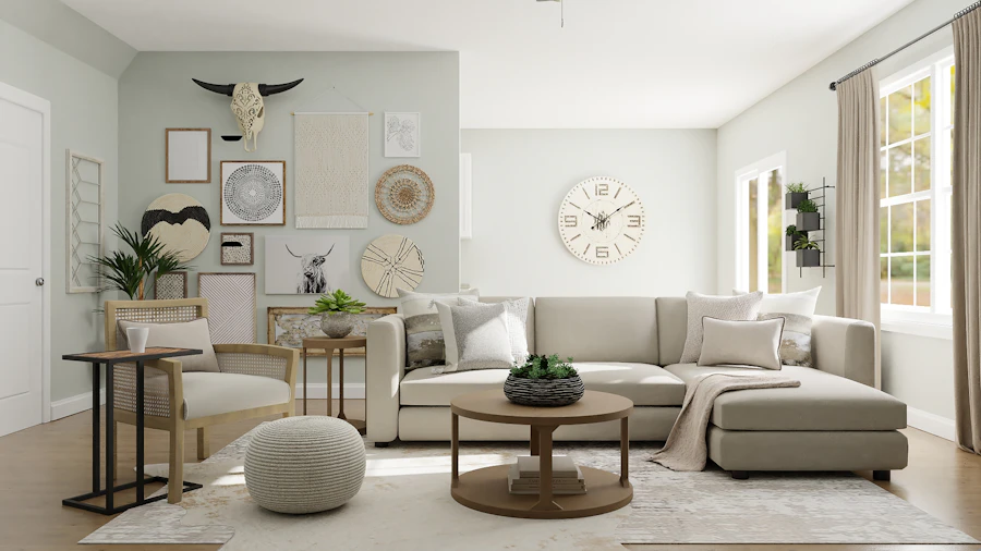
Sophisticated luxury living room with premium furniture and materials

What Materials Make a Home Look Expensive?

Material quality matters, but the combination and application often matter more than using the most expensive option everywhere.

MaterialLuxury applicationDesign principle
Natural stoneFeature walls, flooring, kitchen surfaces and selected architectural detailsUse selectively and consider scale and visual continuity.
Wood veneerWall panels, cabinetry, wardrobes, consoles and furnitureConsistent grain and tone can create a cohesive appearance.
GlassCabinet doors, partitions, display units and decorative detailsUse to add lightness and visual depth.
MetalHandles, trims, furniture details and lightingRepeat one or two finishes instead of mixing too many metals.
Premium fabricsSofas, curtains, headboards, cushions and accent furnitureTexture can provide richness without adding strong colours.
Refined laminates and finishesCabinetry, wardrobes, TV units and modular furnitureGood detailing, edges and hardware can significantly improve the final appearance.
Quiet Luxury

Why Expensive Homes Often Look Surprisingly Simple

A refined interior does not need every wall to be a feature wall. A quieter background can make premium furniture, artwork, stone, wood and lighting more noticeable.

01 · Fewer Strong Pieces Select furniture that contributes to the room instead of filling every corner.
02 · Cohesive Materials Repeat timber tones, hardware finishes and surfaces to connect different rooms.
03 · Hidden Clutter Integrated storage keeps everyday objects from dominating the visual environment.
04 · Personal Details Art, books, objects and furniture should reflect the people who live there.
Elegant contemporary home interior with custom furniture and lighting
Living Room

How Luxury Homes Decorate the Living Room

The living room often establishes the visual language for the rest of the home. Instead of combining many unrelated statement pieces, create one or two strong focal points.

  • A well-proportioned sofa arrangement.
  • A carefully designed TV or feature wall.
  • Statement or architectural lighting.
  • Custom console or storage furniture.
  • One strong artwork or decorative focal point.
  • Layered rugs, curtains and upholstery for texture.

See Living Room Interior Design for additional planning ideas.

Bedroom

Luxury Bedrooms Focus on Comfort and Calm

A premium bedroom usually feels more restrained than a formal living room. Soft materials, comfortable furniture, integrated wardrobes and carefully controlled lighting create a more private atmosphere.

  • Upholstered or custom-designed bed.
  • Coordinated bedside furniture.
  • Warm layered lighting.
  • Full-height wardrobes where appropriate.
  • Quality curtains and soft furnishings.
  • A restrained colour and material palette.
Luxury bedroom with upholstered bed and refined neutral palette
Kitchen & Dining

Luxury Kitchens Look Integrated, Not Overdecorated

High-end kitchens often combine refined cabinetry, efficient storage, premium surfaces and integrated appliances so that functionality becomes part of the design.
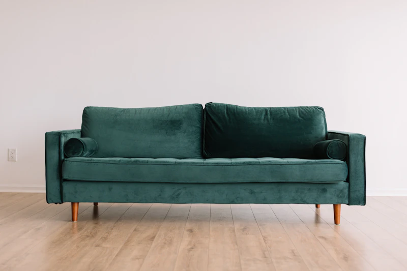
01

Integrated Appliances

Concealing selected appliances can create cleaner cabinetry lines and stronger visual continuity.

02

Premium Work Surfaces

Stone or engineered surfaces can provide durability and a strong visual element when selected to suit the overall palette.

03

Intelligent Storage

Internal organisers, drawers, tall units and dedicated storage can reduce visible clutter.

Lighting

Lighting Is One of the Biggest Luxury Design Details

One ceiling light rarely creates the layered atmosphere associated with a carefully designed premium home. Instead, use several lighting levels for different functions.

Ambient Lighting

Provides the general illumination required for everyday activities.

Task Lighting

Supports activities such as reading, cooking, dressing and working.

Accent Lighting

Highlights artwork, wall details, shelves, architectural features and selected decorative objects.

The aim is not simply to add more lights. The aim is to give each layer a purpose and allow the home to change character throughout the day.

Luxury Home Storage: The Detail People Often Notice Least

Good storage may be one of the least visible elements of an interior, but it has a major effect on how organised and refined the home feels.

Full-Height Wardrobes

Use vertical space efficiently and reduce the visual fragmentation caused by multiple small cabinets.

Integrated TV Units

Combine entertainment equipment, closed storage and display areas into a coordinated wall.

Entryway Storage

Conceal shoes, bags, keys and everyday objects near the entrance so they do not spread through the living areas.

Bedroom Storage

Custom wardrobes and dressing areas can be planned around the household’s actual clothing and storage requirements.

Utility Storage

Keep cleaning supplies, household equipment and less decorative items in dedicated areas.

Display Storage

Use open niches selectively for artwork, books and objects that genuinely contribute to the room.

How to Make a Home Look Luxurious Without Overspending

Luxury is not only about material price. Several lower-cost improvements can significantly improve the appearance of a home when they are coordinated well.

Improve Furniture Proportion

Correctly sized furniture can make a room look more intentional without requiring expensive pieces.

Upgrade Lighting

Layered lighting can change the atmosphere of an otherwise ordinary room.

Declutter Surfaces

Keep only useful or meaningful objects visible and provide storage for everyday items.

Use One Cohesive Palette

Repeating a small group of colours across walls, furniture and textiles can create visual continuity.

Choose Better Curtains

Properly proportioned curtains with suitable fabric can significantly influence the perceived quality of a room.

Select Fewer Decorative Pieces

A smaller number of well-positioned objects can have more impact than numerous unrelated accessories.

Personal Character

Luxury Homes Should Feel Personal

A genuinely sophisticated home should not look like a showroom. Artwork, books, photographs, collections, furniture and materials should reflect the people who live there.

Current Interior A to Z guidance for bespoke luxury homes places emphasis on individuality, proportion, craftsmanship, comfort and details that are specifically connected to the homeowner.

  • Display meaningful artwork.
  • Use furniture suited to your lifestyle.
  • Choose materials you enjoy living with.
  • Create storage around your actual belongings.
  • Use colours that complement your personal style.
  • Allow the architecture of the property to influence the design.

The Premium Home Formula

Good planning + quality materials + custom details + layered lighting + integrated storage + personal character

The result is a home that feels considered rather than simply expensive.

Delhi NCR

Luxury Home Interiors in Delhi, Gurgaon and Noida

Luxury residential design can be adapted to apartments, builder floors, villas, penthouses and independent houses. The architecture and lifestyle should determine the final design rather than forcing every property into the same template.

Delhi

Refined apartments, builder floors and independent residences can combine custom furniture, elegant materials, architectural lighting and practical storage.

Gurgaon

Larger apartments, villas and premium residences can accommodate more extensive customisation, integrated technology and larger furniture layouts.

Noida

Contemporary apartments can achieve a premium appearance through efficient planning, integrated storage, controlled materials and layered lighting.

Luxury Home Interior Inspiration

Use these references for material, furniture, lighting and composition inspiration rather than copying an entire room.

Frequently Asked Questions

How do rich people decorate their houses?

Sophisticated luxury homes often focus on thoughtful space planning, well-proportioned furniture, premium materials, custom joinery, layered lighting, integrated storage and carefully selected artwork and accessories.

What makes a house look luxurious?

Good proportions, cohesive materials, quality finishes, custom furniture, layered lighting, clean storage and restrained decoration can create a luxurious appearance without covering every surface with expensive products.

Do luxury homes use expensive furniture everywhere?

Not necessarily. A luxury interior can combine a few strong furniture pieces with practical custom cabinetry, quality finishes and carefully selected decorative elements.

What colors are common in luxury interiors?

Warm white, beige, taupe, greige, natural wood and restrained accent colours are commonly used as foundations for sophisticated interiors.

How can I make my home look luxurious on a normal budget?

Start with furniture proportion, decluttering, cohesive colours, improved lighting, tailored curtains, integrated storage and a small number of carefully selected furniture or decorative pieces.

What is quiet luxury in interior design?

Quiet luxury generally emphasises refined materials, comfortable furniture, craftsmanship, subtle colours, visual restraint and personalised details rather than excessive decoration or visible branding.

Interior A to Z

Design a Home That Feels Luxurious, Personal and Practical

Luxury interior design is strongest when space planning, materials, furniture, lighting, storage and personal style are developed as one complete concept.

Explore Luxury Home Interior Design
Interior A to Z

Luxury home interiors, residential interior design and turnkey interior solutions across Delhi NCR.

How do rich people decorate their houses? Read More »

Which colour is lucky for living room?

Which Colour Is Lucky for Living Room? 7 Vastu Colour Ideas
Vastu-Inspired Living Room Colour Ideas for Delhi NCR Homes
Vastu & Interior Design

Which Colour Is Lucky for Living Room?

Discover auspicious living room colours inspired by Vastu and learn how to create a balanced, welcoming and beautiful space with green, white, yellow and blue.

Which Colour Is Lucky for Living Room?

Green is widely considered an auspicious and lucky colour for a living room in Vastu-inspired interior design. It is associated with nature, growth, renewal, freshness and balance. Other colours such as white, light yellow and blue can also be incorporated depending on the desired mood, natural light, furniture and overall interior style.

Living Room Colour Guide

Choose a Colour That Feels Lucky and Looks Beautiful

A living room is one of the most important social spaces in a home. The right colour should complement your design style, natural lighting and furniture while creating the atmosphere you want your family and guests to experience.

Green living room interior with natural textures and elegant furniture
#1 Lucky Living Room Colour

Why Green Is Considered Lucky

Green is strongly connected with the natural world. In Vastu-oriented interiors, it is commonly associated with growth, renewal, freshness and harmony.

It is also a versatile interior colour. A soft sage green can create a calm contemporary room, while deeper greens can produce a richer and more dramatic look.

  • Connects the room visually with nature.
  • Works beautifully with natural wood.
  • Can create a fresh and relaxing atmosphere.
  • Works with modern, contemporary and classic interiors.
  • Can be used as a wall, furniture or accent colour.
Get Colour Guidance
Auspicious Colour Choices

4 Lucky Colours for Your Living Room

Green is a leading choice, while white, light yellow and blue can be used to create different visual and emotional qualities.

Green

Associated with nature, growth, renewal and balance. A strong choice for an inviting living room.

Growth & Harmony

White

Creates a clean, bright and spacious appearance. Use warm white for a softer luxury effect.

Purity & Light

Light Yellow

Adds warmth and optimism without overwhelming the living room when used in softer shades.

Warmth & Optimism

Blue

Light blue can introduce calmness, freshness and visual depth to a living room.

Calm & Balance
How to Use Lucky Colours

6 Ways to Bring Lucky Colours Into Your Living Room

You do not have to paint every wall. Strategic colour placement can produce a more sophisticated interior.

01

Accent Wall

Use green or another preferred auspicious shade on one feature wall while keeping the remaining walls neutral.

02

Sofa & Upholstery

Introduce green, blue or warm yellow through a sofa, occasional chair or upholstered accent piece.

03

Curtains

Curtains can introduce colour without making a permanent change to the architecture of the room.

04

Rugs

A patterned rug can combine several lucky shades and visually connect furniture and accessories.

05

Artwork & Accessories

Add colour through artwork, cushions, vases, books, lamps and carefully selected decorative objects.

06

Plants & Natural Materials

Real plants and natural wood can reinforce a green, nature-inspired living room concept.

Vastu-Inspired Planning

Match Colour With Your Living Room Layout

Vastu recommendations can vary depending on the home’s orientation, layout and other factors. Treat colour guidance as part of a broader interior planning approach.

N

North

Consider fresh, lighter tones and a visually open palette to maintain a bright atmosphere.

E

East

Fresh green and light natural tones can complement an east-facing living environment.

W

West

Balanced neutrals, warm whites and selected accent colours can create a comfortable setting.

S

South

Consider warmer balanced tones while keeping the overall palette comfortable and visually controlled.

Designer Colour Palettes

Best Lucky Colour Combinations for Living Rooms

Combining a dominant lucky colour with neutrals can create a more elegant and timeless result.

Green + Beige + White

A natural and sophisticated combination that works particularly well with wood and plants.

Green + Light Yellow + White

Adds freshness and warmth while keeping the living room bright and welcoming.

Green + Blue + Wood

A contemporary nature-inspired palette with depth, calmness and natural warmth.

Expert Interior Tips

How to Choose the Right Lucky Colour

Vastu is one consideration. Your room’s light, size, furniture and personal taste also matter.

TIP 01

Consider Natural Light

Test your selected colour in morning and evening light. Natural illumination can significantly change how a paint shade appears.

TIP 02

Avoid Overusing One Colour

A lucky colour does not need to cover every surface. Use neutral walls and introduce the main colour through furniture, artwork and accents.

TIP 03

Coordinate With Furniture

Green works especially well with natural wood, beige, cream, brass and warm neutral finishes.

TIP 04

Use Lighting Strategically

Warm cove lighting, floor lamps and accent lighting can enhance the appearance of green and other selected colours.

TIP 05

Sample Before Painting

Always test paint samples against your flooring, curtains, sofa and other large surfaces before making a final decision.

TIP 06

Balance Vastu With Design

A successful interior should satisfy your aesthetic, practical and lifestyle requirements as well as your preferred Vastu principles.

Delhi NCR Interior Design

Lucky Living Room Colours for Delhi, Gurgaon & Noida Homes

Interior A to Z can help homeowners create balanced living rooms that combine colour planning, furniture, lighting, storage and contemporary design.

Living Room Colour in Delhi

Green paired with warm neutrals can create a sophisticated living room suited to both traditional and contemporary Delhi homes.

Living Room Colour in Gurgaon

Gurgaon apartments can combine sage green, warm white, beige and natural wood for a modern luxury interior.

Living Room Colour in Noida

Lighter green, white and blue combinations can help create bright, comfortable interiors in Noida apartments and homes.

Frequently Asked Questions

Lucky Living Room Colour FAQs

Which colour is lucky for living room?

Green is widely considered an auspicious choice for a living room in Vastu-inspired interior design. It is associated with nature, growth, renewal and balance. White, light yellow and blue can also be incorporated depending on the home’s design.

Is green a lucky colour for the living room?

Yes. Green is commonly recommended in Vastu-oriented interiors because it is connected with nature, freshness, growth and harmony. It is also a versatile interior colour.

Which colour is best for a living room according to Vastu?

Green is a popular Vastu-inspired option. White, light yellow and blue can also work depending on the desired atmosphere, natural lighting and the home’s overall colour scheme.

Can I use green and white together in my living room?

Yes. Green and white create a fresh and balanced combination. Green can be used for an accent wall, sofa, curtains or accessories while white provides visual breathing space.

Which colour should I avoid in a living room?

There is no single colour that every home must avoid. Very dark or highly saturated colours can sometimes make a room feel visually heavy, particularly when natural light is limited. The overall proportion and combination are important.

How can I add lucky colours without repainting?

Add green, yellow, blue or other preferred colours through cushions, curtains, rugs, artwork, plants, lamps, accent chairs and decorative accessories.

Is green suitable for a modern luxury living room?

Yes. Sage, olive and deeper green shades can work beautifully with warm white, beige, natural wood, brass and contemporary furniture.

Interior A to Z

Ready to Choose the Right Colour for Your Living Room?

Create a living room that combines your preferred Vastu principles with practical planning, elegant colours, comfortable furniture and a cohesive interior design.

Which colour is lucky for living room? Read More »

Which position is best for bed in bedroom?

The mattress have to continually be at the southwest wall of the room. It have to now no longer face the door. The first-rate napping function for couples as in keeping with Vastu is to preserve the pinnacle toward the south, southeast, or southwest. It is strongly suggested now no longer to preserve the pinnacle toward the north at the same time as napping.

The best bed position in a bedroom depends on comfort, space planning, and in India, often Vastu Shastra principles. Here are the most accepted guidelines:

General Interior Design Guidelines

  • Place the headboard against a solid wall for support and stability.
  • Avoid putting the bed directly in front of a door—it disturbs privacy and comfort.
  • Leave space on both sides of the bed for balance and accessibility.
  • If possible, align the bed so natural light doesn’t shine directly onto your face in the morning.

Vastu Shastra Guidelines (commonly followed in India)

  • Best position: South or East wall with the headboard facing south or east.
  • Avoid placing the bed with the head facing north (believed to disturb sleep).
  • Beds should not be placed under exposed beams or directly facing mirrors.

Feng Shui Principles (similar approach)

  • Bed should be in the “command position”—facing the door but not directly in line with it.
  • A solid wall behind the headboard symbolizes stability.
  • Avoid placing the bed under windows for better security and restfulness.

✅ In short: The best position for a bed is with the headboard against a solid wall, facing south or east, not directly opposite the door, and with clear space on both sides for balance.

Which position is best for bed in bedroom? Read More »

What are 4 pieces of necessary furniture in a bedroom?

A bedroom should be both functional and comfortable, offering rest while also staying practical for daily living. While you can add plenty of extras, some pieces are essential for every bedroom. If you’re asking, “What are 4 pieces of necessary furniture in a bedroom?”, here are the must-haves that create a complete and balanced space.


1. Bed

The bed is the centerpiece of every bedroom.

  • It provides comfort and sets the tone for the room’s style.
  • Choose a size that suits the room—single, queen, or king.
  • An upholstered headboard or wooden frame adds elegance.
  • Quality mattresses are equally important for restful sleep.

2. Wardrobe or Closet

Storage is a key function of any bedroom.

  • A wardrobe keeps clothing organized and clutter-free.
  • Options range from modular wardrobes to built-in closets.
  • Sliding doors or mirrored finishes save space in smaller bedrooms, especially in Noida and Delhi NCR apartments.

3. Bedside Tables

Practical and stylish, bedside tables add balance.

  • Provide storage for essentials like lamps, books, or glasses.
  • Keep daily-use items within reach.
  • Symmetry is achieved by placing one on either side of the bed.

4. Dresser or Chest of Drawers

Additional storage makes the bedroom functional.

  • Perfect for keeping folded clothes, accessories, or personal items.
  • Can also serve as a surface for décor, mirrors, or lighting.
  • In compact bedrooms, a multifunctional dresser can double as a TV stand.

Extras That Enhance a Bedroom

  • Study desk or vanity unit for multifunctional spaces.
  • Accent chair or bench for comfort and style.
  • Soft furnishings like rugs, curtains, and cushions to complete the look.

Summary

The 4 necessary pieces of bedroom furniture are a bed, wardrobe, bedside tables, and a dresser. These essentials balance comfort, storage, and practicality, creating a bedroom that’s both stylish and functional.


Call to Action

Planning a bedroom setup in Delhi NCR, Gurgaon, or Noida? Start with these four must-have furniture pieces, and add extras only as space and lifestyle allow. For a polished look, consult an interior designer to create a bedroom that’s elegant, cozy, and tailored to your needs.

What are 4 pieces of necessary furniture in a bedroom? Read More »

What do you put next to a bed?

What Do You Put Next to a Bed? 11 Stylish & Practical Ideas | Interior A to Z
Bedroom Furniture Guide

What Do You Put Next to a Bed?

The space beside a bed can be practical as well as beautiful. A bedside table, floating nightstand, wall light, storage cabinet, small bench or carefully chosen decorative piece can make the bedroom more comfortable without creating clutter.

Quick answer

The most practical thing to put next to a bed is usually a bedside table or nightstand with enough space for a lamp, phone, book and everyday essentials. In smaller bedrooms, a floating shelf, wall-mounted unit or narrow cabinet can provide the same functionality while preserving floor space.

11 Things You Can Put Next to a Bed

The right bedside solution depends on room size, storage needs, lighting, circulation and the way the bedroom is used.

01

Bedside Table

The classic choice. A bedside table provides a convenient surface for lighting, books, charging and small personal items.

02

Floating Nightstand

A wall-mounted bedside unit keeps the floor visually open and can be useful in compact bedrooms.

03

Bedside Cabinet

Choose a cabinet when you need more concealed storage for books, medicines, personal items or other everyday essentials.

04

Chest of Drawers

A compact chest can combine bedside functionality with additional clothing or accessory storage when the room has sufficient width.

05

Wall-Mounted Shelf

A simple shelf or ledge provides a useful surface without occupying the floor area required by a conventional nightstand.

06

Table Lamp

A lamp adds practical bedside illumination and can become an important decorative element when the table surface allows it.

07

Wall Sconce

A wall-mounted reading light can free the bedside table from a lamp while keeping illumination close to the bed.

08

Small Accent Chair

Where space permits, a compact chair can create a reading or dressing corner beside the bed.

09

Small Plant

A modest plant can introduce natural texture and colour, provided it does not interfere with movement or bedside use.

10

Decorative Stool

A small stool can work as a flexible surface for a book, small lamp or decorative object and can be moved when needed.

11

Built-In Bedside Storage

Custom joinery can combine the bed, storage, charging points and lighting into one integrated bedroom composition.

12

Nothing at All

If circulation is tight, leaving one side open may be better than forcing furniture into a space where it cannot function comfortably.

Start With Function

The Best Thing Next to Your Bed Is the Thing You Will Actually Use

Bedroom furniture should be selected around real routines. If you read at night, prioritise a reading light. If you need charging beside the bed, plan a socket or charging point. If storage is limited, choose a bedside cabinet instead of an open table.

  • Reading → lamp or wall-mounted reading light.
  • Charging → accessible socket and cable management.
  • Storage → drawers or closed bedside cabinet.
  • Small room → floating shelf or compact nightstand.
  • Large room → wider bedside table or chest.
  • Decorative styling → lamp, artwork or small plant.

Interior A to Z’s current bedroom guidance recommends planning bedside storage and lighting as part of the overall bedroom layout rather than adding them after the furniture has been selected.

Elegant bedroom with bedside table and layered lighting

Bedside Table vs Floating Nightstand vs Cabinet

These three solutions cover many bedroom layouts. Choose based on storage, floor area and the look you want.

OptionBest forMain advantageConsideration
Bedside tableMost bedroomsFlexible, practical and easy to replaceUses floor space
Floating nightstandSmall bedroomsPreserves floor area and creates a lighter appearanceRequires suitable wall fixing
Bedside cabinetBedrooms needing storageConceals everyday itemsCan appear visually heavier
Chest of drawersLarger bedroomsCombines bedside access with additional storageRequires greater width and depth
Wall shelfVery compact roomsMinimal floor footprintLimited storage capacity
Small Bedroom

What Should You Put Next to a Bed in a Small Bedroom?

In a compact bedroom, the priority is useful functionality without sacrificing circulation. A large conventional bedside table may not always be the best answer.

Floating Shelf

Provides a small surface for essentials while keeping the floor open.

Wall Sconce

Frees the bedside surface from a table lamp and creates more usable space.

Narrow Nightstand

A slim table can provide storage without overwhelming a compact room.

Integrated Bedside Unit

Custom furniture can combine the headboard, storage, lighting and charging point into one compact solution.

Small Stool

A lightweight stool can work where only a small temporary surface is needed.

No Furniture

If the bed is close to a wall or circulation is restricted, leaving the area open may create a better overall layout.

Modern bedroom with bedside furniture and warm lighting
Bedside Lighting

What Lighting Should Go Next to a Bed?

Lighting beside the bed should support practical activities while contributing to the overall atmosphere of the bedroom.

  • Table lamp: ideal when you have a usable bedside surface.
  • Wall sconce: useful when floor and table space are limited.
  • Pendant: can create a stronger decorative feature.
  • Reading light: useful for people who read in bed.
  • Integrated LED: works well within custom headboard designs.

Layered bedroom lighting is a recurring recommendation in Interior A to Z’s current bedroom design guidance.

Bedside Styling

What Should You Put on a Bedside Table?

Keep the surface functional and edited. A bedside table does not need to become another storage area for the entire bedroom.

01 · Light Use a lamp or keep the surface clear if the room has a wall-mounted light.
02 · Essentials Keep the items you regularly use at night within easy reach.
03 · One Accent A small plant, artwork, vase or decorative object can add personality.
04 · Keep It Clear Avoid filling every centimetre with decorative objects and unused items.

Should Both Sides of the Bed Match?

Matching bedside tables are not essential, but visual balance is important. You can create symmetry through similar heights, colours, materials or lighting even when the furniture itself is different.

Matching Tables

A simple choice for a symmetrical master bedroom and an easy way to create a coordinated appearance.

Different Tables

Two different pieces can add personality when their scale, colour or material relationship is carefully controlled.

One Side Only

Useful in compact bedrooms, single beds or layouts where one side of the bed is against a wall.

Bedside Furniture by Bedroom Size

Scale the furniture to the room instead of using the same bedside solution everywhere.

BedroomGood bedside optionDesign priority
Very small bedroomFloating shelf or narrow wall-mounted unitPreserve circulation and floor area.
Small bedroomCompact nightstand or floating cabinetCombine surface space with storage.
Medium bedroomStandard bedside tablesBalance function, symmetry and proportion.
Large bedroomWide bedside cabinets or drawer unitsUse scale to complement a larger bed and headboard.
Luxury bedroomCustom integrated bedside furnitureCoordinate lighting, charging, storage and materials.
Avoid These Mistakes

Common Bedside Design Mistakes

01

Using Furniture That Is Too Large

Oversized bedside tables can make the bed area feel crowded and reduce comfortable circulation.

02

Ignoring Socket Placement

Plan charging and electrical points before installing fixed furniture or wall panels.

03

Too Many Decorative Objects

A bedside table should remain useful. Excess decoration quickly becomes visual clutter.

04

Wrong Table Height

A bedside surface should be convenient to reach from the mattress rather than being awkwardly low or high.

05

Blocking Wardrobe Access

Make sure bedside furniture does not interfere with wardrobe doors, drawers or dressing areas.

06

Forgetting Lighting

Decide whether you need a table lamp, wall sconce, pendant or integrated lighting before finalising the bedside furniture.

Delhi NCR

Bedside Furniture Ideas for Delhi, Gurgaon and Noida Homes

Bedroom sizes vary considerably across apartments, builder floors, villas and independent homes. The bedside solution should follow the actual room layout.

Delhi

Compact bedrooms can benefit from narrow bedside tables, floating units, wall sconces and integrated storage.

Gurgaon

Larger bedrooms can accommodate wider bedside furniture, custom cabinetry, upholstered bed walls and layered lighting.

Noida

Apartment bedrooms can combine compact storage, floating furniture and integrated lighting to preserve usable floor area.

Bedside Design Inspiration

Use these references for furniture proportion, lighting and material ideas.

Frequently Asked Questions

What do you put next to a bed?

A bedside table or nightstand is the most common choice. Depending on the room, you can also use a floating shelf, wall-mounted nightstand, bedside cabinet, chest of drawers, bench, chair or compact storage unit.

Should you have two bedside tables?

Two bedside tables can provide symmetry and convenient storage on both sides of a double bed, but one unit can be more practical when space or layout is limited.

What should I put on a bedside table?

A lamp, book, phone charger, small tray and a limited number of decorative objects are practical choices. Keep the surface edited so it remains useful.

What can I put next to a bed instead of a nightstand?

Consider a floating shelf, wall-mounted ledge, narrow cabinet, compact chest, stool, small round table or integrated bedside storage.

What is best next to a bed in a small bedroom?

A floating nightstand, narrow bedside table, wall-mounted shelf or compact cabinet can provide useful functionality without taking too much floor space.

Should bedside tables match the bed?

They do not need to match exactly. Similar proportions, materials, colours or lighting can create a coordinated appearance without making the room look overly uniform.

Interior A to Z

Plan the Bedside Area as Part of the Whole Bedroom

The best bedside design combines furniture, storage, lighting, electrical points and circulation from the beginning. A small detail beside the bed can make the entire bedroom more functional and refined.

Explore Interior Design Services
Interior A to Z

Bedroom interior design, home interiors and turnkey interior solutions across Delhi NCR.

What do you put next to a bed? Read More »

Which type of curtains are best for bedroom?

Which Type of Curtains Are Best for Bedroom? | Interior A to Z
Bedroom Interior Design

Which Type of Curtains Are Best for Bedroom?

The best bedroom curtains should balance privacy, light control, comfort and the overall interior style. For many bedrooms, a blackout curtain or a layered combination of sheer and blackout curtains offers the most practical balance.

Quick answer Choose blackout curtains when darkness and privacy are priorities. Choose sheer curtains when you want soft daylight and an airy appearance. For the most flexible bedroom setup, combine a sheer inner layer with a heavier blackout or lined outer curtain.
Choose by function

6 Curtain Types for a Bedroom

Curtain fabric, lining and layering matter as much as colour. Start with what the bedroom needs from its windows, then select a style that works with the bed, wardrobe, walls and lighting.

Best for darkness

1. Blackout Curtains

Blackout curtains are designed to provide strong light control and privacy. They are particularly useful for bedrooms exposed to bright morning sunlight, street lighting or nearby buildings.

Best with: modern, contemporary and hotel-inspired bedrooms.

Best for daylight

2. Sheer Curtains

Sheer curtains filter daylight and create a softer window treatment. They work particularly well when the bedroom should remain bright during the day.

Best with: light, minimalist and Scandinavian-inspired interiors.

Best overall flexibility

3. Layered Curtains

Pair a sheer curtain with a heavier outer curtain. The sheer layer can remain closed during the day while the outer layer provides greater darkness and privacy when required.

Best with: master bedrooms and premium interiors.

Best for natural texture

4. Linen & Linen-Blend Curtains

Linen and linen-blend fabrics add texture and a relaxed natural character. They are especially effective in neutral bedrooms with wood, upholstered furniture and soft lighting.

Best with: warm minimal, contemporary and organic interiors.

Best for everyday practicality

5. Cotton Curtains

Cotton curtains offer a familiar, versatile appearance and are available in many weights, colours and patterns. Lining can be considered when additional privacy or light control is needed.

Best with: family bedrooms, guest rooms and relaxed interiors.

Best for premium ambience

6. Heavy Drapes

Heavier drapes can create a richer and more cocooning bedroom atmosphere. They can also work with blackout or thermal linings when stronger light and temperature control is required.

Best with: luxury, classic and dramatic bedroom schemes.

Comparison

Which Bedroom Curtain Should You Choose?

Curtain typeLight controlPrivacyBest design character
BlackoutVery highHighModern, hotel-inspired
SheerLow to mediumLow to mediumAiry, light and elegant
Sheer + blackoutHigh and adjustableHighPremium and versatile
Linen / linen blendMedium, depending on weightMedium, depending on weaveNatural and relaxed
CottonLow to high, depending on weight/liningMedium to highClassic and comfortable
Heavy drapesHighHighRich and luxurious
Most versatile solution

Why Layered Curtains Work So Well in Bedrooms

A bedroom needs different levels of light throughout the day. A single curtain may not provide the same flexibility as two layers.

  • Sheer layer for filtered daylight
  • Outer curtain for stronger privacy
  • Blackout lining when darkness is important
  • More visual depth around the window
  • Easy adjustment from morning to night
Elegant bedroom with layered curtains and soft neutral interior
Design details

How to Choose Bedroom Curtains Correctly

01

Start With Natural Light

A bright bedroom may benefit from light-filtering curtains, while a room receiving strong direct sunlight may need a lined or blackout layer.

02

Consider Privacy

Bedrooms facing streets, neighbouring buildings or common areas generally need stronger privacy than bedrooms facing a private garden or open view.

03

Match the Room Palette

Soft beige, ivory, warm white, taupe, muted grey and gentle earthy colours can integrate easily with many bedroom schemes.

04

Choose the Right Fabric Weight

Lightweight fabrics create a relaxed appearance. Heavier fabrics create more visual weight and can support stronger light control.

05

Think About Maintenance

Select fabrics according to dust, ventilation, washing requirements and how frequently the curtains will be opened and closed.

06

Plan the Installation

Rods, tracks, ceiling-mounted systems and curtain fullness should be planned with the window, ceiling height, wardrobe and furniture positions.

Room proportions

Best Curtains for Different Bedroom Situations

Bedroom situationRecommended approachWhy it works
Small bedroomLight-coloured sheer or layered curtainsKeeps the window treatment visually light while allowing flexible light control.
Very bright bedroomBlackout or lined outer curtainsProvides stronger control over daylight.
Street-facing bedroomSheer + opaque/blackout combinationBalances daytime daylight with evening privacy.
Luxury master bedroomFull-height layered draperyCreates a more architectural and finished appearance.
Minimalist bedroomPlain linen, cotton or simple blackout panelsSupports a clean, uncluttered visual scheme.
Warm natural bedroomLinen, cotton and earthy neutralsWorks naturally with wood, woven textures and soft lighting.
Neutral bedroom with floor length curtains and upholstered bed
Curtain height

Should Bedroom Curtains Be Full Length?

Floor-length curtains are often the most visually polished option for bedrooms, particularly when the window treatment is being designed as part of the overall room.

Installing the track or rod higher and allowing the fabric to fall vertically can emphasize the height of the room. The exact installation should still account for the ceiling, window frame, wardrobe doors, furniture and floor clearance.

For compact bedrooms, avoid excessive fabric pooling that can make the window area feel unnecessarily heavy.

Bedroom palette

What Colour Curtains Work Best in a Bedroom?

Curtain colour should support the bedroom rather than compete with the bed, headboard, walls and flooring. The best colour depends on the amount of daylight and the overall palette.

Warm White & Ivory

Useful for soft, bright and understated bedrooms. They work especially well with warm wood and neutral walls.

Beige & Taupe

A versatile choice for warm contemporary and luxury bedrooms where a little more visual depth is desirable.

Soft Grey

Works with modern palettes and can complement white, charcoal, wood and muted accent colours.

Sage & Muted Green

Useful when the bedroom includes natural textures, wood finishes or a subtle biophilic direction.

Dusty Blue

A calm accent option that can work particularly well with warm white, cream and natural wood.

Deep Neutrals

Charcoal, taupe and deeper brown tones can create a more intimate look, particularly in larger bedrooms.

Bedroom styling

Common Curtain Mistakes to Avoid

Choosing Only by Colour

A beautiful colour cannot compensate for poor privacy or inadequate light control.

Using Only Sheers

Sheers are excellent for daylight but may not provide enough privacy or darkness for every bedroom.

Ignoring Curtain Length

Incorrect length can make a carefully designed bedroom look unfinished.

Blocking the Window

Oversized furniture or poorly planned curtains can reduce useful daylight and make circulation difficult.

Too Many Patterns

Strong curtain patterns can compete with an already detailed bed wall, wallpaper or bedding.

Forgetting the Hardware

The curtain track or rod is part of the design and should be planned around the ceiling and overall bedroom style.

Visual inspiration

Bedroom Curtain Ideas

Delhi NCR homes

Bedroom Curtains for Delhi, Gurgaon & Noida Homes

Bedroom window treatments should respond to the actual room rather than follow one fixed formula. Apartment bedrooms, builder floors, villas and larger master bedrooms can require different combinations of privacy, daylight control, fabric weight and styling.

Delhi Bedrooms

Consider privacy, strong daylight and practical fabric maintenance when selecting bedroom curtains.

Gurgaon Bedrooms

Layered curtains can work particularly well in modern apartments and larger master bedrooms where flexibility is important.

Noida Bedrooms

For compact apartments, light colours, simple panels and carefully planned curtain installation can keep the room visually open.

Related guides

Explore More Bedroom Interior Design Ideas

Bedroom Design Services

Explore bedroom design solutions covering storage, lighting, curtains, furniture and finishes.

FAQ

Bedroom Curtain Questions

Which type of curtains are best for a bedroom?

Blackout curtains or layered curtains with a sheer inner layer are practical choices for many bedrooms because they combine privacy and light control.

Are blackout curtains good for bedrooms?

Yes. They are useful when strong control over outside light and privacy is important, particularly in bedrooms with bright windows.

Are sheer curtains suitable for bedrooms?

Yes. Sheers can filter daylight and create a soft, airy appearance. They can be paired with an opaque or blackout outer curtain when greater privacy or darkness is required.

Is linen good for bedroom curtains?

Linen and linen-blend curtains can work well where a natural, relaxed appearance is preferred. Add lining when additional privacy or light control is needed.

Should bedroom curtains touch the floor?

Floor-length curtains often create a polished appearance and can emphasize ceiling height. The final length should be planned around the window, floor and installation method.

What curtains are best for a small bedroom?

Light-coloured, simple curtains can help keep a small bedroom visually calm. A sheer and blackout combination provides flexibility without requiring a complicated design.

Plan a Bedroom That Feels Comfortable and Complete

Curtains are only one part of a successful bedroom. Bed placement, wardrobes, lighting, storage, colours, furniture proportions and window treatments should work together as one design.

Explore Interior Design Services
© 2026 Interior A to Z · Bedroom Interior Design · Delhi NCR

Which type of curtains are best for bedroom? Read More »

Scroll to Top