A keen visual sense is essential for interior designers. Understanding how colors influence mood, perception, and spatial experience can determine whether a space feels inviting, balanced, or uncomfortable. Effective use of color transforms interiors from ordinary to harmonious and emotionally engaging.
Why Color Knowledge Matters


Color affects how people feel and interact with a space.
Color influences:
- Mood and emotional response
- Perception of room size and brightness
- Comfort and relaxation levels
- Overall visual harmony
Poor color choices can make even well-designed spaces feel unbalanced.
Understanding Color Psychology
Different colors evoke different emotional responses.
Common effects:
- Blue: Calm, peaceful, and relaxing
- Green: Fresh, balanced, and soothing
- Yellow: Energetic and uplifting
- Red: Bold, stimulating, and dramatic
- Neutral tones: Elegant and timeless
Designers use color psychology to match spaces with their intended function.
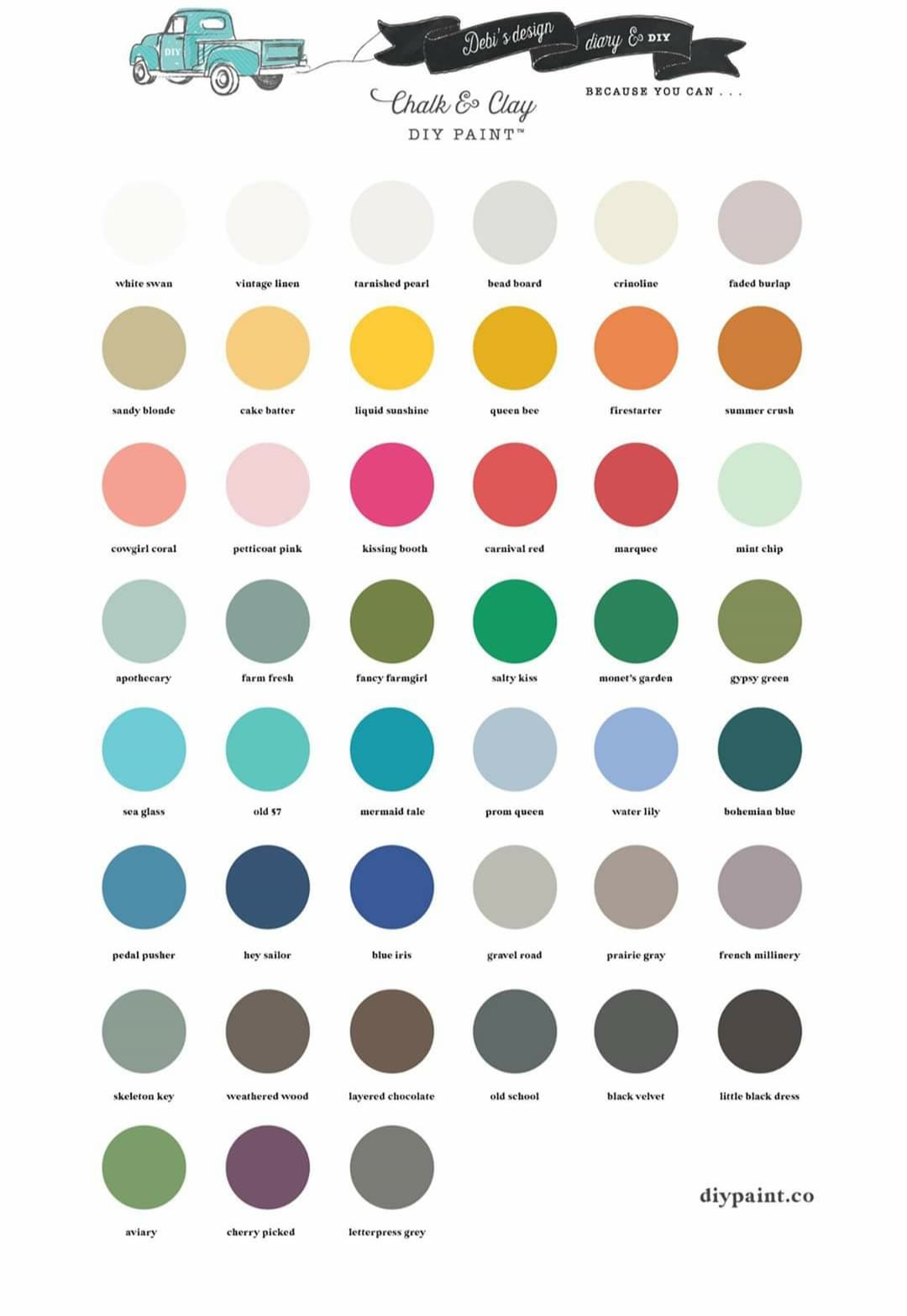
Basics of Color Theory
Color theory helps designers create balanced and harmonious interiors.
Key concepts include:
Primary colors: Red, blue, yellow
Secondary colors: Green, orange, purple
Tertiary colors: Blends of primary and secondary hues
Understanding these relationships allows for effective color combinations.
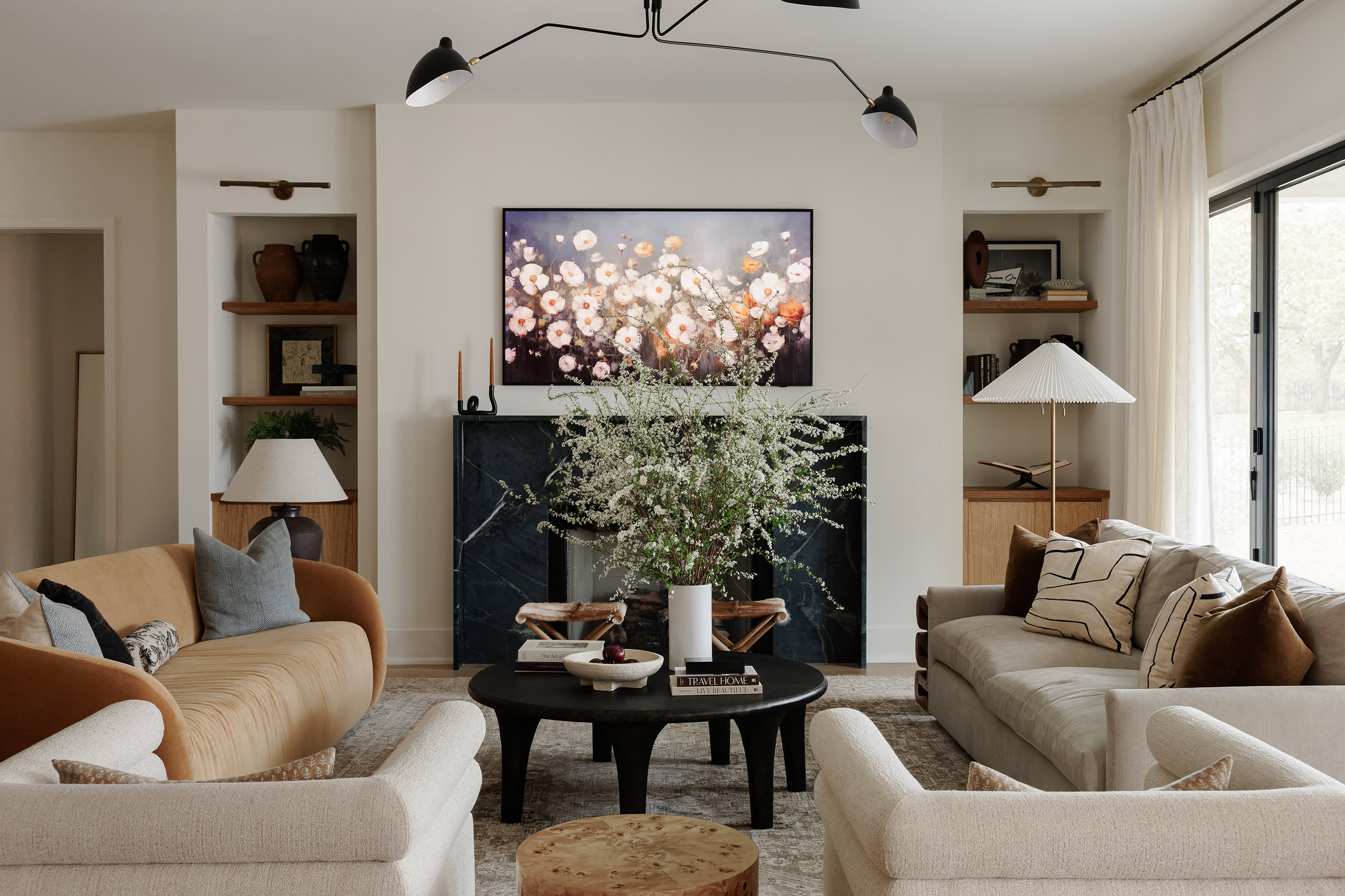
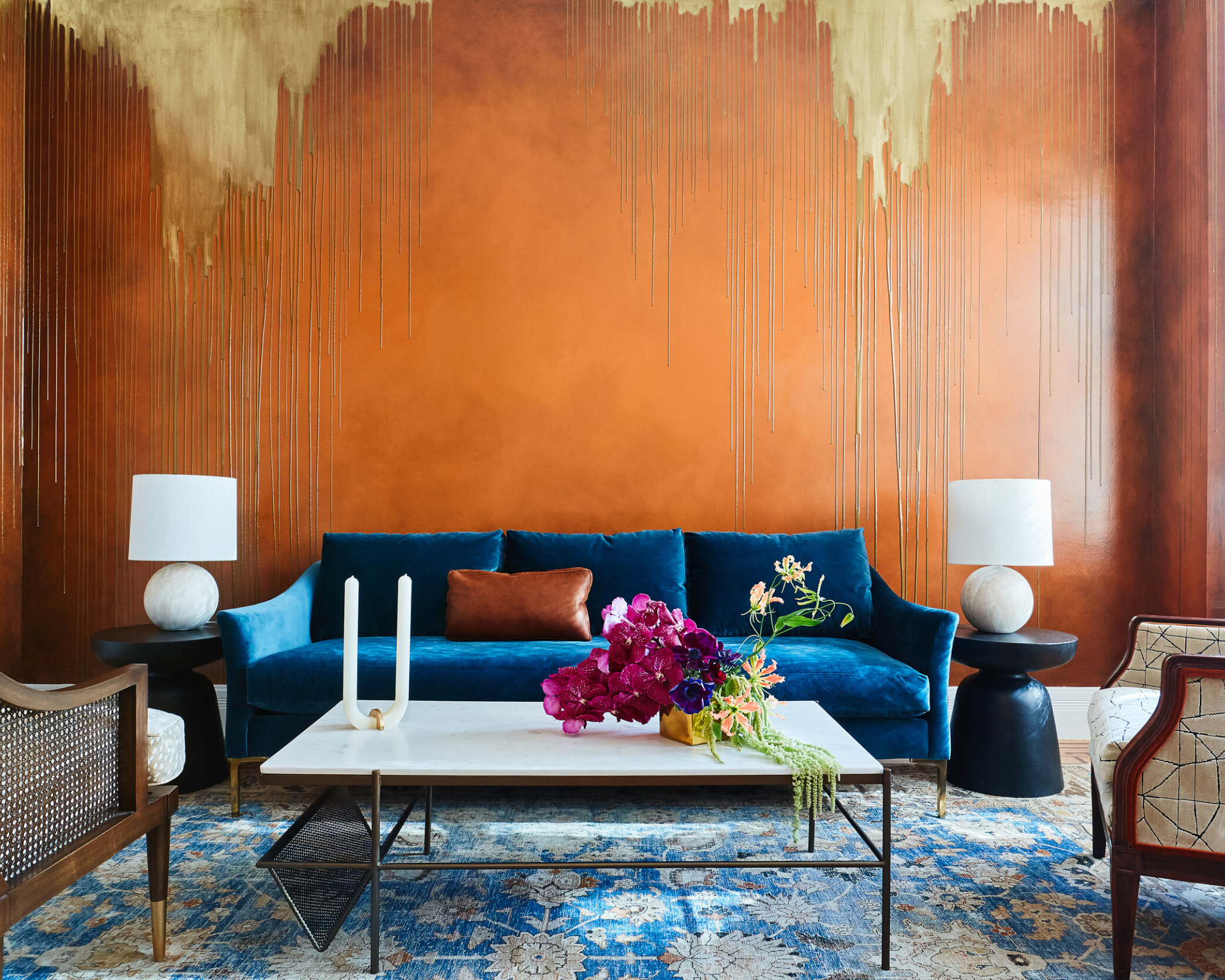
Popular Color Schemes in Interior Design


Monochromatic
Uses variations of a single color for a clean, cohesive look.
Complementary
Combines opposite colors (e.g., blue and orange) for visual contrast.
Analogous
Uses neighboring colors on the color wheel for harmony.
Neutral with Accents
Neutral base with bold accents for balance and sophistication.
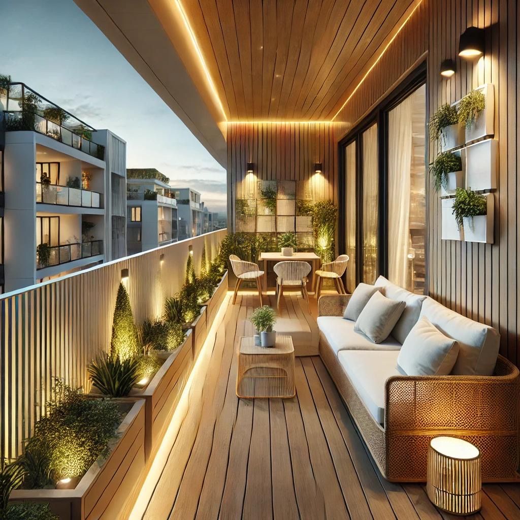
How Color Affects Space Perception
Strategic color use can visually alter room dimensions.
✔ Light colors make spaces feel larger and brighter
✔ Dark colors create coziness and intimacy
✔ Vertical color patterns add height perception
✔ Horizontal accents can make rooms feel wider
Designers use these techniques to enhance spatial perception.
Tips for Choosing Harmonious Colors
✔ Start with a neutral base for flexibility
✔ Use accent colors to add personality
✔ Test paint samples in natural and artificial light
✔ Maintain consistency across connected spaces
✔ Balance warm and cool tones
Thoughtful selection ensures visual balance.
Common Color Mistakes to Avoid
- Using too many bold colors in one space
- Ignoring lighting conditions
- Following trends without considering longevity
- Choosing paint before furniture and finishes
- Lack of contrast leading to flat interiors
Color decisions should support both style and functionality.
Summary
A strong understanding of color theory and psychology is crucial for interior designers. Colors influence mood, spatial perception, and overall harmony within a space. By exploring color relationships, using balanced schemes, and considering lighting and function, designers can create interiors that are both visually appealing and emotionally comfortable.
Effective color choices can elevate a design, while poor selections can undermine an otherwise well-planned space.