Introduction:
Color is a language that speaks volumes in the realm of interior design, and mastering the art of balancing contrasting colors can elevate your space to new heights. While it may seem challenging, juxtaposing colors that are seemingly opposite on the spectrum can create a dynamic and visually striking palette. Join us as we delve into the world of contrasting colors and explore the keys to achieving harmony in your home.
Understanding Color Wheel Dynamics:
At the heart of mastering contrasting colors lies an understanding of the color wheel. The color wheel is a valuable tool that categorizes colors based on their relationships. Contrasting colors, often found opposite each other on the wheel, create a dynamic and visually stimulating effect. Popular contrasting pairs include blue and orange, red and green, and yellow and purple.
The Power of Complementary Colors:
Complementary colors, those found directly opposite each other on the color wheel, bring out the best in each other. When used in balance, they create a vibrant and harmonious palette. Experimenting with these bold pairings can infuse energy and drama into your space. Consider incorporating complementary colors in accents, artwork, or even feature walls.
Balancing Intensity:
Contrasting colors can have different intensities, and finding the right balance is key to a harmonious palette. Pairing a saturated color with a muted or pastel counterpart can create visual interest without overwhelming the senses. This interplay of intensity ensures that both colors shine without competing for attention.
Creating a Focal Point:
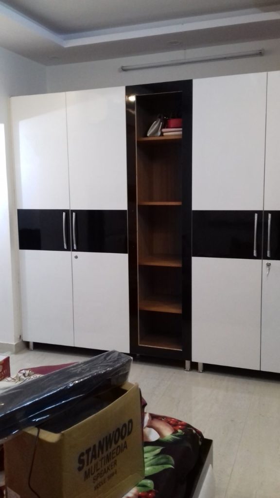
Contrasting colors are excellent tools for creating focal points within a room. Whether it’s a bold accent wall, a statement piece of furniture, or vibrant accessories, the strategic use of contrasting colors draws the eye and anchors the visual composition. This technique adds depth and dimension to your space, guiding the viewer’s gaze to specific areas.
Embracing Analogous Colors:
While contrasting colors are often found opposite each other on the wheel, analogous colors, which are adjacent to each other, can also create a harmonious blend. For a subtler approach, consider using colors from the same segment of the wheel. This creates a cohesive and serene palette while still allowing for visual interest.
Neutralizing with Neutrals:
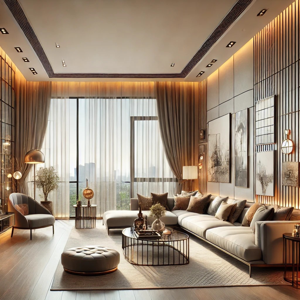
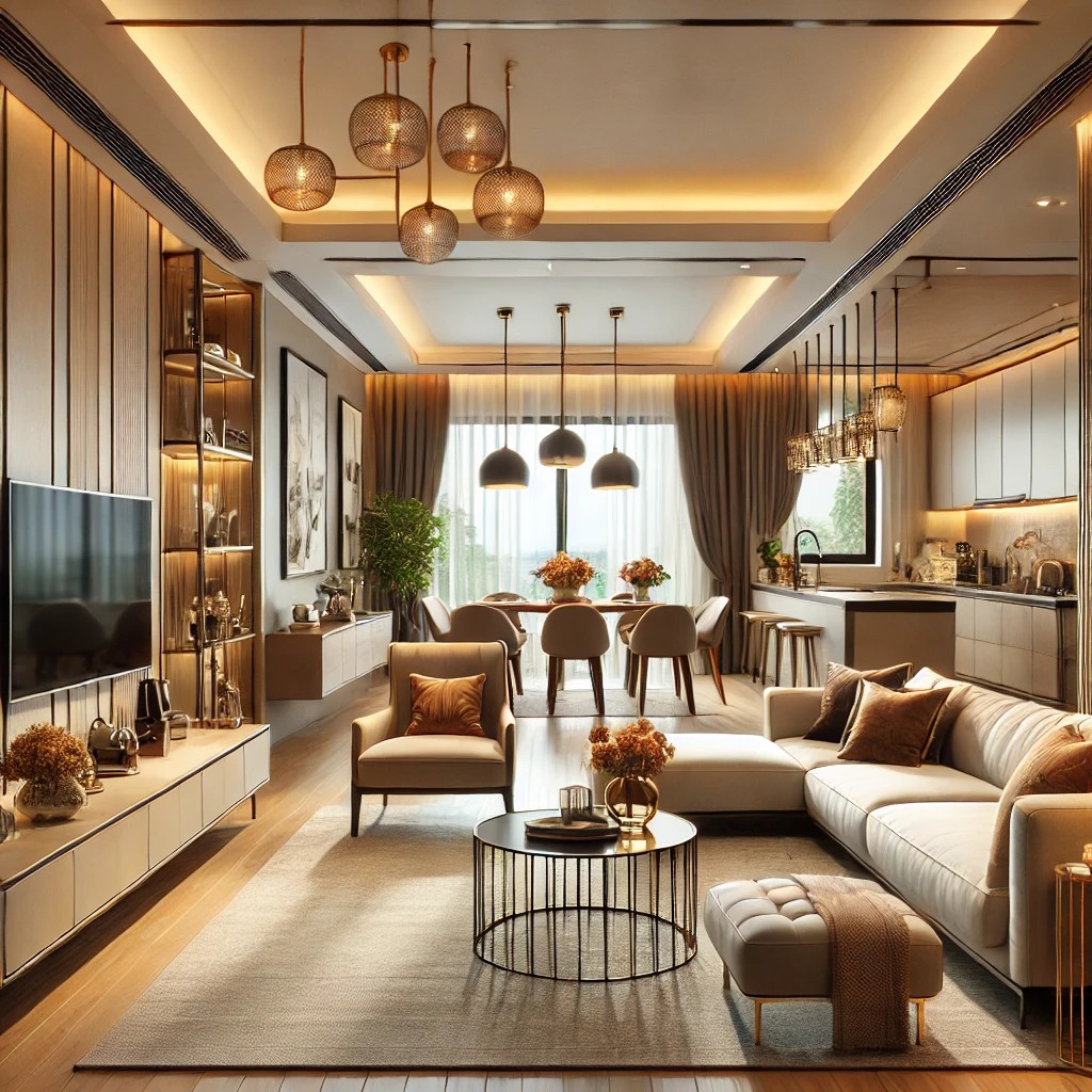
Contrasting colors can be intense, and incorporating neutrals into your palette serves as a grounding element. Neutrals, such as whites, grays, or earthy tones, provide a calming influence and prevent the space from feeling too overwhelming. Use neutrals strategically to balance out the vibrancy of contrasting hues.
Experimenting with Accents:
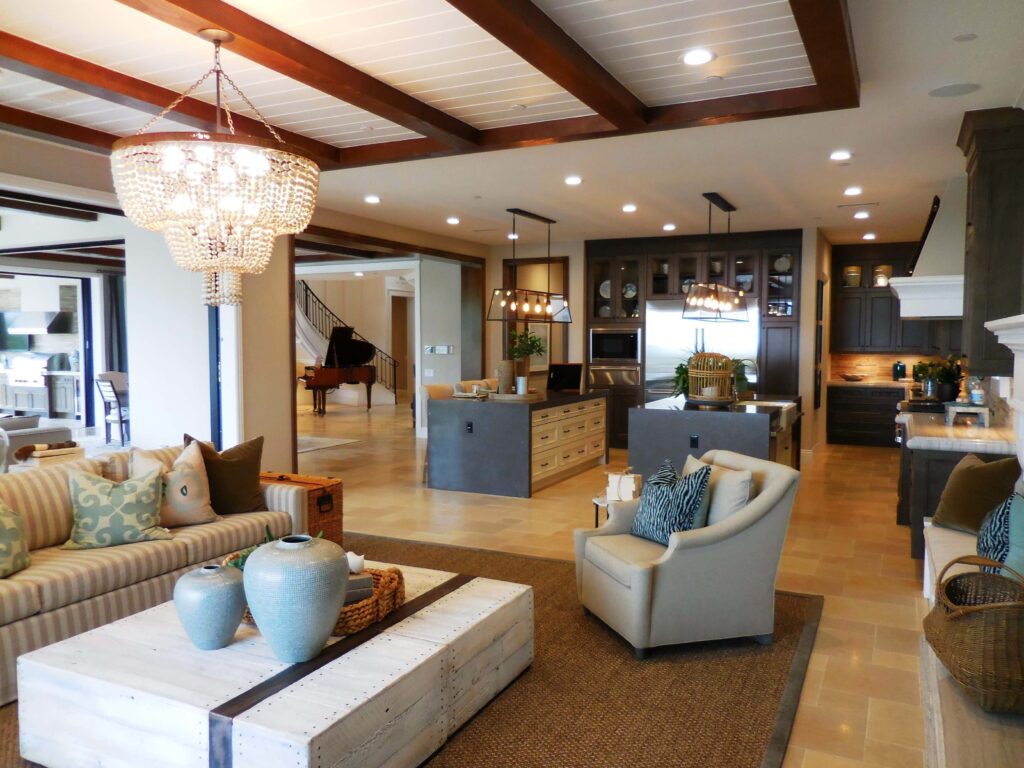
If the idea of an entire room in contrasting colors feels too bold, start small with accents. Introduce contrasting colors through decor items like throw pillows, rugs, or artwork. This allows for experimentation without committing to a full-scale color transformation, providing the flexibility to evolve your palette over time.
Conclusion:
Mastering the art of balancing contrasting colors is a journey of creativity and expression. By understanding the dynamics of the color wheel, embracing complementary pairings, and considering factors like intensity and neutrals, you can create a harmonious and visually captivating palette for your home. So, let your imagination run wild, experiment with contrasting colors, and watch as your space transforms into a work of art that reflects your unique style.