Color Scheme Selection for Interiors That Feel Balanced & Beautiful
The right color scheme can make a home feel larger, calmer, warmer, more luxurious or more energetic. Learn how to select wall colours, furniture tones and accent shades that work together across homes in Delhi, Gurgaon, Noida and Delhi NCR.
 Start With the Mood, Then Build the Palette
Walls • Furniture • Flooring • Lighting • Textures • Accent Colours
Start With the Mood, Then Build the Palette
Walls • Furniture • Flooring • Lighting • Textures • Accent Colours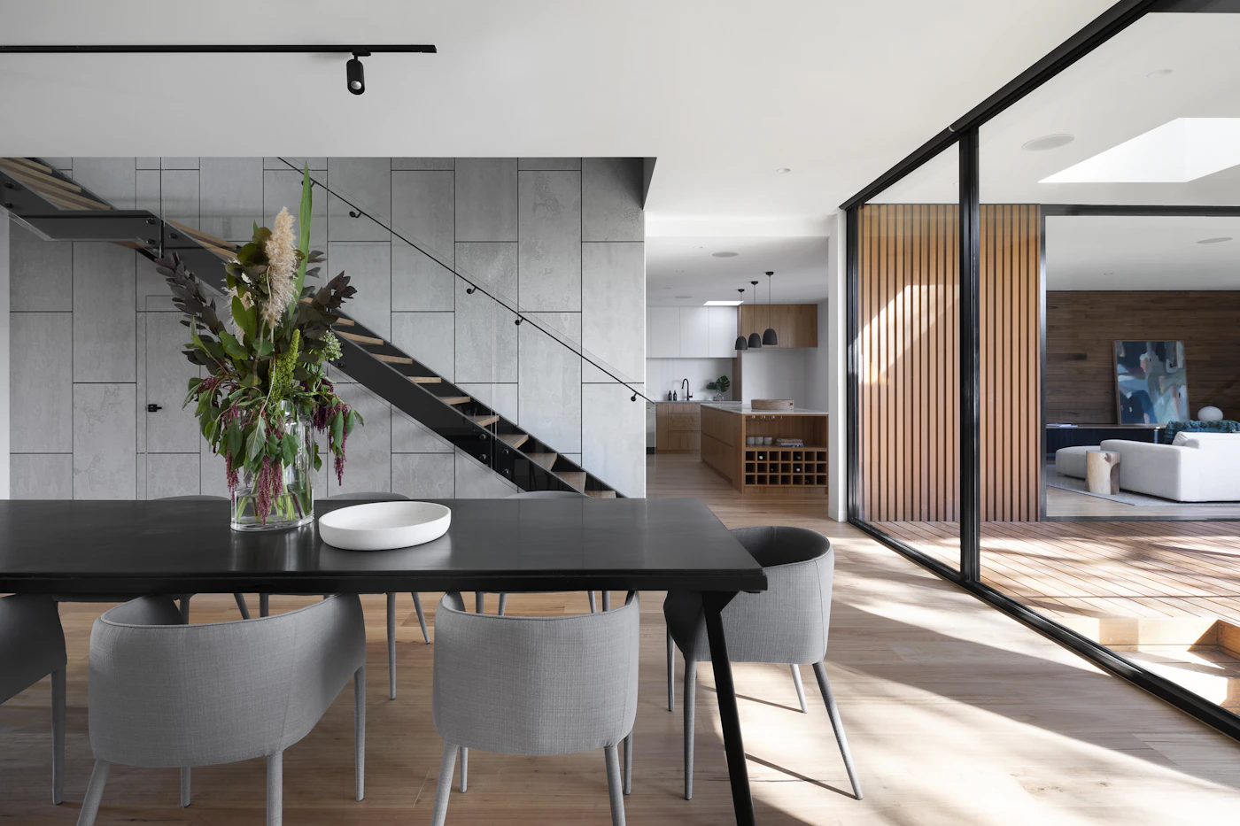
Why Color Scheme Selection Matters in Interior Design
Colour is one of the most powerful design decisions in an interior. It influences how a room feels, how large it appears and how furniture, flooring, lighting and décor relate to one another.
A well-planned palette can connect separate rooms into one cohesive home. A poorly coordinated palette can make even expensive furniture and finishes feel disconnected.
For homes in Delhi NCR, the selection should also respond to natural daylight, room orientation, apartment size, existing finishes and the way artificial lighting changes colour after sunset.
8 Things to Consider Before Selecting Interior Colors
A paint card can look completely different once it is surrounded by furniture, flooring, daylight and warm artificial lighting.
Natural Light
Observe how much daylight enters the room and whether it feels warm or cool at different times of day.
Room Size
Smaller spaces often benefit from lighter, reflective palettes, while deeper colours can add intimacy to larger rooms.
Ceiling Height
Ceiling and wall colour relationships can visually influence the perceived height and proportions of a room.
Furniture
Existing sofas, beds, cabinetry and wood tones should be considered before committing to a new wall palette.
Flooring
Marble, wood, tiles and rugs introduce undertones that can influence whether a wall colour feels warm, cool or balanced.
Room Function
Bedrooms, living rooms, studies, kitchens and dining spaces can require different emotional and visual qualities.
Lighting Temperature
Warm and cool artificial lighting can change the appearance of paint, fabrics, wood and decorative surfaces.
Long-Term Flexibility
Neutral foundations make it easier to refresh a home with cushions, artwork, curtains and accessories later.
Personal Preference
Trends are useful for inspiration, but the final palette should reflect how the occupants want the home to feel.
8 Interior Color Schemes That Work Across Modern Homes
These combinations provide starting points. The exact shade should always be tested against the room’s actual lighting and materials.
Soft Neutrals
Ivory, beige, taupe and warm grey create a calm and timeless base.
Warm Earth Tones
Terracotta, clay, warm brown and muted mustard add depth and warmth.
Blue & Grey
Soft blue, dove grey and slate can create a peaceful contemporary atmosphere.
Nature-Inspired Green
Sage, eucalyptus, moss and muted olive connect interiors with natural textures.
Soft Pastels
Blush, lavender, powder blue and muted yellow keep interiors light and fresh.
Modern Monochrome
White, graphite and charcoal deliver a clean, architectural appearance.
Jewel Tones
Emerald, sapphire, burgundy and restrained gold accents create richness.
Warm Contemporary
Warm white, camel, muted brown and terracotta create comfortable modern interiors.
A Simple Formula for Creating a Balanced Palette
The 60-30-10 approach is a useful starting framework for distributing colour. It does not need to be followed mechanically.
60% — Dominant Colour
Usually the largest visual area, such as walls, large cabinetry, major upholstery or other architectural surfaces.
- Warm white
- Beige
- Soft grey
- Taupe
- Muted earth tones
30% — Secondary Colour
Introduce the second major tone through furniture, curtains, flooring, cabinetry, rugs or feature surfaces.
- Wood tones
- Muted green
- Blue-grey
- Warm brown
- Soft contrasting neutrals
10% — Accent Colour
Use the accent selectively to create visual focus and personality without allowing it to dominate the room.
- Artwork
- Cushions
- Accent chairs
- Decorative objects
- Feature lighting
Balance Beats Rules
Some interiors may need more than one secondary shade or a stronger accent. The objective is visual balance, not mathematical precision.
- Check colour undertones
- Consider material textures
- Observe the room in daylight
- Test artificial lighting
- Keep transitions between rooms intentional
Choosing Colors for Different Rooms
A successful home does not need every room to use the same colour. Instead, related palettes can create continuity while allowing each space to have its own character.
Living Room
The living room often works best as the visual anchor of the home. Choose a flexible base and introduce personality through furniture, art and accent surfaces.
- Warm white and beige for a calm foundation
- Earthy accents for warmth
- Deep green or blue for a feature wall
- Layered textures to prevent a flat appearance
Bedroom
Bedrooms generally benefit from colours that feel restful and comfortable rather than visually aggressive.
- Soft beige and taupe
- Muted blue and grey
- Sage and eucalyptus
- Warm neutral headboard walls
Kitchen
Kitchen colour selection should coordinate with cabinets, countertops, backsplash, appliances and flooring.
- White and warm wood
- Greige and natural stone
- Muted green cabinetry
- Monochrome modern palettes
Dining Area
Dining spaces can carry slightly warmer and richer colours to make the area feel intimate and inviting.
- Terracotta and warm beige
- Olive and cream
- Deep blue with natural wood
- Warm pendant lighting for evening ambience
Study & Home Office
A controlled palette can help create a visually focused work environment without feeling sterile.
- Soft grey
- Muted blue
- Sage green
- Wood and neutral combinations
Kids’ Rooms
Instead of relying exclusively on strong colours, combine a calm base with playful accents that can be changed as the child grows.
- Soft pastels
- Warm white foundations
- Colourful artwork
- Changeable textiles and accessories
How to Match Wall Colors With Furniture
Furniture and wall colours should coordinate through undertones, contrast and proportion rather than being exact matches.
Neutral Walls + Bold Furniture
Beige, warm white or soft grey walls create a flexible background for navy, green, rust, charcoal or other statement furniture.
Tone-on-Tone Interiors
Use different strengths of one colour family across walls, upholstery, rugs and décor for a sophisticated layered appearance.
Warm Wood + Soft Neutrals
Natural wood works especially well with cream, beige, greige and muted earthy shades.
Dark Walls + Light Furniture
A carefully chosen dark wall can create depth while lighter furniture prevents the overall composition from becoming visually heavy.
Cool Colors + Warm Materials
Blue or grey walls can be softened with warm wood, brass, natural fabrics and warm lighting.
Accent Wall Strategy
Use a stronger colour behind a bed, TV unit, console or artwork to establish a focal point without overwhelming the whole room.
Color Selection Mistakes That Can Weaken an Interior
Choosing From a Tiny Swatch Alone
A small sample cannot always show how a colour behaves across a large wall under changing light.
Ignoring Undertones
Two colours may both look beige in isolation but have very different pink, yellow, grey or green undertones.
Using Too Many Accent Colors
Too many competing accents can make an interior feel fragmented. Select a controlled hierarchy instead.
Ignoring Existing Flooring
Flooring often occupies a significant visual area and should be included in the palette from the beginning.
Matching Everything Exactly
Perfect matching can create a flat appearance. Coordinated contrast usually creates more depth and sophistication.
Following Trends Blindly
A trending colour may not suit your home’s lighting, furniture, architecture or long-term preferences.
Forgetting Artificial Lighting
A colour that looks perfect during daylight can appear substantially warmer or cooler under evening lighting.
Overusing Dark Colors
Dark colours can create drama, but their proportion should consider natural light, room dimensions and the desired visual weight.
Painting Before Finalizing Materials
Wall colour is easier to adjust than fixed materials, so flooring, stone, cabinetry and major furniture should inform the final palette.
How Interior A to Z Can Help Build a Cohesive Palette
Professional colour planning connects paint with the complete interior rather than treating walls as an isolated decision.
Lighting Assessment
Consider natural daylight and the proposed artificial lighting before finalizing shades and finishes.
Material Coordination
Coordinate walls with wood, stone, marble, laminates, upholstery, flooring and metal finishes.
Mood & Lifestyle
Build the palette around how the family wants each room to feel and function rather than choosing colours only for appearance.
Room-to-Room Continuity
Use related tones and repeating materials to create visual flow between connected spaces.
Accent Control
Use statement colours selectively for feature walls, artwork, furniture, textiles or decorative details.
Practical Finishes
Select finishes according to maintenance, room usage and the desired visual character of the home.
Color Selection for Gurgaon, Noida & Delhi Homes
The best palette depends on the specific home, but local apartment layouts and changing seasonal light can provide useful starting points.
Gurgaon
Modern Gurgaon apartments can work beautifully with warm neutrals, earthy accents, muted greens and sophisticated blue-grey palettes. Premium materials and layered lighting can add depth without relying on excessive colour.
Noida
Compact and mid-sized apartments can benefit from light foundations, controlled contrasts and multifunctional furniture. A carefully chosen accent wall can create character without reducing visual openness.
Delhi NCR
Delhi NCR homes range from apartments and builder floors to villas and independent houses. The palette should respond to architectural character, daylight, room proportions and the family’s lifestyle.
Related Interior Design Resources
Continue exploring colour, styling, home interiors and professional interior design services from Interior A to Z.
Color Scheme Selection for Interiors FAQ
How do I choose a color scheme for my interior?
Start with the room’s natural and artificial lighting, size, furniture, flooring and desired mood. Select a dominant base colour, a secondary colour and one or two controlled accent shades.
Which colors make a small room look bigger?
Light neutrals, warm whites, pale beige, soft grey and subtle pastels can help reflect light and create a more open visual effect. Mirrors and layered lighting can reinforce the effect.
What is the 60-30-10 color rule?
It uses approximately 60 percent as the dominant colour, 30 percent as a secondary colour and 10 percent as an accent. It is a useful design framework rather than a strict mathematical requirement.
What colors work well for luxury interiors?
Warm neutrals, beige, taupe, soft grey, deep blue, emerald, muted earth tones and restrained metallic accents can create an elegant luxury palette when coordinated with materials and lighting.
Should wall color match furniture?
Wall colours do not need to exactly match furniture. They should coordinate through undertones, contrast, saturation and materials so the overall composition feels balanced.
How does lighting affect interior color selection?
Natural daylight and artificial lighting can significantly change how colours appear. Test samples at different times of day before committing to a full wall application.
Are neutral interiors boring?
Not necessarily. Neutral interiors can gain depth through texture, wood, stone, artwork, lighting, fabrics and carefully selected accent colours. The result depends on composition rather than colour quantity.
How can I add bold colors without overwhelming my home?
Use bold shades selectively through an accent wall, artwork, cushions, rugs, an accent chair, decorative objects or a feature surface while keeping the dominant palette controlled.
Can one color palette work throughout the entire home?
Yes. A consistent base palette can connect rooms, while secondary and accent colours can vary slightly according to each room’s function and personality.
Should I choose paint colors before furniture?
If furniture and major finishes are already selected, they should influence the final wall colours. In a new project, the palette can be developed alongside furniture, flooring, lighting and materials.
Choose Colors That Make Your Interior Feel Complete
Share your room photos, floor plan or interior requirements with Interior A to Z. Develop a coordinated palette for walls, furniture, lighting, flooring and décor across your Delhi NCR home.