Primary Colors: Red, blue, and yellow, the foundational trio that forms the basis of all other colors. They are the bold strokes that initiate the artistic narrative, commanding attention and infusing energy into the room.
Secondary Colors: Green, orange, and purple emerge from the marriage of two primaries. Their vibrant personalities add depth and complexity to the palette, creating a dynamic interplay of tones.
Monochromatic Majesty: In the pursuit of subtlety and sophistication, the monochromatic palette takes center stage. Variations in lightness and saturation of a single color create a nuanced and elegant ambiance.
Analogous Allure: Colors that sit side by side on the wheel, like lifelong companions sharing secrets. This palette radiates a seamless flow, offering a gentle transition between hues and a sense of visual comfort.
Complementary Drama: Opposites attract in the complementary color scheme, where colors from opposite ends of the spectrum converge. The resulting high contrast injects drama and intensity into the design narrative.
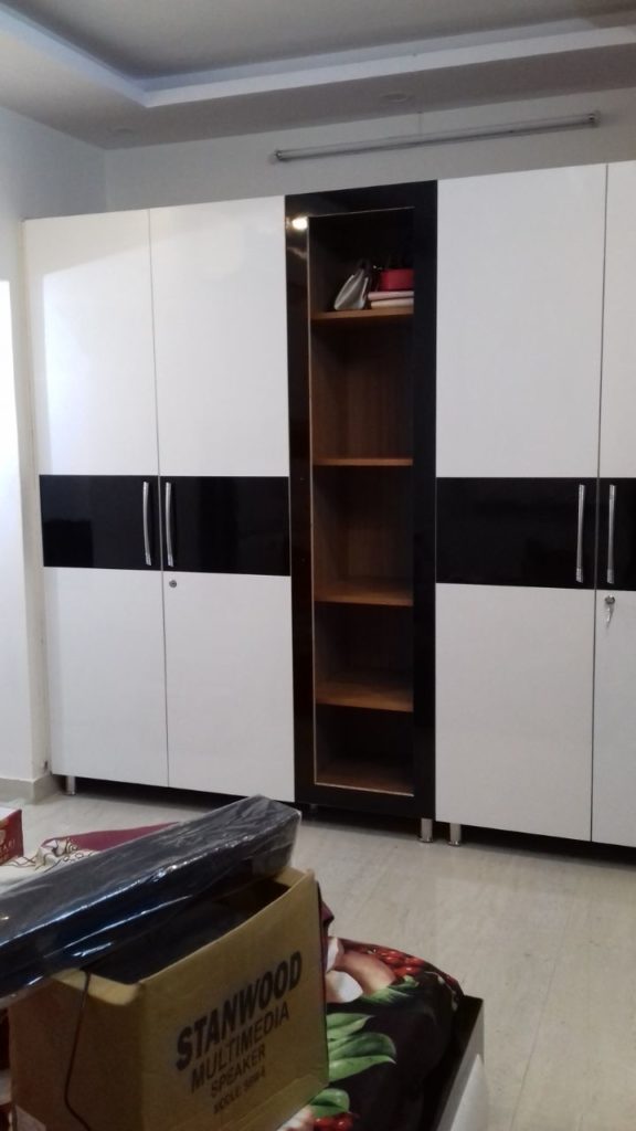
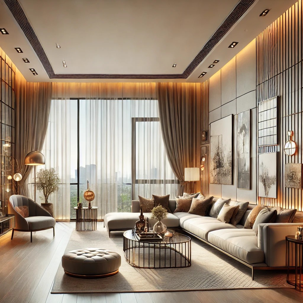
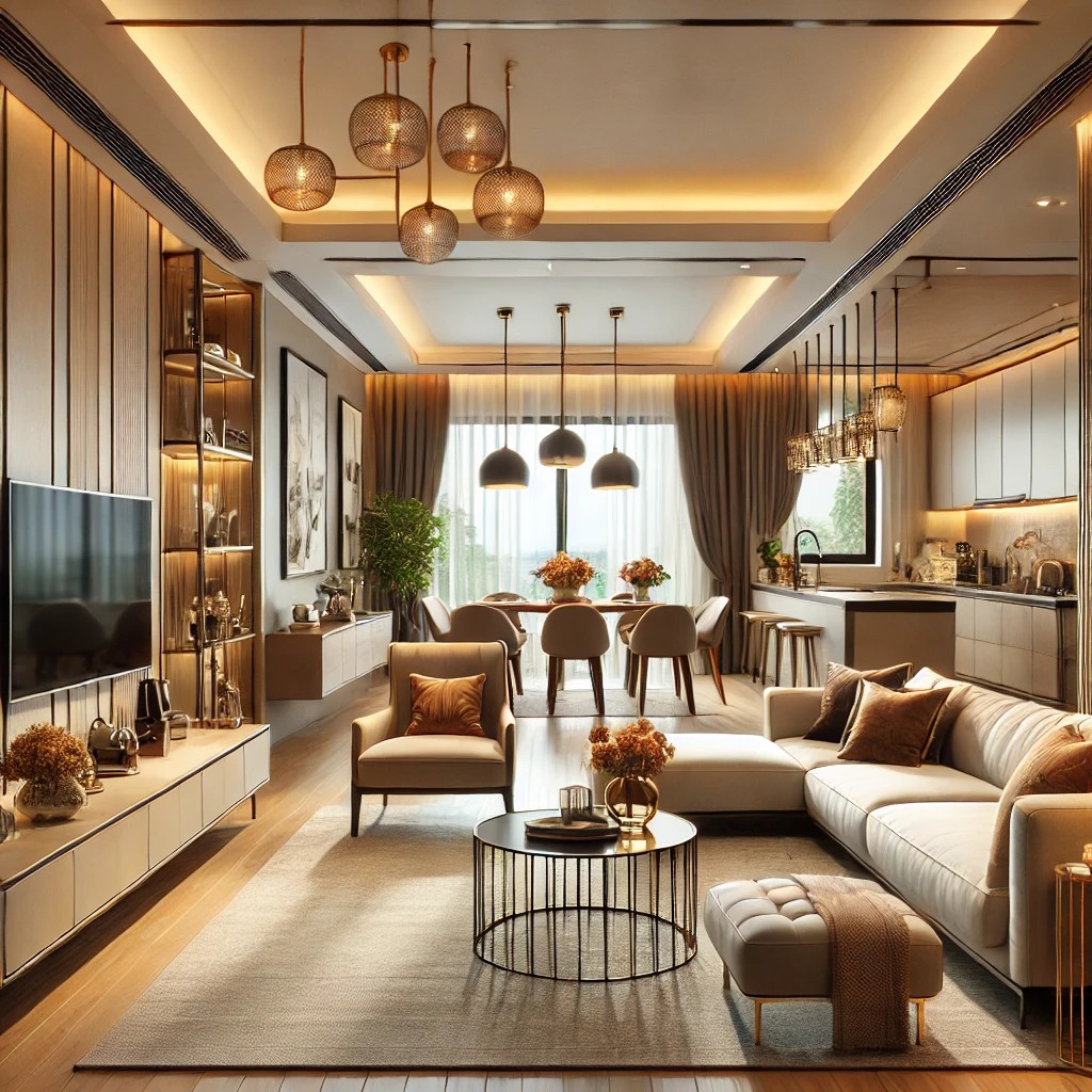
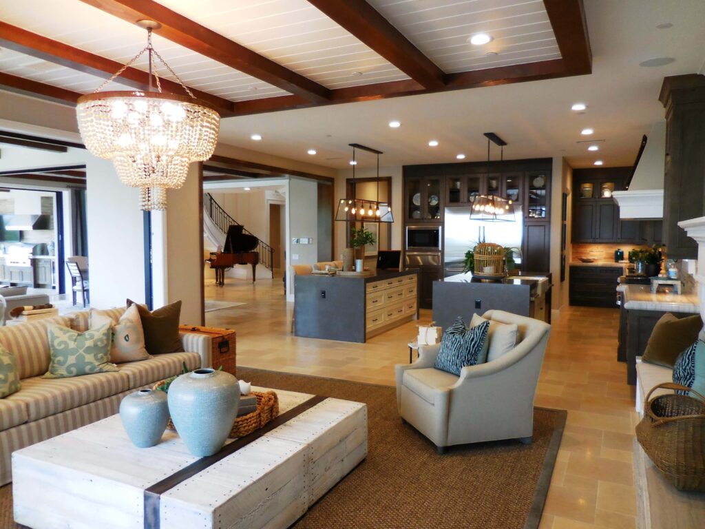
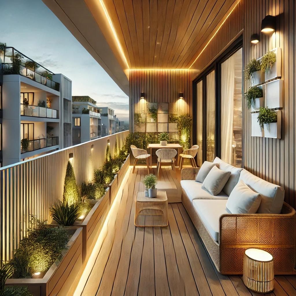
Neutral Sanctuary: Enter the realm of beige, gray, and white – the unsung heroes of the color wheel. Neutrals provide a calming backdrop, allowing other colors to shine and harmonizing diverse elements in the space.
Warm Embrace: The fiery allure of reds, oranges, and yellows wraps a room in a cozy, welcoming embrace. These warm colors stimulate energy and evoke a sense of conviviality.
Cool Tranquility: On the flip side, blues, greens, and purples paint a serene landscape. Cool colors invite a sense of calm, making a space an oasis of tranquility and relaxation.
Pastel Dreams: Soft and muted pastels bring a touch of whimsy and playfulness. These gentle hues create a delicate ambiance, like a breath of fresh air in a sunlit meadow.
Bold Declarations: For those unafraid of making a statement, bold colors demand attention. Vibrant and lively, they inject life and personality into a room, turning it into a visual feast.
Muted Elegance: On the other end of the spectrum, muted colors speak in hushed tones, exuding understated elegance. Subtle and refined, they create a sophisticated backdrop for any design.
In the grand tapestry of interior design, the color palette is the unifying thread that weaves together emotions, aesthetics, and functionality. It transforms spaces into living canvases, where every shade tells a story and every hue contributes to the narrative of a well-designed life.
Q1: What is a color palette in interior design? A: In the realm of interior design, a color palette refers to the carefully selected range of colors chosen to adorn a space. It serves as the artistic foundation, dictating the overall aesthetic and mood of the environment.
Q2: Why is choosing the right color palette important? A: Selecting the right color palette is crucial because it sets the tone and atmosphere of a room. Colors have the power to influence emotions, perceptions, and even functionality within a space.
Q3: How do primary colors contribute to a color palette? A: Primary colors—red, blue, and yellow—are the fundamental building blocks. They bring vibrancy and vitality, forming the base for creating an intricate interplay of hues.
Q4: What role do secondary colors play in a palette? A: Secondary colors—green, orange, and purple—emerge from the fusion of two primary colors. They inject depth and complexity, adding layers to the visual narrative.
Q5: What is the significance of a monochromatic palette? A: A monochromatic palette involves variations in lightness and saturation of a single color. This approach creates a sophisticated and cohesive look, offering subtlety and elegance.
Q6: How does an analogous color scheme work? A: Analogous colors, situated next to each other on the color wheel, create a seamless flow. This palette ensures a gentle transition between hues, fostering visual comfort and cohesion.
Q7: What drama does a complementary color palette bring? A: Complementary colors, positioned opposite on the color wheel, generate high contrast. This dramatic interplay injects energy and intensity into the design, captivating the eye.
Q8: What role do neutrals play in a color palette? A: Neutrals—beige, gray, and white—act as a calming backdrop, allowing other colors to shine. They serve as the foundation for a balanced and harmonious design.
Q9: How do warm colors influence a space? A: Warm colors, like reds, oranges, and yellows, create a cozy and inviting atmosphere. They stimulate energy and foster a sense of conviviality.
Q10: What ambiance do cool colors bring to a room? A: Cool colors—blues, greens, and purples—impart a sense of calm and tranquility. They transform a space into a serene sanctuary, promoting relaxation.
Q11: What characterizes pastel colors in a palette? A: Pastels, with their soft and muted tones, add a touch of whimsy and playfulness. They create a gentle ambiance, reminiscent of a sunlit meadow.
Q12: How do bold colors make a statement in design? A: Bold colors demand attention and inject vitality into a room. Vibrant and lively, they contribute to a dynamic visual narrative, making a bold design statement.
Q13: What defines muted colors in interior design? A: Muted colors speak in hushed tones, offering understated elegance. Subtle and refined, they provide a sophisticated backdrop for various design elements.
In the intricate tapestry of interior design, the color palette is the brushstroke that paints emotions and aesthetics into the canvas of a living space. It’s a dynamic and powerful tool that transforms mere rooms into personalized expressions of style and atmosphere.