
A colour scheme is the foundation of interior design. It controls mood, cohesion, and visual flow. A strong palette makes a home feel intentional, while a random mix of colours creates tension.
Good colour design is less about picking favourites and more about building relationships between tones.
What Makes a Good Colour Scheme?
Colour works best when structured.
Design thinking influenced by Bauhaus emphasizes harmony and proportion — colour should support space, not overpower it.
Core rules:
- Limit dominant colours
- Repeat tones across rooms
- Balance warm and cool shades
- Use contrast intentionally
- Leave visual breathing space
A palette should feel calm, not busy.
The 60–30–10 Rule
This is a classic interior colour balance:
- 60% dominant colour → walls & large surfaces
- 30% secondary colour → furniture & textiles
- 10% accent colour → decor & details
This structure prevents overload and creates hierarchy.
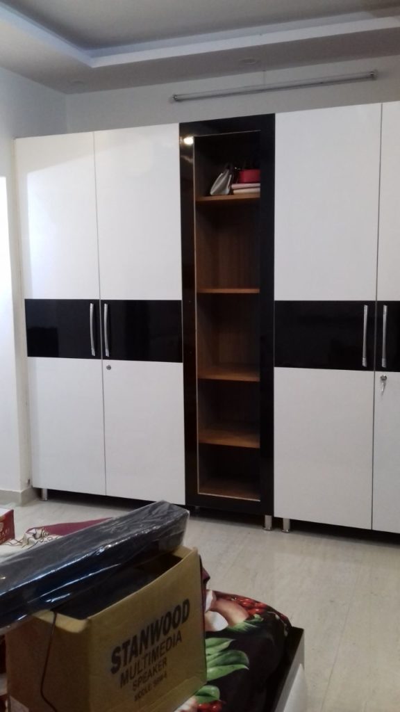
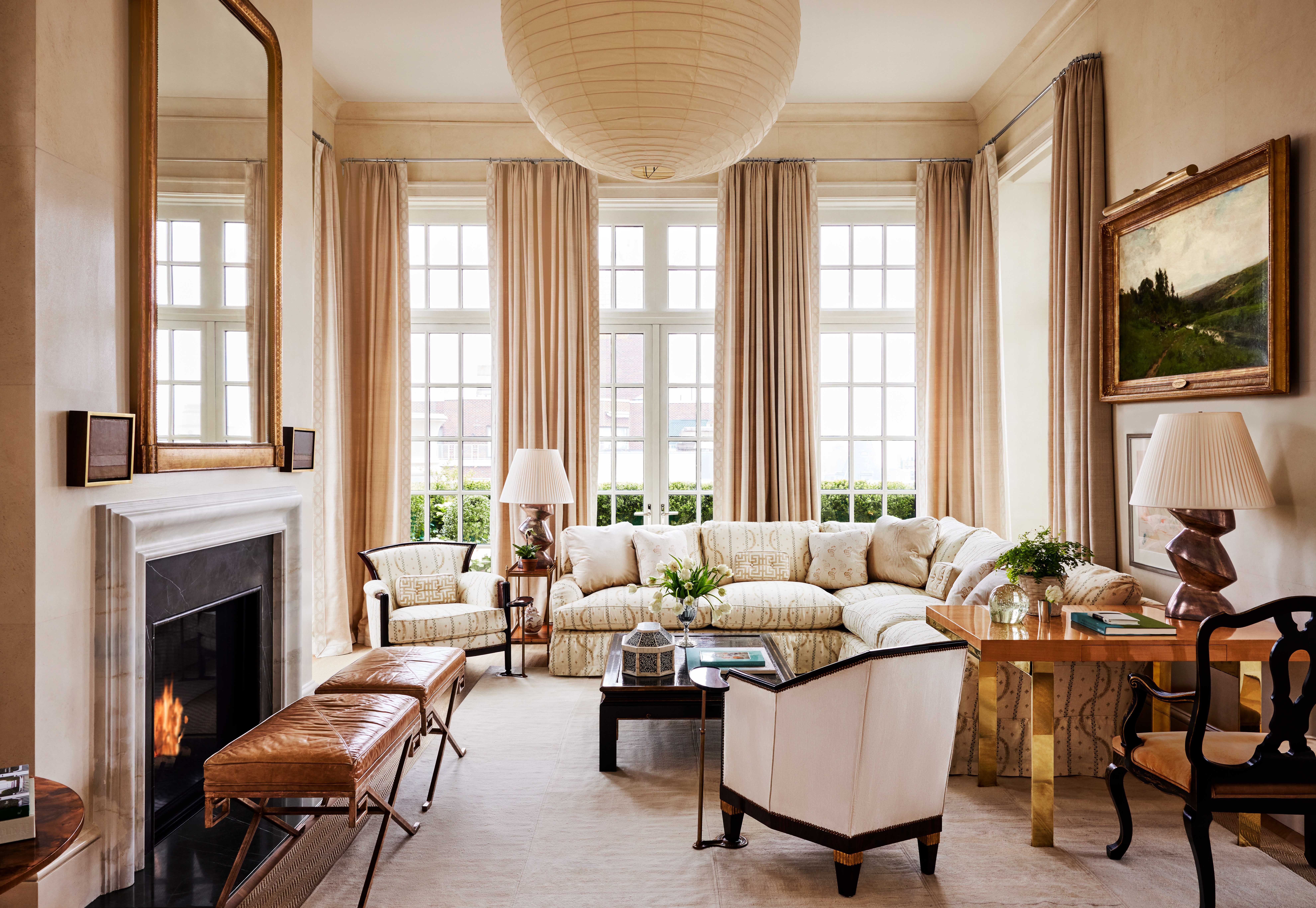
Neutral Colour Schemes


Neutral palettes feel timeless.
Common combinations:
- Warm white + beige + wood
- Grey + cream + black accents
- Taupe + soft brown + linen
- White + sand + muted green
Neutrals create calm backgrounds.
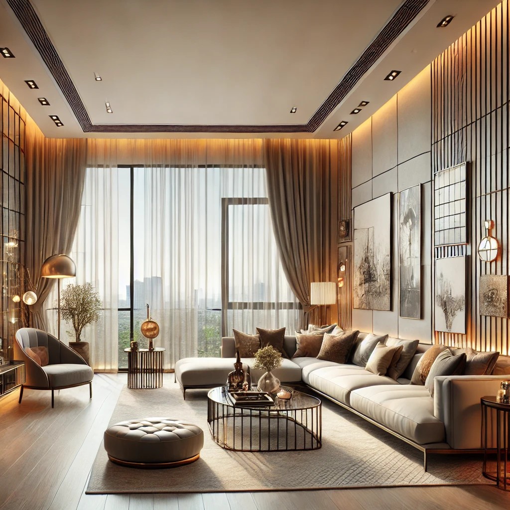
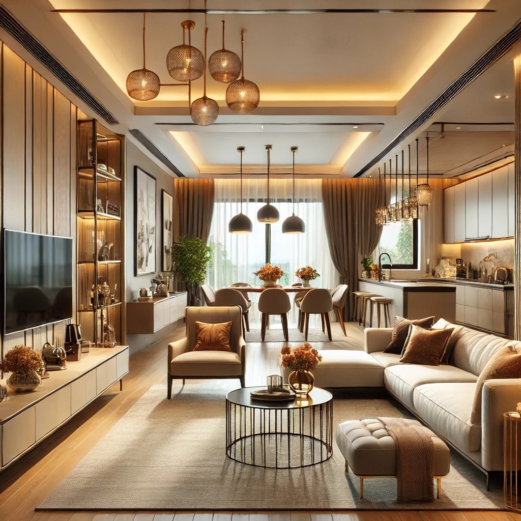
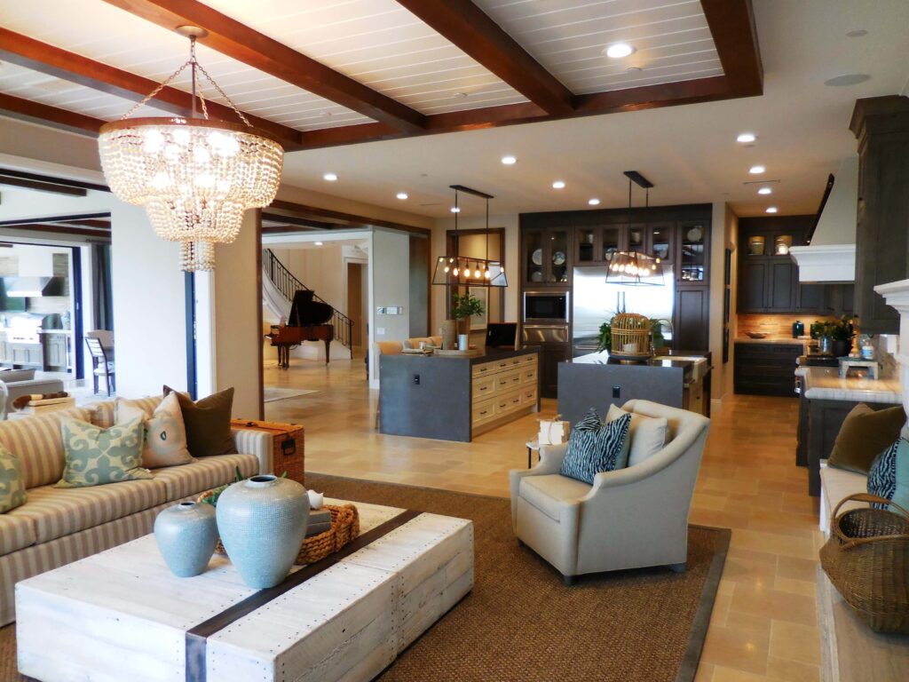
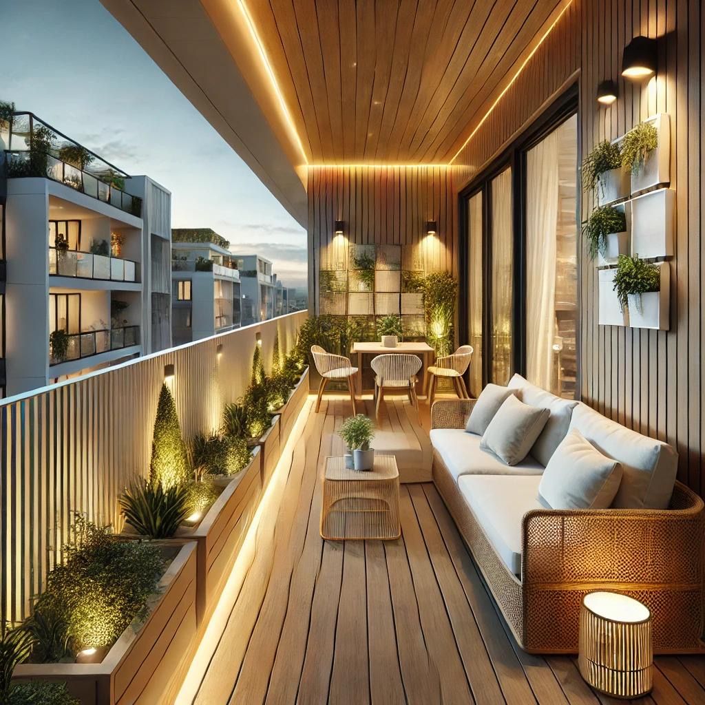
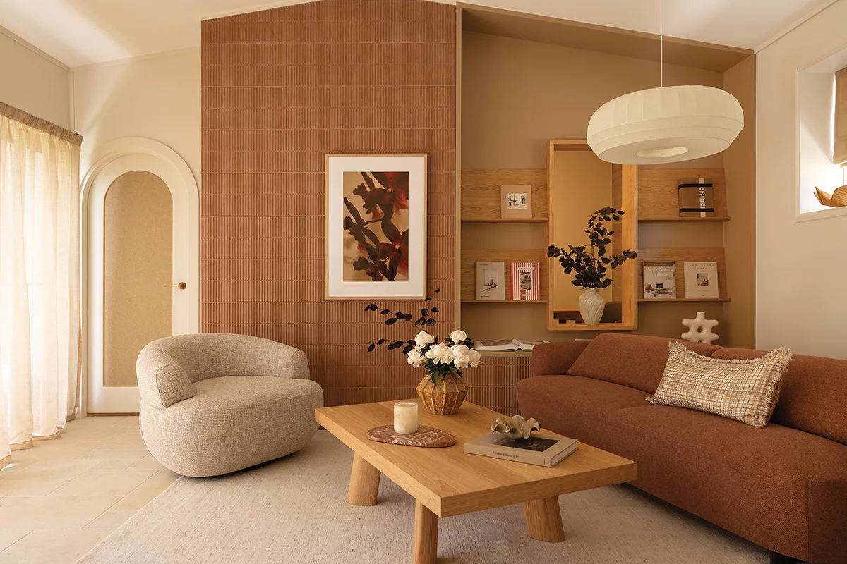
Warm Colour Schemes


Warm palettes feel inviting.
Examples:
- Terracotta + beige + rust
- Warm brown + cream + gold
- Clay + muted orange + sand
- Soft caramel + white
Warm tones add comfort.
Cool Colour Schemes


Cool palettes feel fresh and calm.
Examples:
- Blue-grey + white
- Sage green + beige
- Soft navy + cream
- Misty blue + wood
Cool tones relax the eye.
Monochrome Colour Schemes
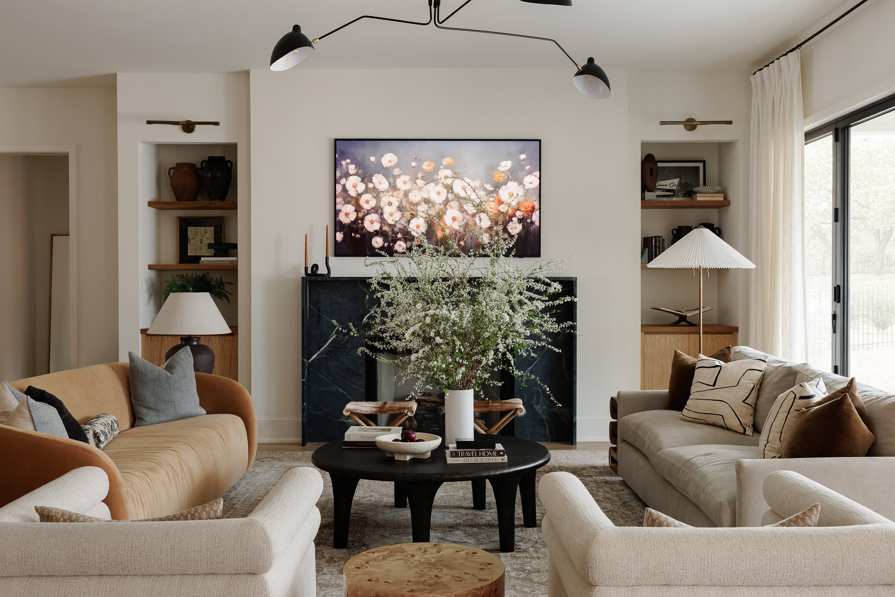


Monochrome uses one colour in multiple shades.
Example:
- Light beige → medium beige → deep taupe
Layering tones adds depth without clutter.
Accent Colour Strategy
Accent colours should guide attention.
Use accents in:
- Cushions
- Artwork
- Lamps
- Throws
- Decorative objects
Repeat the accent 3–5 times for cohesion.
Colour Flow Between Rooms
A home should feel connected.
Methods:
- Repeat one neutral everywhere
- Use variations of the same palette
- Keep accent colours related
- Maintain similar undertones
Flow creates harmony.
Common Colour Mistakes to Avoid
Do not:
- Use too many strong colours
- Mix warm and cool undertones randomly
- Ignore lighting conditions
- Change palettes room-to-room with no link
- Overuse bright accents
Editing improves elegance.
Summary
A strong colour scheme relies on balance, repetition, and restraint. Neutral bases, structured accents, and tonal layering create interiors that feel cohesive and calm. Whether designing a compact apartment or a large home, colour should guide the eye gently — not overwhelm it.
A good palette is not loud.
It is composed.