What Colors Are Not Good in a Kitchen?
Learn which kitchen colours can feel too dark, harsh or difficult to balance, plus Vastu colour guidance, better alternatives and stylish combinations for modern Indian kitchens.
Quick answer
No kitchen colour is universally “bad”. However, very dark colours, overly saturated shades and poorly balanced combinations can make a kitchen feel smaller, darker or visually busy. Traditional Vastu guidance may also recommend using certain intense or dark colours carefully.
Why kitchen colour matters more than you think
The kitchen is one of the hardest-working rooms in a home. Cabinet colour, countertop, backsplash, flooring and lighting all interact. A colour that looks beautiful on a small sample may appear very different when used across an entire kitchen.
9 kitchen colours and combinations to handle carefully
These colours are not automatically wrong. The issue is usually the intensity, proportion, lighting and combination rather than the colour itself.
All-Black Kitchen
Black can look luxurious, but using it across cabinets, walls, countertop and backsplash can make a compact kitchen feel heavy.
Balance with lightVery Dark Grey
Charcoal and deep grey are stylish but can absorb visual light, especially in kitchens with small windows.
Use selectivelyIntense Red
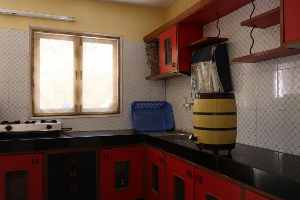
Bright red can create energy but may become visually overpowering when used across large cabinet surfaces.
Better as accentBright Orange
Orange can feel warm and lively, but highly saturated orange can dominate the kitchen palette.
Control intensityVery Bright Yellow
Strong yellow can become overwhelming under warm artificial lighting. Softer yellow or muted mustard is often easier to use.
Choose softer tonesDeep Purple
Purple can create a luxury look, but extensive use may make the kitchen feel visually dense.
Pair with neutralsVery Dark Green
Deep green can be beautiful, but it works best when balanced with warm wood, white or a light countertop.
Add contrastDeep Navy
Navy is elegant but can visually reduce brightness when used on every cabinet and wall in a small kitchen.
Use strategicallyToo Many Strong Colours
Red cabinets, colourful backsplash, patterned flooring and bright accessories together can create visual clutter.
Keep palette controlledDark kitchens can work when the palette is balanced
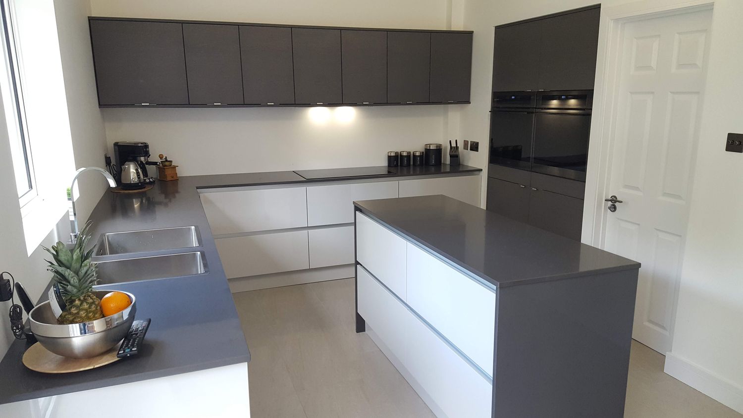
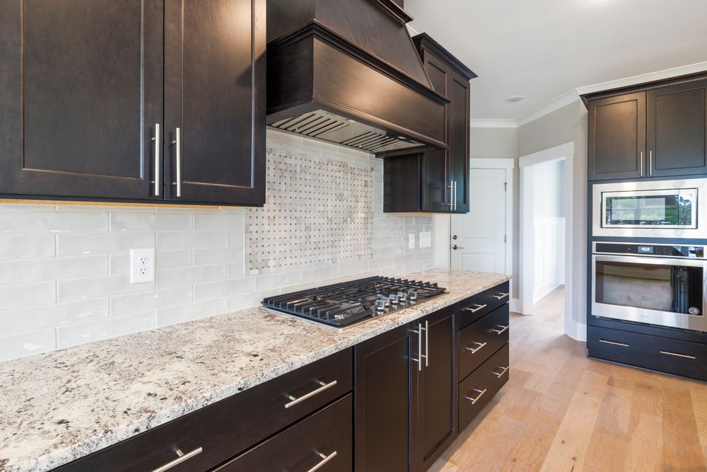
Dark cabinetry is not automatically a mistake. Good lighting, a lighter countertop and controlled contrast can turn a dark kitchen into a sophisticated interior.
Kitchen colours that are easier to coordinate
If you want a kitchen that feels bright, timeless and easy to update, start with a controlled base colour and introduce stronger shades as accents.
Warm White
A versatile base for small kitchens and homes with limited natural light.
Cream & Beige
Creates a warm and timeless palette that works especially well with wood and brass accents.
Light Grey
A contemporary neutral that pairs well with white, black, wood and stainless-steel finishes.
Soft Green
Adds personality and a natural feeling without the visual intensity of a highly saturated colour.
What kitchen colours are traditionally considered better in Vastu?
Traditional Vastu recommendations vary by direction and practitioner. Commonly discussed kitchen palettes include warm, earthy and lighter shades, while very dark or excessively intense colours may be recommended for limited use.
| Colour | Traditional association | Interior design approach | Use |
|---|---|---|---|
| Red | Often associated with fire and energy. | Use as a controlled accent or muted tone. | Accent |
| Orange | Warm and energetic. | Terracotta and muted orange are easier to balance. | Accent / selected cabinets |
| Yellow | Warm and bright. | Soft yellow can brighten the space. | Walls / accents |
| Green | Often associated with nature. | Soft green works well with wood and white. | Cabinets / accent |
| White | Light and clean visual character. | Excellent base for modern modular kitchens. | Cabinets / walls |
| Black | Vastu opinions vary. | Use selectively with lighter materials. | Accent / lower cabinets |
Where should you use stronger kitchen colours?
You do not need to eliminate a colour simply because it is strong. Controlling where it appears can dramatically improve the final result.
Upper Cabinets
Keep upper cabinets lighter when the kitchen is small. Dark colours can be reserved for selected lower units.
Lower Cabinets
Stronger colours can work beautifully on lower cabinets while lighter upper units maintain an open appearance.
Backsplash
A colourful backsplash can introduce personality without committing the entire kitchen to a strong colour.
Accessories
Handles, stools, artwork, appliances and decorative objects are excellent places for stronger colours.
8 kitchen colour mistakes to avoid
Balance dark cabinetry with lighter walls, countertops or flooring.
Always test your colour under the actual daylight conditions of the kitchen.
Two or three coordinated colours are generally easier to manage than many competing shades.
Cabinet and countertop colours should be selected together.
Large surfaces can look significantly different from a small colour card.
Warm LEDs can make creams and yellows appear considerably warmer.
Select a colour that works with your home architecture and long-term preferences.
Consider fingerprints, cooking stains, grease and cleaning before choosing a very light or very dark finish.

Need help choosing your kitchen colours?
Share your kitchen photos, cabinet style, countertop preference and approximate size. Get practical colour guidance for a modern kitchen in Gurgaon, Noida or Delhi NCR.
Kitchen colour FAQs
What colors are not good in a kitchen?
There is no universally bad kitchen colour. Very dark shades, extremely saturated colours and combinations with too much visual contrast can make a kitchen feel smaller, darker or busy. Traditional Vastu guidance may also recommend using certain intense colours carefully.
Is black a bad colour for a kitchen?
No. Black can create a sophisticated kitchen when balanced with lighter cabinets, countertops, flooring and good lighting. If you follow Vastu, recommendations about black can vary by kitchen direction and tradition.
Is red colour good for a kitchen?
Red can create a warm and energetic kitchen. However, a highly saturated red across large cabinet surfaces may feel overwhelming. Terracotta, muted red or smaller red accents can provide a softer result.
Which kitchen colours should be avoided according to Vastu?
Vastu recommendations vary according to direction and tradition. Very dark colours and certain intense shades are sometimes suggested for limited use rather than being universally prohibited.
What is the best colour for a small kitchen?
White, cream, beige, light grey and soft green can help a small kitchen appear brighter and more spacious. Stronger colours can be introduced through handles, backsplash, stools or selected cabinets.
Which colour is best for a modern modular kitchen?
White, cream, beige, grey, wood, muted green, navy and black can all work in a modern modular kitchen. The right combination depends on kitchen size, natural light, countertop and the overall interior style.