Which Colour Is Not Good for House?
Discover traditional Vastu guidance on house colours, including shades that are commonly used carefully, better alternatives, room-wise colour ideas and practical ways to create a beautiful, balanced home.
Quick answer
There is no single colour that is universally considered “bad” for every house. Traditional Vastu guidance generally recommends using very dark, excessively intense or visually heavy colours carefully, depending on the room, direction and overall colour balance.
Is there really a colour that is bad for every house?
House colour recommendations under Vastu are usually more nuanced than simply choosing one “good” or “bad” colour. Traditional guidance often considers the direction of the room, the purpose of the space and the intensity of the shade.
9 house colours traditionally used with caution
These colours are not automatically unsuitable. Their effect depends on where and how they are used. Accent walls, furniture and décor can create a very different result from using the same colour throughout the house.
Black
Black can feel sophisticated and dramatic, but traditional Vastu approaches may recommend using very dark shades selectively rather than covering large residential areas.
Use selectivelyVery Dark Grey
Charcoal and deep grey can look premium, although too much dark grey may make a small or poorly lit room feel heavier.
Balance with lightIntense Red
Red is associated with energy and fire in traditional symbolism. Large areas of intense red can also create a visually energetic environment.
Better as accentVery Dark Purple
Deep purple can be luxurious, but using it extensively can make a residential room feel visually dense.
Use with neutralsVery Dark Blue
Deep navy can create an elegant accent wall, but excessive use may reduce the brightness of compact rooms.
Best as accentVery Bright Orange
Orange can be warm and welcoming, but extremely bright orange may become visually overpowering when used across large surfaces.
Control intensityOverly Bright Yellow
Yellow can make rooms feel cheerful, but highly saturated shades should be balanced with softer furniture and neutral finishes.
Choose softer tonesVery Dark Green
Deep green can look sophisticated, while lighter greens generally create a fresher and more open visual effect.
Consider lighter tonesToo Many Strong Colours
A combination of several highly saturated colours can make the interior feel visually chaotic regardless of Vastu considerations.
Keep palette balancedBeautiful homes usually balance colour with light
A sophisticated interior does not require completely avoiding dark colours. The better approach is to control proportion, contrast, natural light and supporting finishes.
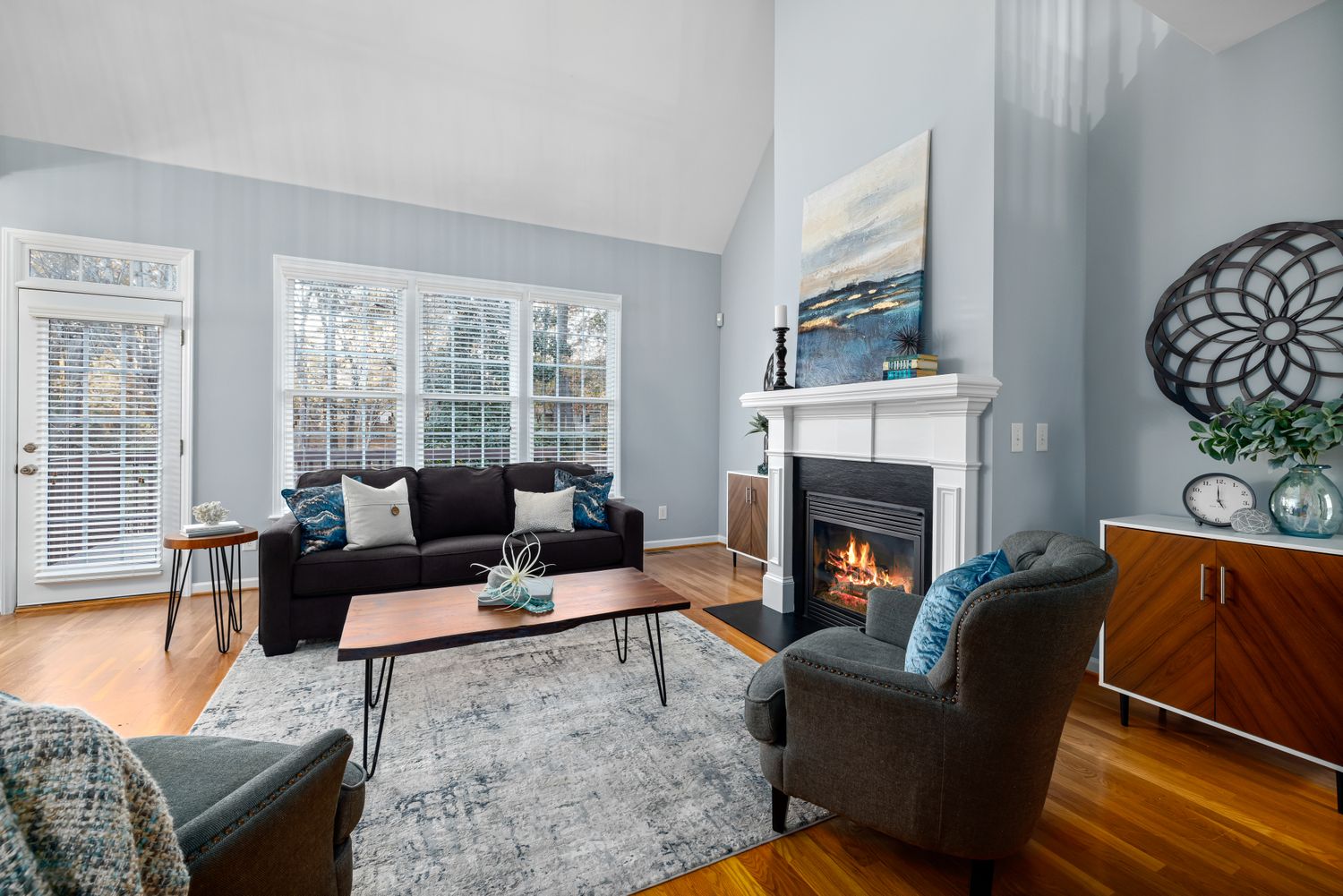
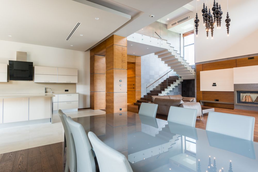
Which colours work well in different rooms?
Instead of selecting one colour for the entire house, create a coordinated palette based on the purpose and lighting of each room.
Living Room
Cream, beige, warm white, soft green, light yellow and selected blue shades can create an inviting living environment.
Bedroom
Soft beige, cream, muted green, light blue and other calming shades are commonly suitable for restful bedrooms.
Kitchen
White, cream, warm neutrals, selected green and earthy shades can create a clean and welcoming kitchen palette.
Entrance
Light neutrals, warm whites and carefully selected accent colours can make the entrance feel brighter and more welcoming.
House colour guide: use carefully vs softer alternatives
Use this table as a practical starting point when creating a Vastu- inspired interior colour palette.
| Colour | Traditional consideration | Design approach | Alternative |
|---|---|---|---|
| Black | Often used selectively in Vastu-oriented interiors. | Use for accents, furniture or details. | Charcoal, warm grey or cream. |
| Dark Grey | Can feel visually heavy when extensively used. | Balance with white and warm lighting. | Greige or light grey. |
| Intense Red | Strong fire/energy association. | Use as an accent rather than everywhere. | Terracotta or muted red. |
| Dark Purple | Use carefully in large areas. | Combine with cream and warm neutrals. | Dusty mauve or lavender. |
| Dark Blue | Can vary by room and Vastu tradition. | Use as a feature wall or furniture colour. | Powder blue or muted blue. |
| Very Bright Orange | High visual energy. | Use in controlled accents. | Peach, terracotta or warm beige. |
8 smart rules for choosing house colours
Dark colours absorb visual light while lighter shades can make a room feel more open.
If you follow Vastu, consider the direction of the room alongside the colour palette.
A layered palette of base, secondary and accent colours usually produces a more sophisticated interior.
Paint can look significantly different under daylight, warm LEDs and cool LEDs.
Wall colours should coordinate with flooring, doors, wardrobes and large furniture.
Dark shades can be excellent for feature walls, furniture and architectural details.
Soft neutrals often make compact bedrooms, corridors and living spaces feel more spacious.
Individual rooms should have their own identity while maintaining a coherent overall palette.
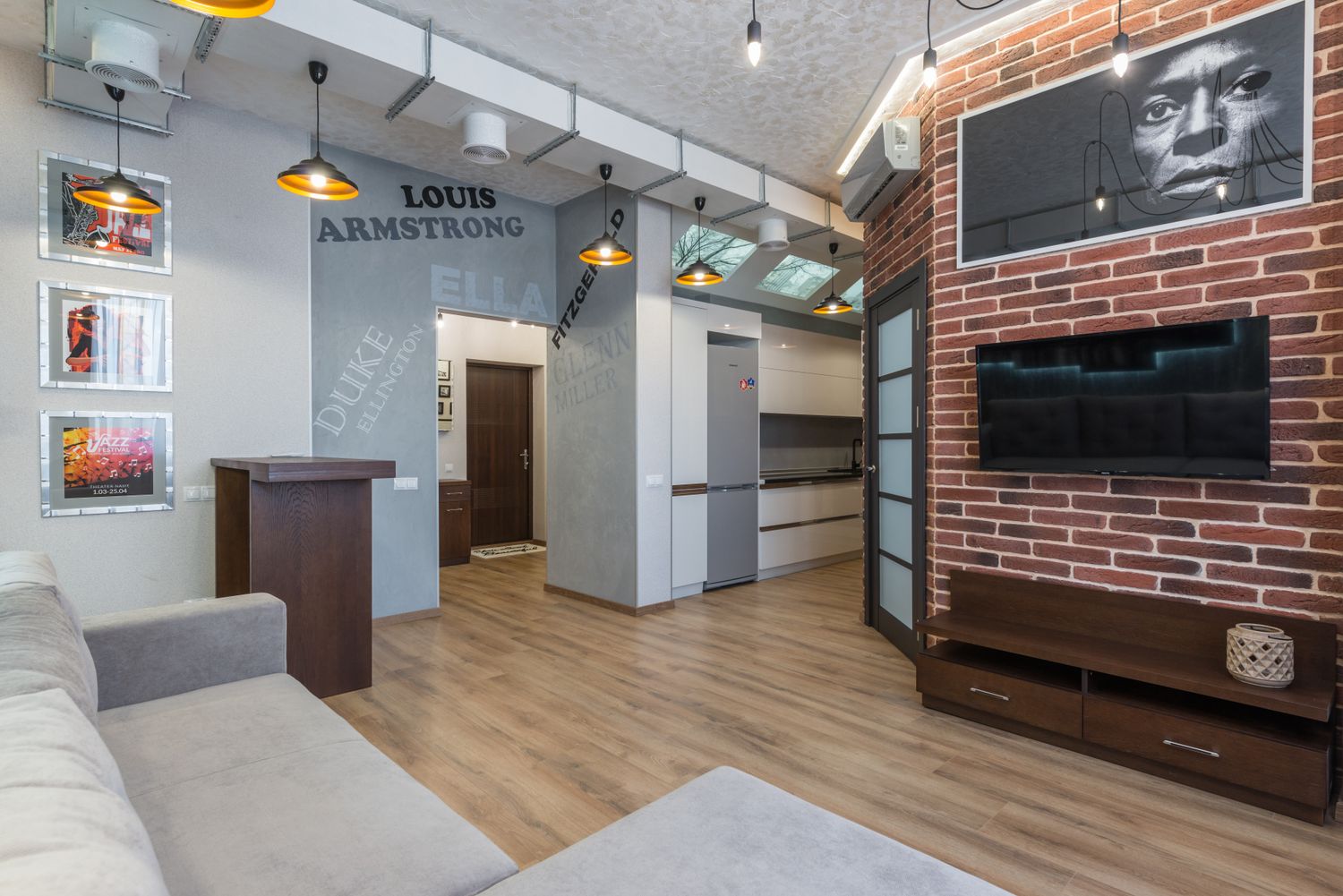
Planning colours for your new home?
Share your floor plan, room directions and preferred interior style. Get help creating a coordinated colour palette for your home in Gurgaon, Noida or Delhi NCR.
House colour and Vastu FAQs
Which colour is not good for house as per Vastu?
Traditional Vastu guidance may recommend using very dark, highly intense or visually heavy colours carefully. Black, very dark grey, deep red and some intense shades are often discussed in this context. However, there is no single colour that is universally unsuitable for every room or every house.
Is black colour bad for the house as per Vastu?
Vastu opinions about black vary according to room, direction and tradition. Rather than treating black as universally bad, it can be used selectively as an accent, furniture colour or architectural detail and balanced with lighter shades.
Which colour is best for a house according to Vastu?
Light and balanced shades such as white, cream, beige, light yellow, soft green and selected blue tones are commonly used in Vastu-oriented homes. The appropriate choice depends on the room and direction.
Is red colour good for a house?
Red is traditionally associated with energy and fire. It can be effective as an accent colour, but large amounts of highly saturated red may feel visually intense in residential interiors.
Which colour should be avoided in the bedroom as per Vastu?
Traditional Vastu guidance commonly favours softer, calming shades in bedrooms and recommends using very intense or excessively dark colours carefully.
Which colour is good for living room as per Vastu?
Cream, beige, warm white, light yellow, soft green and selected blue shades are commonly considered for living rooms. Direction and the home’s overall palette should also be considered.