Sensational monotone interior tips

Sensational monotone interior tips | Gurgaon | Noida | Delhi NCR

The appearance of the interior, which is calmly decorated in achromatic colors such as white, gray, and black, is always attractive. Because it is a color that stands out often around you, it looks easy to follow, so you want to try it at least once. However, in order for ‘color’ to become the center of the interior, a sense of balance is more important than anything else. It is necessary to determine the direction of the interior by carefully examining whether it is too obsessed with one color or whether it harmonizes with the surrounding accessories. Only then can you naturally revive the sophisticated style that the color influences.

Therefore, before trying monotone interiors overnight, it is recommended that you gradually develop an eye for this in your daily life. Careful in choosing the overall texture of the wallpaper or floor, and the finishing materials for the furniture. A stylish monotone space is created only when these things come together and blend naturally. We hope that this idea can create a more sensible atmosphere, and here are some tips for those who plan to have a monotone interior.

Let’s take a look at the dining room and kitchen with typical monotone interiors. Wood brown and white furniture, dark gray walls. These three colors stand out at a glance. If even one highly saturated primary color had been mixed, it would have been difficult to create such a neat feeling. Let’s take a closer look at how the various elements harmonize well with each other.

I installed a temporary wall in a space that could have been a bit boring and made use of the power by matching dark gray tones that contrast with the furniture. White lettering and chocolate chairs designed on the wall bring a casual feel to the space. The achromatic walls and furnishings blend with the silver wood flooring, creating a warm, non-pale atmosphere. Lastly, the flower decoration placed in the place facing the kitchen from the front gives life to this space, which is harmonized with achromatic colors.

The walls, floor, and even the columns are all unified in one color. Painting all the walls and floors with these dark solid colors rather than plain white or beige tones seems a bit bold. You need to match bright furniture here to make the space come alive without dying as shown in the photo. The bright beige color unifies the table, chairs and lighting to give the furniture a complete highlight.

The table and chairs are made of iron with simple lines, making the space more sophisticated. You can’t just ignore the pattern of the wallpaper that is lightly stained. Although it is a space covered in dark gray on all sides, the subtle wall pattern helps to make this place not stuffy. Thanks to this, it has become a space that resonates deeply, as if it were contained in watercolor. In addition, the picture frames hanging on the wall are of different sizes, but are unified in black to form an understated sense of rhythm. The artwork inside is set as a black-and-white photo to add a more chic feeling to the space. An interior that can create a luxurious feel when used in a dressing room, workroom, or study.

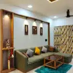
If you create a different color for each space, you can create a fresher interior. For example, in this house, the accent color of the bedroom is mint. Unlike the black wallpaper, the bedding and carpets are made in a bright mint color to add lightness to the bedroom. Instead of setting the color to a completely bright color, the pattern was matched with a little black to soothe the sense of disparity.

As such, it is recommended to match the walls with dark monotone colors such as black or dark gray with light colored furniture or accessories. It is a way to breathe a fresh atmosphere into the space. On the other hand, white or light gray can be accentuated with a darker color to create a more sophisticated atmosphere. In order to stand out as a stylish interior, be careful to exclude other colors as much as possible other than the color that serves as a point.

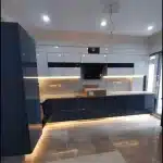
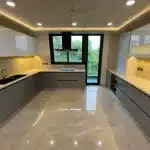
The first thing that catches your eye is the finished wall. It has an industrial feel and creates a rough atmosphere, but the warm beige color gives a sense of stability. The dark brown tone counter top and storage cabinet is made of matt wood, adding weight to the kitchen. The dark blue colored light shade is also not glossy, so it feels luxurious and neat. On the other hand, the smooth texture of the island table of bright white marble stands out. If you use the textures of various materials directly in the interior like this, the down atmosphere of the monotone will calmly gain vitality.

A bathroom with a bright energy in white and light gray colors. Black color was added to this place, which can look cold and flat, to enhance the completeness of the design. Materials with black color enhance their luster to show off their presence. The soft feel of the rug was also used in black and white, and a circular pattern was used to add richness. A monotone interior bathtub with a refined sensibility.

Sensational Kitchen – Art Decor Interior Tips

Furniture for cooking area has a huge variety of alternatives to match the user’s comfort and taste, and provides a huge variety of merchandise and features that make it tough to worry. If you’ve got got ever desired to have a completely unique kitchen that isn’t common, you’ve got got been promoting your merchandise, touring furnishings stores, and searching into diverse interiors and on-line buying department shops at the Internet. In different words, you could create your personal particular kitchen with the aid of using re adorning the wall, floor, or creative props past the layout of furnishings consisting of counter tops and tables that must be positioned with inside the kitchen.

Idea 1 – wall tile decoration

The wall wherein the countertop and sink meet withinside the kitchen is specifically fabricated from tiles. This is because, because of the character of tiles, it is able to be effortlessly wiped off although it receives moist or pro with food, and it does now no longer go away stains, so that you can hold a pleasing and smooth kitchen. Most of the tiles used with inside the kitchen are simple white tiles to create simplicity, or you could regularly see the partitions adorned with colorful tiles with patterned tiles. If you need a current and now no longer uninteresting kitchen, pick 3 or 4 favored pastel-toned tiles and blend them with none unique rules. Pastel tones are a great aggregate regardless of what destination you positioned them together, and whole the diffused indoors atmosphere.

Idea 2 – Floor decoration

Even with a bit ornament at the floor, it has the gain of encompassing the general ecosystem of the distance with a completely unique ecosystem. It isn’t always clean to capture your eye while you go to a high-priced cafe or industrial store, however in case you experience that the indoors has a unique ecosystem, it might be due to the ornament of the floor. Among a whole lot of substances with distinct colors and shapes, consisting of tiles, wooden panels, marble, etc., in case you discover one which is going nicely with the indoors ecosystem and fixtures located with inside the current kitchen, you’ll be capable of use it satisfactorily for an extended time.

Idea 3 – Sculpture-like lighting props

If you’re hesitating due to the fact it’s time and monetary burden to update many things, you may use a surprisingly easy method, lighting fixtures, to extrude the ecosystem of the room. These days, there are numerous styles of lighting fixtures set up with inside the ceiling, from circuitously emitting mild to lighting fixtures set up at the wall. In different words, it looks as if an inventive item floating with inside the kitchen from 360 levels as opposed to the mild connected to the wall, so that you can see how a unmarried shining accent decorates the distance colorfully.

Idea 4 – Colorful storage cabinet

It is an critical garage cupboard in each kitchen for kitchen add-ons that aren’t completed irrespective of how tough you arrange them. In order to apply the distance effectively, it’s miles not unusual place to put in a cupboard on the pinnacle of the wall in which the counter top is placed. In different words, the cupboard at the wall going through you while you input the kitchen is the face of the kitchen. If you need to make a major extrude with inside the indoors atmosphere, we advocate a cupboard indoors with ambitious hues and robust hues. It has the gain that it could be finished through making an investment a touch effort and time with indoors ornament objects inclusive of easy color sheet paper with no need to shop for new furniture.

Idea 5 – Art Wall

The recognition of artwork wall wallpaper with massive drawings or drawings at the complete wall like a sketchbook is growing day via way of means of day. You also can use those artwork wall wallpapers partly with-inside the kitchen to beautify them as factor decorations. The kitchen with inside the image is packed with artwork of inexperienced landscapes at the wall, much less than a meter high, among the sink and the cupboard on the top. Simple black-and-white drawings, romantic European road scenes, or caricatures in lovable colors, which can be famous those days, assist to beautify the kitchen with an inventive feel easily.

Secrets to increase the space of your small living room | Gurgaon

The living room is the area of ​​the house where we spend moments of relaxation, alone, in the family or in company, so it should be welcoming and well organized, whether to be comfortable and to accommodate, in a practical way, everything you need for the moments we decide to spend: a comfortable sofa, TV, books, computers, tablets, it depends on tastes.

If the living room is small, we must pay special attention to organizing the space well to make the most of it and make it pleasant and welcoming. If we want to have more space in  a small living room  , we must choose the furnishings and arrange them well, but that’s not all, there are some very useful tricks to make the small living room seem more spacious.

Below we will look at some ideas that can help us achieve the goal. Some pictures do not show small stays, but the principle is important, and each of us can choose how to fit each idea and put it into practice according to situations and needs.

1. Little Furniture

If the living room is small, it is better not to fill the space too much, regardless of the square footage, i.e. a room that is too crowded with furniture and things that look smaller than they actually are. If the living room is already, in itself small, then surely it is better not to overdo it, otherwise it will become oppressive. It is better to use walls, perhaps plain, with niches, shelves and furniture, thus leaving the view more free and open. And if the space in the living room is too little, perhaps it is to sacrifice something, perhaps no longer needed, to maintain a more comfortable living space.

2. Choose functional furniture

Secrets to increase the space of your small living room

If the  living room is small, it is necessary to choose the right furniture. It should be functional and help make the most of the available space. In a small living room, it is important to choose furniture that provides numerous support spaces, such as shelves and bookcases, whether closed or open, in order to allow us to maintain a clean and tidy appearance in the room.

3. Take advantage of height

As we have said, in a small room, it is a good solution to exploit the walls in different ways. First, the arrangement of furniture designed to contain objects on the walls is the best way to leave space in the room, however, no less important, to increase the space, make the walls along their length, and obviously put up what I need, less or decorative things.

4. . wall outlets

Secrets to increase the space of your small living room

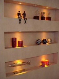
Dry renovations make it possible to create walls from wall panels that can accommodate many niches and shelves. These spaces, besides being functional, are also highly decorated. In this way, the small living room will be more spacious by taking advantage of the depth of the walls that you may risk being used exclusively for paintings, posters and decorations which can be very interesting but not particularly useful if there is little space.

5. Dimensional Reduction

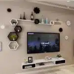
With niches in the walls or specially designed furniture, you can reduce the clutter of some things and keep the living room, no matter how small and neat, clean. For example, televisions or electronic devices that use electrical cables find their ideal home in pre-arranged compartments that conceal their true dimensions and relative electrical accessories. In the picture we also see two chairs placed in a place that does not take up space but remains within reach.

Seating option by an interior Designer | Gurgaon and Gurugram

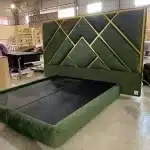
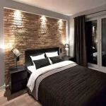
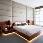
BEDROOM

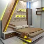
A bedroom design, called by the other name, is actually a sanctuary. A refuge from the stress of adulthood and therefore, the taxing workday. While the fashionable designs may keep changing, the fundamentals tend to remain an equivalent in a design concept.

Word of caution: avoid using leather within the bedroom, especially if you reside during a region with a tropical climate. If it isn’t a shared space, the perfect seating addition would be an armchair. You’ll make it’s as soft and cozy as you want; cover it with a pleasant vibrant color or may be a light-weight one if that goes with the theme of your room design.

Select a cutesy owl-print cushion and accessorize the armchair with a soft velvet sofa throw. If you’re a bookworm, add on a footrest and found out a lamp on the side. However, if you’re sharing the bedroom, start with a two-seat couch or a bench ahead of the bed.

They’re going to look chic while providing a handy spot for lacing up your shoes. If you’re the outdoorsy type and have a balcony, you’re in luck! Bring home a swing chair. You’ll now spend your free time swinging back-and-forth while enjoying the evening breeze.

LOUNGE

The lounge area is more of an all-purpose recreation room where people eat, nap, watch TV, and even play board games, if it is design with a design therapy. It’s essentially the house’s epicenter, so comfortable seating should be plentiful. A two or three-seated couch within the lounge may be a good place to start out. Choose an L-shaped sofa as there’s room for everybody on their — even the cat!

You’ll also add a classic divan or a Victorian fainting couch to at least one side of the lounge. Traditionally-embroidered floor cushions of varied sizes can accommodate the whole family on movie nights. If you’ve got a hearth, keep small backless stools ahead of it and luxuriate in your winter dry fruits there.

LEISURE ROOM

DINNING ROOMS

You can experiment the maximum amount as you would like together with your dining chairs. Arm chairs, side-chairs or maybe backless stools would look great. Mix them up! Add a pair of benches if you would like the small space to possess a more casual look. Choose vibrant colors when covering the dining room chairs with fabric. Darker colored chair covers, with stain-proof treatment, are more likely to survive spills and drips on a day to day. Play it safe, and you’ll not be sorry!

DRAWING ROOMS

This is usually the foremost pristine, yet least used room in every house. Choose lighter color tones for drawing room sofas as they carry an understated elegance. Choose plush, velvet pillows and sofa fabric on a minimum of one among the side-chairs. A Chesterfield sofa, a chaise or may be a sofa is all sophisticated seating options for the drawing room area.

OUTDOOR SEATING

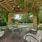
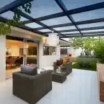
Whether it’s the rooftop for mid-summer night parties, a day at the pool side or simply a daily tea within the garden, the primary thing your furniture should be been weather-resistant. With mercurial weather like ours, it’s unwise to pick rich fabric coverings for outdoor furniture pieces. Keep it light (on your wallet) and straightforward (on the upkeep side) by choosing retreated, waterproof fabrics.

Freestanding hammocks are often put up almost anywhere, from the patio to the corner of the lawn. If the patio area is roofed, you’ll add a couple of flat cushions or low stools round the bonfire spot. Whether you’re renovating an existing house or building a fresh one, the tiniest of selections make an enormous impact on the ultimate product.

Even something as apparently mundane like chairs and sofas. Once you are building a house you would like it to be perfect, so confirm you concentrate to each little detail — every decoration piece, every fabric matters. Keep searching until you discover the proper architectural design firm which will construct the posh home of your dreams.