Color Palette Magic: Transform Your Home With the Right Colours
The right colour palette can make a home feel calmer, brighter, larger, warmer and more sophisticated. Discover 21 practical colour ideas, room-by-room combinations and professional principles for creating interiors that feel beautifully connected.
Beautiful Interiors Begin With a Thoughtful Palette
Colour is more than decoration. It influences mood, visual proportion, perceived spaciousness and the relationship between furniture, flooring, lighting and architectural details.
- Creates a visual identity for the entire home
- Connects living, dining, bedroom and kitchen spaces
- Controls how natural and artificial light are perceived
- Helps compact rooms feel lighter and more spacious
- Creates contrast without making the interior feel chaotic
- Allows furniture and décor to become intentional focal points
Colour Combinations That Create Instant Interior Character
Start with the atmosphere you want, then build a controlled relationship between dominant, supporting and accent colours.
01. Warm Beige + Taupe + Charcoal
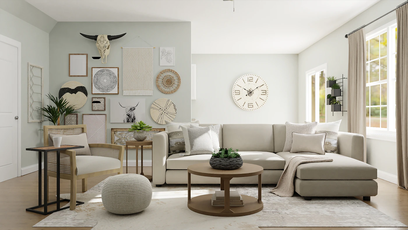
A sophisticated neutral palette for contemporary living rooms and complete homes.
02. Ivory + Sand + Natural Wood
Soft, welcoming and timeless, particularly effective with warm layered lighting.
03. Soft Grey + Sage + Black
A modern palette with subtle contrast for urban apartments and contemporary homes.
04. Blush + Terracotta + Brown
Warm and expressive without becoming overly bright or visually demanding.
05. Soft White + Sage + Olive
A nature-inspired combination that brings calmness and freshness indoors.
06. Cream + Walnut + Gold
An elegant luxury combination for sophisticated living rooms, bedrooms and dining areas.
07. Warm White + Dusty Blue + Navy
Relaxed yet refined, ideal for bedrooms, studies and calm contemporary interiors.
08. Ivory + Dusty Rose + Mauve
A soft palette for bedrooms and personal spaces where warmth and comfort matter.
09. Beige + Olive + Deep Green
A grounded earthy combination suited to biophilic and contemporary interiors.
10. Off-White + Beige + Brass
A quiet-luxury palette that lets premium materials and lighting take centre stage.
11. Beige + Terracotta + Muted Gold
Excellent for Indian homes seeking a modern interpretation of warm earthy colours.
12. Cream + Sage + Walnut
A comfortable family-home palette with natural warmth and visual depth.
13. Grey + Slate Blue + Charcoal
A sophisticated urban combination for modern apartments and executive spaces.
14. Clay + Beige + Gold
Creates a warm luxury feeling through earthy colour and controlled metallic detailing.
15. Pale Green + Olive + Charcoal
Works beautifully with wood, stone, indoor plants and natural textures.
16. Ivory + Blue + Brass
A refined palette that combines cool colour with warm metallic accents.
17. Sand + Olive + Brown
A natural palette for homes that prioritise comfort, organic textures and warmth.
18. White + Grey + Navy
Clean and contemporary, particularly effective when paired with streamlined furniture.
19. Beige + Rust + Deep Green
Creates an expressive earthy character without overwhelming the room.
20. Grey + Warm Beige + Gold
A polished modern-luxury combination for sophisticated Delhi NCR residences.
21. Cream + Sage + Blush
A gentle contemporary palette for bedrooms, living spaces and welcoming homes.
Make Colour Feel Balanced, Not Random
A successful palette is not simply a collection of attractive colours. It needs hierarchy. The 60–30–10 approach creates a simple framework for deciding where each colour should appear.
- 60% dominant colour — walls, ceilings and large surfaces
- 30% secondary colour — furniture, curtains, rugs and larger textiles
- 10% accent colour — cushions, artwork, décor and smaller details
- Repeat selected tones to create continuity between rooms
Choose Colours According to How Each Room Feels
A successful home does not need every room to use exactly the same colours. The key is creating a visual relationship between spaces.

Living Room
Start with a neutral foundation and introduce personality through an accent wall, artwork, cushions, rugs or statement furniture. Warm beige, ivory, taupe, muted green and earthy tones work well for sophisticated contemporary homes.

Modular Kitchen
Kitchens benefit from practical colour combinations that remain visually clean. Pair warm neutrals with wood finishes, muted greens, grey tones or carefully selected darker cabinetry.

Master Bedroom
Bedrooms should generally feel restful. Soft beige, cream, sage, dusty blue, muted taupe and warm grey create a calm backdrop, while deeper tones can be introduced behind the headboard.

Dining Area
Dining areas can carry stronger accents than bedrooms. Terracotta, deep green, navy, warm brown and brass details can create a richer atmosphere without overwhelming the wider home.
9 Rules for Getting Your Home Colour Palette Right
Colour selection becomes easier when it follows the architecture, natural light, furniture scale and lifestyle of the home.
Study Natural Light
Observe how sunlight changes throughout the day before committing to large areas of colour.
Start With a Base
Choose one dominant neutral or foundational colour before adding stronger accents.
Repeat Important Tones
Repeat selected colours in furniture, fabrics, artwork or accessories to connect spaces.
Balance Warm & Cool
A controlled mix of warm and cool tones can create depth without making the palette feel flat.
Use Contrast Intentionally
Dark colours are most effective when used to create focal points rather than visual heaviness.
Coordinate Materials
Consider wood, marble, stone, metal, upholstery and flooring alongside paint colours.
Test Before Painting
View samples under daylight and artificial lighting because the same shade can appear very different.
Consider Room Size
Light colours can visually open compact rooms, while deeper tones can create intimacy in larger spaces.
Design for Your Lifestyle
The best palette is one that supports how you actually live, relax, work and entertain.
When Colour Goes Wrong, Even Beautiful Furniture Can Look Wrong
Professional colour planning is largely about proportion, repetition and restraint. Avoiding a few common mistakes can dramatically improve the finished interior.
Using multiple strong colours without a relationship can make the home feel visually fragmented.
Artificial lighting can change how warm, cool, bright or muted a colour appears.
Furniture, flooring, stone and upholstery are often harder to replace, so coordinate them before finalising paint.
An accent works because it is limited. Repeating it everywhere removes its impact.
Open-plan and connected spaces should share enough visual language to feel intentional.
A fashionable colour is not automatically the right colour for your architecture, light and lifestyle.
Let Your Palette Shape the Mood of Your Home
Colour can influence how a room feels. Soft greens can suggest freshness and balance, blues can feel calm, warm neutrals can create comfort, while terracotta and earthy colours can make interiors feel grounded and welcoming.
- Yellow: warmth, optimism and energy
- Green: balance, freshness and connection with nature
- Blue: calmness, focus and tranquillity
- Pink: softness, warmth and gentle character
- Orange: energy and creativity when used selectively
- Earth tones: grounded, comfortable and sophisticated interiors

Colour Palette Planning for Delhi, Gurgaon & Noida Homes
Colour decisions should respond to the size, natural light, architecture and lifestyle of the property.
Delhi
Delhi homes can combine warm neutrals, earthy shades, heritage-inspired colours and contemporary accents. Thoughtful colour planning works particularly well in apartments, builder floors and independent homes.
Gurgaon
Gurgaon interiors often benefit from sophisticated neutral palettes, warm woods, stone textures, muted greens, navy accents and controlled metallic detailing for modern apartments and luxury residences.
Noida
Noida apartments can use lighter base colours, reflective surfaces, smart accents and coordinated furniture tones to create an open, contemporary and spacious visual impression.
Continue Your Home Design Journey
Explore related Interior A to Z resources for complete home interiors, lighting, luxury design, budget planning and room-specific inspiration.
Colour Palette Questions, Answered
What is the 60–30–10 rule in interior design?
The 60–30–10 rule uses approximately 60% dominant colour, 30% secondary colour and 10% accent colour. It creates visual hierarchy and helps prevent the interior from feeling overloaded.
Which colour palette is best for a modern home?
Warm neutrals such as beige, ivory, taupe and soft grey make strong foundations. Muted greens, terracotta, navy, brown or metallic accents can then add personality without overwhelming the space.
How many colours should I use in one room?
A controlled combination of one dominant colour, one supporting colour and one or two accents usually creates a more cohesive result than using many unrelated colours.
How do I choose colours for a small room?
Light neutrals, soft whites, pale beige, gentle greys and muted pastel shades can help reflect available light and create a more spacious visual impression.
Should every room in a house have the same colour palette?
Not necessarily. Each room can have its own mood, but repeating selected tones, materials or accent colours helps the complete home feel connected.
Which colours work well for Delhi NCR homes?
Warm beige, ivory, taupe, earthy brown, terracotta, olive, muted mustard, soft green and selected blues can work beautifully in contemporary Delhi NCR homes when coordinated with lighting and materials.
Can an interior designer help me choose the complete colour palette?
Yes. Professional colour planning can coordinate walls, furniture, flooring, upholstery, curtains, lighting, cabinetry and decorative elements so that the finished interior feels intentional rather than assembled piece by piece.
Turn Your Colour Ideas Into a Beautifully Balanced Home
From the first palette and mood board to furniture, lighting, finishes and final styling, create an interior where every colour has a purpose.